Center Pane
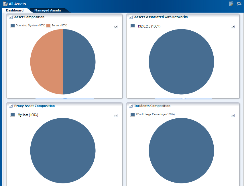
Center pane is the preliminary overview of the assets when no asset is selected in Oracle Enterprise Manager Ops Center. Each section represents the types of assets in a different type of chart. To identify the asset or asset type, hover the mouse on that portion of the chart. Figure 3-8 shows the pictorial representation of center pane.
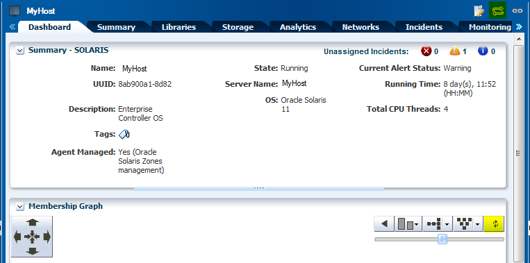
Any selection in the Navigation pane changes the display in the center pane. For most types of assets, the center pane shows a dashboard of standard information about the selected asset, a Membership Graph that shows its relationships, and a status summary that includes information about the unassigned incidents.
Allow time for the information to finish loading in the Membership Graph, depending on the complexity of your selection. Use the scroll bars to view all the information. For some types of assets, you need to click the right double-arrow button to view all the tabs.
You can edit, and refresh the details of an asset that appear in the center pane. Click Edit icon to edit the summary details of the selected asset in the Summary tab of the center pane. Commit the changes by clicking the Save icon or Cancel to ignore any change. A pop-up message displays information about the successful commit in the application.
The center pane also has icons that perform an action on the selected item, depending on the section selected in the Navigation pane. These icons are View Alerts, Close Incidents, Open Service Requests, Add User, Manage User Roles and so on.
Some types of assets have additional sections such as Services, Status, Compliance Reports, and File Systems. You can collapse these sections to hide the display and to prevent the information from refreshing. Click the down-arrow in the corner of the section to hide the section. Click the resulting right-arrow to reveal the section.
Click the Refresh symbol in the upper-right corner of the center pane to view any new information.
Click the Refresh symbol in Oracle Enterprise Manager Ops Center when you want to get the latest information. The Refresh feature is available at all the drawers of the Navigation pane, center pane, Actions pane, and so on. Figure 3-9 shows the Refresh icon in the right side corner of center pane and in Membership Graph.
Tabs
Some sections of the Navigation pane display their details in the form of tabs in the center pane. With your setting preference, you can set up any tabs in an object to be the default tab. Dashboard or Summary can be the default tab for those selected sections.
In case of assets selected as a section, the Dashboard tab displays a high-level overview of the asset. Every group and managed asset has a dashboard tab that provides a Summary, a Membership Graph, and the Monitoring status. The Dashboard tab displays additional information, depending on the type of asset selected in the section.
Dashboard enables you to customize your display preference by changing the position and height, or by collapsing or expanding any panel of the dashboard. The set preference is saved and used at the time of your next login.The same display preference is applied to other dashboards of the same type for other assets. For example, when you move the Status panel to the top for a dashboard of the selected server, at your next login, you find the Status panel at the same new location. When you select another server, you find the Status panel at the same new location of the dashboard.
When you select a group of assets, the Summary tab describes about all members of a group, and charts to identify the most active and least active members. To know more about the asset, click one of the tabs. Click the right double-arrow button to view the remaining tabs when there are too many tabs to fit into the center pane. Hold or hover the mouse over the value in the table to see its definition.
Charts are included in the Dashboard, Summary, and the Charts tab. Charts give access to the data collected by Oracle Enterprise Manager Ops Center for all the assets all the time. Hover the mouse over a portion of the chart to view the value it represents. On the Dashboard, you can hide the legend for a chart and the chart itself. Hide the legend when you want to see more details in the chart. Hide the entire chart to focus on another part of the center pane. Click the down-arrow button to hide and click the right-arrow button to show.
The Charts tab, display different types of charts. Right-click one of the charts to display a submenu of the following actions to customize the chart:
-
Select to pick a point on the line and display its values.
-
Zoom to concentrate on a portion of the chart.
-
Move to change the location of the chart.
-
100% to restore the original chart.
-
Select All
-
Property to display a table of all the values in the chart. You can control the scope of the chart by increasing or decreasing the time period of the data collection.
You can export your chart data in one of the following formats:
-
CSV
-
XML
Select one of the following time period to export your chart data.
-
Current View
-
6 months
The display of the tabs change in the center pane depending on the type of asset selected in the Navigation pane. For example, the display of tabs change in center pane when a hardware asset or an operating system is selected. The center pane displays some common tabs such as Dashboard, Monitoring, Jobs, and so on. On the selection of an asset in the Navigation pane, the center pane displays information about incidents in Incidents tab. You can view the alerts, incidents composition, and the unresolved incidents for the selected asset.
Administrating Enterprise Controller displays its information in various tabs like Summary, Configuration, Storage Libraries, Proxy Controller, and Logs.
You can select a template to view the template details or create a deployment plan from the templates tab in Plan Management. Existing Deployment Plans tab helps you in viewing a collection of profiles and plans that enables using the software to perform the tasks needed to maintain, monitor, and manage the infrastructure of your datacenter.
Oracle Enterprise Manager Ops Center uses libraries to store and manage cached data, images, packages, and metadata. It displays all its information through Summary, Usage, Disks, Incidents, and Monitoring tabs.
Networks describe about the network domains that are created. The Dashboard tab summarizes details about the network type, MTU, IP Range, Bandwidth, status of unassigned incidents, and recent incidents. The Network Details tab displays information about the Network IP, Netmask, Network Type, Network Name, and various other information about the network domain. Other tabs of Managed Network that provide more information about the network domain are IP Address Allocator, Network Services, Network Connections, Incidents, and Monitoring.
Membership Graph
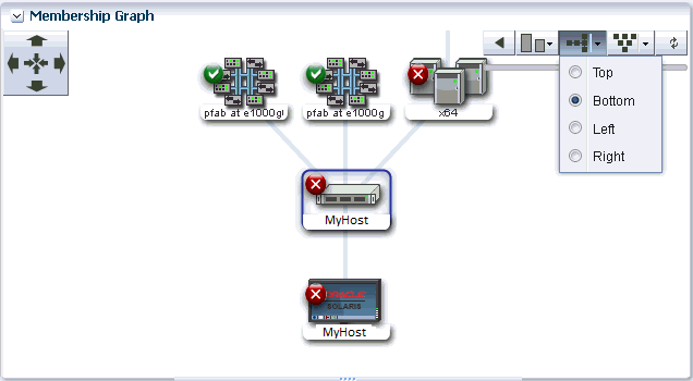
The Dashboard tab is the default display of the center pane, and the Membership Graph is a part of the Dashboard tab. The Membership Graph shows the relationships between the assets that are selected. Depending on what you select in the Navigation pane and on your datacenter's organization, the Membership Graph can have a single object or multiple objects. To control the view, you can use these options:
-
Use the scroll bar for moving the display and bringing the assets in large graphs into view.
-
Use view controls to relocate the Membership Graph left and right, and up and down. These view controls are two sets of arrows: four inward arrows and four outward arrows. Click one of the outward arrows to relocate the Membership Graph. Click one of the inward arrows to center the graph in the center pane.
-
Use the orientation controls to change the orientation of the graph. The hierarchy can be presented from the top down or from the bottom up. If the hierarchy is flat and wide, a more convenient display might be to change to a horizontal display so that the top is now on the left or right. Click the left arrow to restore the display.
-
Drill into the graph. When you choose assets or a group at the top of a hierarchy, the Membership Graph consolidates the display of the assets so that the graph is not unwieldy. Click in the graph to show the actual members.
Hover your mouse on the desired icon in the Membership Graph to view details about the type of asset like name, description, type, and tags. Double-click the icon in the Membership Graph to reach that asset in the Navigation pane and also view its detailed description in the Dashboard tab of center pane.
For an incident, the warning, and critical icons appear next to the asset. These icons also appear as a badge on the asset and the asset group in the Navigation pane. Figure 3-10 shows the pictorial representation of the Membership Graph.
Click the Refresh icon in the upper right corner to refresh the Membership Graph.
See the section Establishing Your Account Preferences for more information about setting the default display preferences for Membership Graph.


