Histogram Plot
A Histogram Plot is a basic visualization for showing the distribution of values for a single metric.
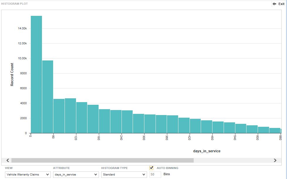
On the Histogram Plot, the X-axis contains bars with binned data reflecting ranges of attribute values. Values are left inclusive and right exclusive. For example, the first bin might reflect values between 0 and 29, the second bin values between 30 and 59, and so on. The Y-axis shows the number of records with values that fall within each range of values.

About using a Histogram Plot
Mousing over the bar for a bin displays the range of values for the bin, as well as the record count for the bin.
You can refine displayed data by clicking a the bar for a single bin, or by clicking and dragging to select a set of bins, then clicking a second time to apply the selection as a refinement. Alternately, hold the CTRL key and select multiple bins, then click Apply refinements in the selection box when finished. You can also select or multi-select values directly from the X-axis.
Selected refinements display in the Selected Refinements Panel and can be toggled to set them as negative refinements. See About the Selected Refinements panel for details.
- Selecting Histogram Plot data and display options
You can select the data view, metric, histogram type, and number of bins when viewing a Histogram Plot.
Parent topic: Working with Components