Scatterplot Matrix
The Scatterplot Matrix is a Scatter chart sub-type that plots multiple matrices for comparing attributes against each other. You can also add an optional Color attribute for grouping.
About using a Scatterplot Matrix
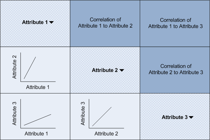
To find the plot or correlation for any two attributes, look at where their rows and columns intersect. For example, for three attributes the matrix is organized as follows:

Mousing over a chart or a correlation value highlights the attributes being compared. For example, in the diagram above, mousing over the lower-left corner highlights the "Attribute 1" and "Attribute 3" squares to make it clear what is being compared and rendered in the chart, and it also highlights the "Correlation of Attribute 1 to Attribute 3" value in the upper-right corner so you can see if the two attributes have closely correlated values, or are independent.
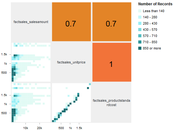
Mousing over a bin within one of the charts also shows the value ranges for the bin in a tooltip, while mousing over a correlation value displays the exact correlation. Clicking and dragging a range of values in any of the scatter plot visualizations adds two range filter refinements, one for each of the plotted attributes, to the Selected Refinements panel.
The Number of Records legend indicates the number of records in each bin based on the bin shade, so that you can interpret each of the individual scatterplots.
About configuring a Scatterplot Matrix
A Scatterplot Matrix requires at least three metric attributes to render, though you can add more. Each additional attribute adds a row and a column to the layout.
Selecting a Color attribute color codes bins based on the most common value of that attribute.
