Scatter chart
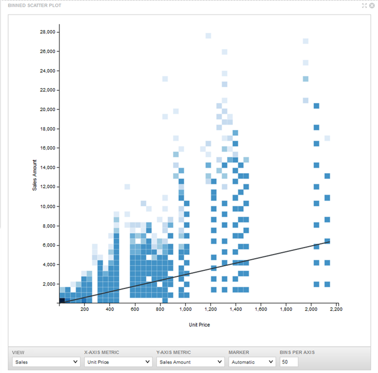
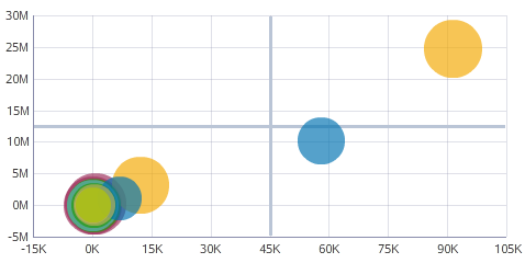
Scatter charts display data points, with each point representing a dimension value. Points can also be aggregated into bins in a binned scatterplot, or measured against a third metric and displayed as scaled bubbles in a bubble chart. These charts are useful for showing correlations between metrics.
A Scatter chart can show a line of best fit if there is any clear trend in the distribution of data points.
As an example of binning, one bin may contain all points where both the X and Y values are between 0 and 50. The bin to the right contains all points where X is between 50 and 100, and Y is still between 0 and 50. By default, scatter charts automatically switch from individual points to bins when there are more than 1000 data points in the chart.

- Scatter — A basic Scatter chart displays points in either binned or unbinned form.
- Grouped Scatter — Specifying a Color metric renders a Scatter chart as a Grouped Scatter chart. Records are grouped based on their values in the Color metric, with a single point shown per Color metric value.
- Bubble — Specifying both Color and Size metrics renders a Scatter chart as a Bubble chart. Like a Grouped Scatter plot, each Color metric value displays a single point on the chart. The size of the point is determined by the Size metric value:

- Scatterplot Matrix — A collection of binned scatterplots and correlation values displaying the relationships between three or more metrics.
About using a Scatter chart
Mousing over a bin or bubble displays all of the corresponding metric values. Highlighting a color in the legend highlights the corresponding point.
You can refine displayed data by clicking a single point or bubble, or by clicking and dragging to select a set of points, then clicking a second time to apply the selection as a refinement. Alternately, hold the CTRL key and select multiple points, then click Apply refinements in the selection box when finished. You can also select refinements in the same manner from the color legend or from an axis.
Selected refinements display in the Selected Refinements Panel and can be toggled to set them as negative refinements. See About the Selected Refinements panel for details.
About configuring a Scatter chart
The Scatter chart automatically sets a subtype based on the configured metrics. Converting a Bubble chart to a Grouped Scatter chart clears the Size metric selection. Similarly, converting a Grouped Scatter chart to a Scatter chart clears the Color metric.
You can set whether binning behavior is automatic or manual in the Display Options. You can also set whether the chart renders a line of best fit.
For detailed configuration steps, see Configuring a Chart.