Adding buttons to emails in the Design Editor
Buttons are an effective way to create calls-to-action in your email messages. You can add a button to a layout section of your email using the Design Editor. Button content is text only and cannot use images.
Learn more by watching this video!
Learn more by watching this video!
To add buttons to your email:
- With your email open, drag the button content to the layout.
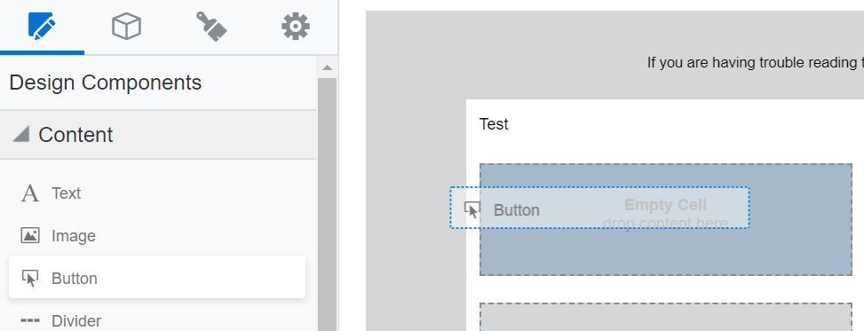
- Click the button content and use the Button panel to style your button and configure the button's link.
- Click the button text to change it. Use the text toolbar to format the button text.
Alignment
Use the alignment options in the Button panel to align the button to the left, to the right, centered, or the full width of the content component.
Text
Set the button text by clicking the button on the email canvas. You can use the text toolbar to change the font, size, style, and color of the button text. If you create emails using a RTL (right-to-left) writing system, the Design Editor gives you the option to write from right to left to insert your button text. Learn more about writing right-to-left.

Color
Using the Button panel, you can set the button color and the background color of the content component. To change the color of the button text, click the button on the email canvas and use the text toolbar to make the change.
Linking
To set the link for the button, use the Button panel. You can link to:
- A landing page
- A file in file storage
- An external webpage
- A system action like subscribing to an email group or opening the subscription management page
- A new email message
Learn more about the link types.
Warning: To avoid issues with buttons rendering in your emails, do not copy and paste text which contains hyperlinks into your buttons.
Sizing
Using the Button panel, you can adjust the size of the button within the content component using the Width setting. The following options are available:
- Fit to text: Size the button based on the button text. As the button text changes, the size adjusts accordingly.
- Fit to width: Size the button to width of the entire content component.
Rounded edges
You can create buttons with rounded edges using the radius settings in the Button panel. By default a button has square edges (0 radius). To make rounded edges, increase the radius setting. The radius can be 0 - 30.

Padding and borders
Adjust the padding and borders around the button or the content component using the options available from the Button panel.
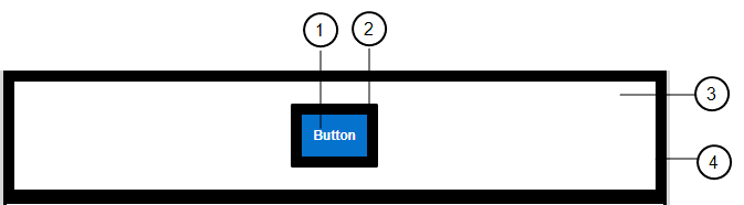
 Button Padding: The space around the text of the button.
 Button Border: The border around the button.
 Outer Padding: The space around the content component.
 Outer Border: The border surrounding the content component.
Working with email content components and layouts in the Design Editor