Adding a graph to your analysis
This tutorial shows you how to add a graph to your analysis. Graphs display your analysis in a visual way, which can make it easier to understand or identify patterns or trends.
Learn more by watching the video!
Learn more by watching the video!
What you'll learn
In this tutorial, we'll show you how to:
- Add a vertical bar graph to an analysis
- Configure the graph to show the data we want
- Format the graph
What you'll need
- Access to Insight
- Analyzer license
- Completed the tutorial Building your first analysis
Step 1: Adding a graph view to your analysis
First, we'll add a bar graph to our analysis results.
To add a graph view to your analysis:
- Open the analysis you created in Building your first analysis
- Click Save As
 , and name the graph Emails Sent Within a Date Range - Graph.
 - Save the graph in /Company Shared/Custom Email Reports/.
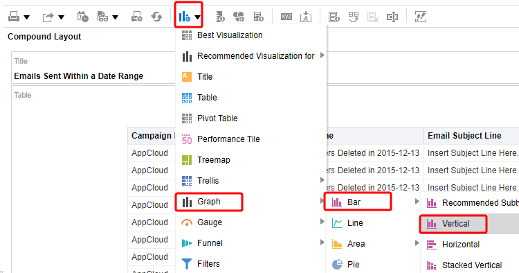
- Click the Results tab.
- Click New View
 , and select Graph > Bar > Vertical from the menu.
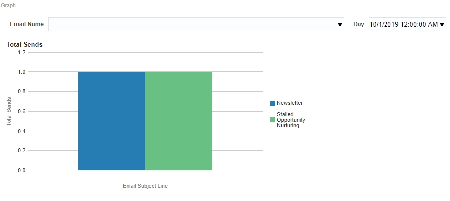
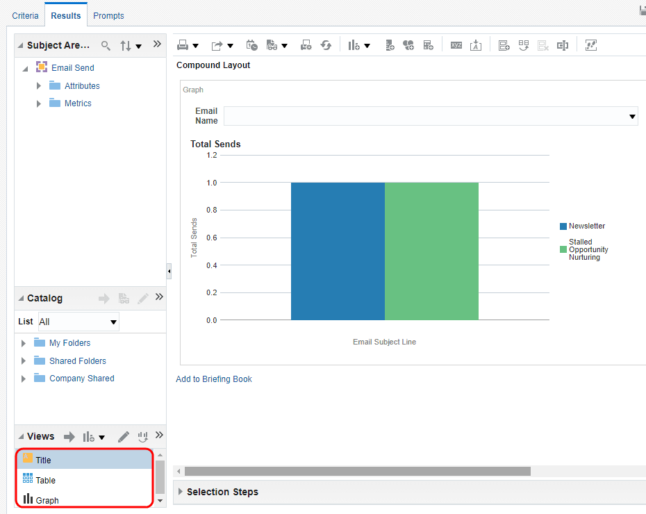
The default Graph view appears in the Compound Layout.

- Click Remove View
 for both the Title and Table views from the Compound Layout.
Both views are removed from the Compound Layout. Note, however, that the views are still available for use from the Views pane.

- Save the analysis.

Step 2: Configure the graph view
Now, we'll update the default graph. We will update the graph to change which data is used for the bars on the graph as well as remove some data from the bar graph.
To configure the graph:
- On the Results tab, click
 Edit View to begin your changes.
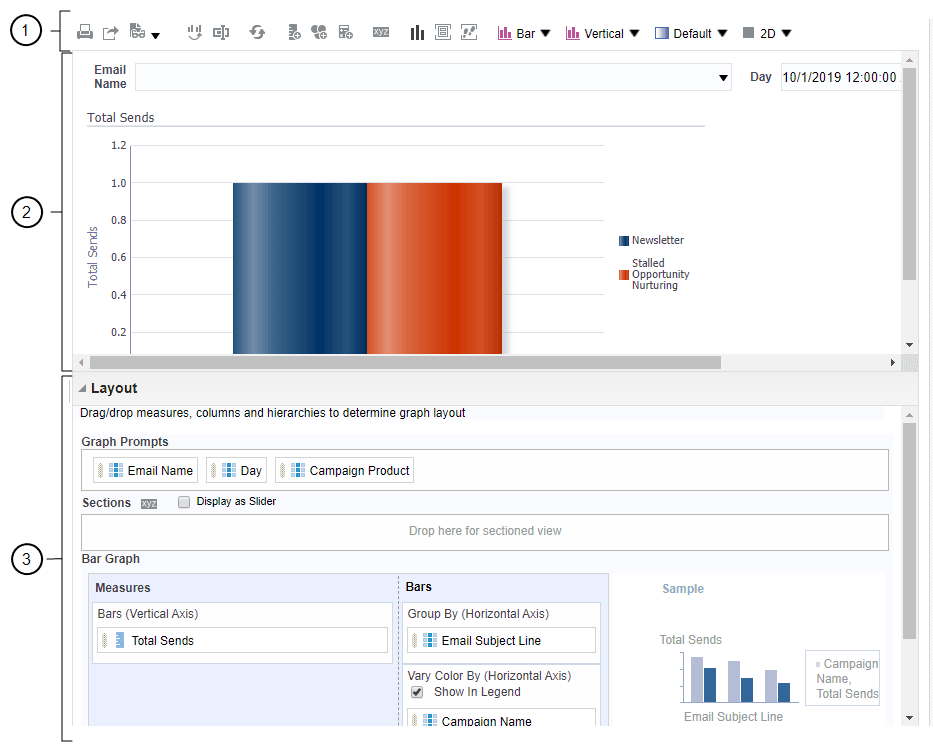
 The Graph editor appears.

The Graph, like other view editors, is composed of three sections:

Toolbar
The toolbar allows you to change graph types and subtypes, print, preview, edit graph properties, and so on.

Preview pane
The preview pane is a dynamic view of the graph, allowing you to view the changes instantly.

Layout
The layout allows you to change the properties of prompts, sections, measures, and so on, and allows you to regroup columns for graph display.
- In the Graph Prompts section, leave Campaign Product as the graph prompt. Drag the rest of the columns from the Graph Prompts to the Excluded section.
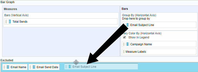
- In the Bars section, drag Email Subject Line column to the Excluded section.

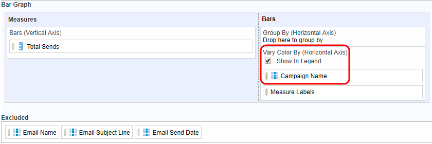
- In the Bars section, drag Campaign Name to the Vary Color By section.

Here is the updated graph.

- Click Done and save the analysis.
Step 3: Format the graph view
Now, we'll format the look and feel of the graph.
To format the graph:
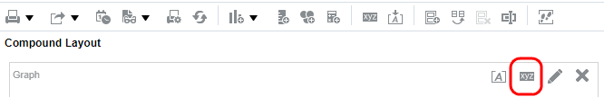
- On the Results tab, click
 Edit Properties.
The Graph properties dialog appears. The Graph properties dialog allows you to do the following:
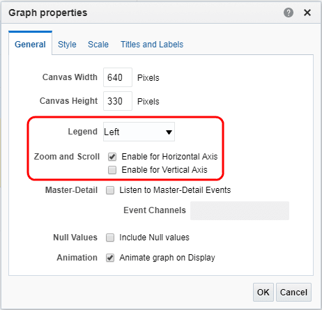
Tab Description General Set properties related to the graph canvas, such as canvas width, height, legend location, and so on. Style Set properties that control the appearance of the graph such as plot area and grid lines. Scale Set properties for parts of the graph, that is axis limits and tick marks. Titles and Labels Set properties that control the display of titles and labels for the graph. - Select Enable for Horizontal Axis from the Zoom and Scroll area, and then select Left from the Legend list.

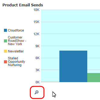
When zooming and scrolling is enabled for a graph, the graph includes a Zoom icon. The Zoom icon allows you to zoom in and out of a graph's plot area via its axes.
Note: The Animate graph on Display check box specifies whether to show initial rendering effects. For example, the bars on a horizontal graph start at the x-axis and move up the scale on the x-axis to the current measurement level in an animate way.
Listen to Master-Detail Events allows you to establish a relationship between two or more views. The master view drives data changes in one or more other views, called detailed views. Refer to the Oracle BI documentation to learn more about linking views in master-detail relationships.
The Canvas Width and Canvas Height manage the size of the graph as it displays on a window.
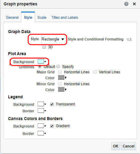
- Click the Style tab. Select Rectangle from the Style list in the Graph Data section.
- Select a light blue color in the Background list in the Plot Area section.
The updated dialog should look like this:

The Graph Data section allows you to choose a style for specific types of graphs. For example, you might choose pattern fill for to highlight differences on a line-bar graph or gradient for a bar graph to make the data values standout.
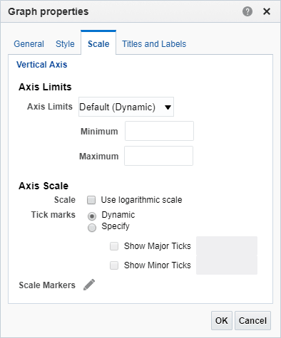
- Click the Scale tab.

Specifically setting axis limits and tick marks allows you to control what you see on your graph. If you override the system default for tick marks, the colors you selected for the horizontal and vertical grid lines are applied to both major and minor ticks.
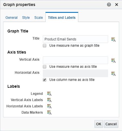
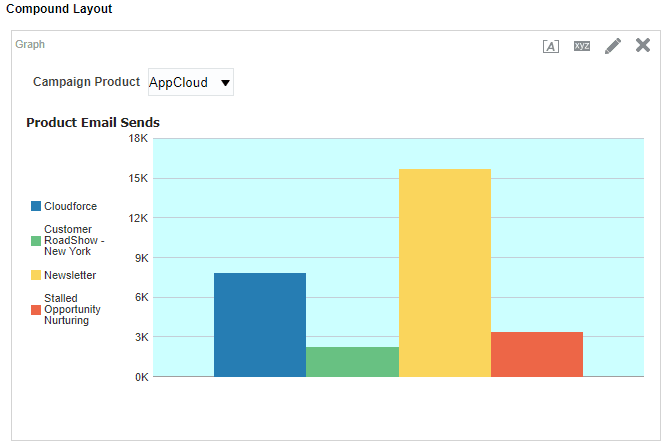
- Click the Titles and Labels tab. Deselect the Use measure name as graph title check box and enter Product Email Sends in the Title field. Deselect the Vertical Axis Title check box.

- Click OK.
The preview pane refreshes. The formatting changes appear along with a new title and a horizontal zoom.

Move your mouse over the graph and notice the Zoom icon. When you zoom in, a slider appears that you can use to navigate the graph.

- Click Edit View to return to the Layout pane.
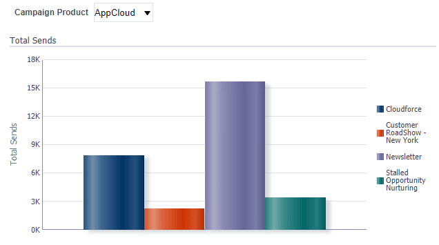
- Move Campaign Product to the Sections area and select the Display as Slider check box.
The slider appears in the preview. When you move along the slider for a particular product, the graph changes accordingly.

- Click Done and then save your analysis.

Now that you're done
Now that you added a graph to your analysis, check out the other tutorials.