Adding the trellis view to your analysis
This tutorial shows you how to add a simple trellis view to your analysis. A trellis is like a grid of charts that displays a matrix of measures over multiple dimensions. Each cell in the matrix contains a micro chart that shows, for example, revenue in each product brand and territory over time.
What you'll learn
In this tutorial, we’ll show you how to:
- Implement the trellis view
What you'll need
- Access to Insight
- Analyzer license
Steps 1: Adding the trellis view to your analysis
First, we’ll apply the trellis view to our analysis results.
To add trellis view to your analysis:
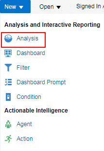
- Create a new analysis by selecting New > Analysis
 on the global header, and then selecting Campaign Revenue Analysis as the subject area.
 - In the Criteria tab, navigate through the folders and double-click on the columns in the following table:
Folders Columns Attributes > Campaign > Campaign Custom Text Campaign Product Attributes > Campaign > Campaign Custom Text Campaign Region Metrics > Revenue Attribution Attributed Revenue - Click the Results tab.
- To add the trellis view, click New View
 >Trellis > Simple.
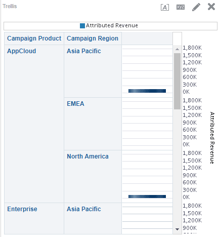
 - Scroll down to see the trellis view.
Step 2: Configuring the trellis view
Now, we’ll configure how the trellis view is displayed.
To configure trellis view:
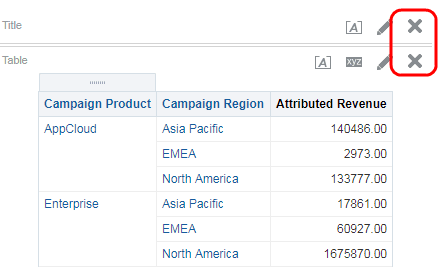
- In the Results tab, delete both the Title and Table views from the analysis.
- Click Edit View
 then drag and drop the Campaign Product to Trellis Prompts at the top of your trellis view.
 - Click on Trellis Properties
 and select None from the Legend Location drop-down list.
 - Click the Style tab then click Style and Conditional Formatting
 .
. - Click Add new position
 , select a blue from the drop-down list, then click OK.
 - In the Visualization frame, select Cylinder from the Style drop-down list.
- Click OK, then click Done.
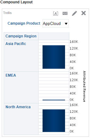
The trellis view should now look like this:

Now that you're done
Now that you have added the trellis view to your analysis, check out Adding performance tile to an analysis.