 |
Knowledge Base/Visual SML/Visual SML Documentation
Step 2: Basic Tab Contruction
This guide is for customers who have been enabled to use Visual SML in their AMP account, have added their Facebook Fan Page to the Social Apps section, and have added a new tab to that page using the steps from the previous section of this documentation. You are now ready to start constructing your tab. Note: as you become more familiar with the tool you may start configuring widgets as you go. For the purposes of getting started, we will be constructing a template of widgets first, styling the tab and then we will move on to the configuration settings in the next section.
Familiarize yourself with the Visual SML tab interface:
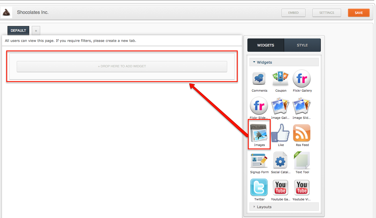
Widgets:
In the toolbox on the right you will see your available library of widgets and one "drop here to add widget" container in the template. Start here and add widgets, they can later be rearranged to where you'd like them to go.
- You may drag and drop any of your widgets into an open container on the tab
- Current default setting will place one container at the top and more containers will appear below each new widget that is dropped in.
- Widgets are all pre-configured to default content, much of it is Involver branded. (See below for more info on each widget)
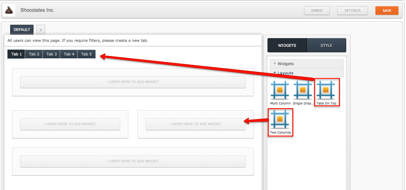
Layouts:
In the toolbox below the widgets you will see your layout tools. These will enable you to create a more complete looking tab.
- Two Column: Use this tool to create two containers of equal width that are side by side.
- Multi-Column: Use this tool to create any number of columns of any width.
- These containers can be configured to the display 1 or more containers of any width you want on the tab.
- Hint: You can change the Multi-Column containers into two columns of unequal widths to create a unique display of your widget content.
- Widgets dropped into these containers will take on the size of the container
- Single Dropzone: Use this tool to add one container to the tab. Can be dragged to another spot on the tab as well.
- Tabs on Top
- Allows you to create navigation states for your tab
- Configure the number of navigation tabs necessary for your overall tab as well as what you want those navigation tabs to be called. Ex: Home, Photos, Videos, Signup Here!, Contact US, etc.
- After you place this widget on the tab, you can drag any widgets into the space created directly underneath the tabs to design what you want displayed on that tab. Widgets can be moved into or out of a specific tab by dragging them to another container outside of the tabs on top widget.
Experiment by dragging and dropping different widgets into different size containers for the best overall look.
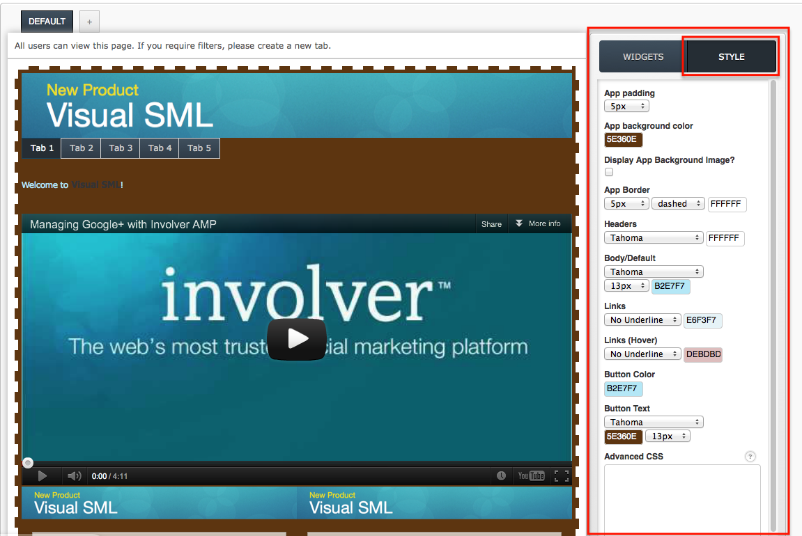
Style:
Set the look and feel of your tab in the Style settings. Colors, fonts, text size, etc. can be set here, through pre-configured settings or if you there is a designer on hand who knows CSS, there is an Advanced CSS section that can be utilized as well. Style set here will be reflected in all widgets. (Style settings on a per-widget basis are detailed below.)
- App Padding: Designate how much space you want in between the border and your widget content.
- App Background Color: Select a color that will appear behind your widgets. Note that some widgets such as the Twitter Feed and RSS Feed widgets (ones that use text as the main content) have transparent backgrounds, and the background color will show through.
- Display App Background Image?: Check the box to upload an image from your computer that will appear beneath your widgets but on top of your background color.
- Image can be set to:
- Repeat (will cover entire tab)
- No Repeat (only one instance of the image will appear.
- Repeat Horizontally (will span across the top of the entire tab)
- Repeat Vertically (will run along the left side of the entire tab)
- App Border: Choose the size, pattern, and color for a border that will wrap around the entire tab.
- Size range: 1px-5px and 10px
- Patterns: Solid, Dotted, Dashed, Inset, Outset, Double
- Headers: Select the font and color of the Headers (titles) on your page. If the header is all a link, style settings for Links will be used instead.
- Body/Default: Select the font and color of the text that appears on your page. This will be used for any text content pulled in from Twitter or RSS Feed widgets, etc.
- Links: Select Underline or No Underline to designate how links are displayed on the tab, then select a color for these links.
- Links (Hover): Select Underline or No Underline to designate how links are displayed in a hover over state to create a unique experience for users.
- Button Color: Select a color for any buttons that might appear on the tab. Only certain widgets contain buttons, i.e. Twitter (Follow) and Signup (Submit).
- Button Text: Select Font, Color and Size of the button text.
- Advanced CSS: Use this to create a more complex look on the tab that is not limited to the choices offered by the pre-set style options. Any settings entered here will override any settings made in the options above.
Style Individual Widgets:
Set the look and feel of each widget separately in the Style settings on the right.
- Hover over the widget you wish to style and click on the bar that appears across the top of the widget to select it.
- Next click on the Style tab in the toolbox to the right.
- Minimize Page by clicking the bar and click into Current Widget to open a new set of styling options for that widget.
- Settings include the following options:
- Padding: Create space around the content of the widget to alter how it appears in respect to the widget's border and background.
- Enter any pixel width for the Top, Right, Bottom and Left sides of the widget.
- Margin: Create space around the entire widget, including the padding, to alter how it will appear next to other widgets.
- Enter any pixel width for the Top, Right, Bottom and Left sides of the widget.
- Font: Set the font and size for any text that might appear in the widget. (Note: Does not apply to all widgets.)
- Headers: Select the font and size of the Headers (titles) in the widget.
- Body/Default: Select the font and size of the text that appears in the widget.
- Button Text: Select font and size of the button text. (Only certain widgets contain buttons, i.e. Twitter (Follow) and Signup (Submit).)
- Color: Click into the field to enter a hex code, or choose from the color selector that appears.
- Background: Color will appear behind this widget specifically.
- Border: Color of the border you place around this widget. (Pattern and size of border can be determined below)
- Header: Color of any titles.
- Body: Color of any text.
- Links: Color of any links.
- Links (hover): Color any link will change to when the cursor is moved over the link.
- Button: Color of any buttons, i.e. Follow or Submit.
- Button Text: Color of the text inside the button.
- Links: Select Underline or No Underline to designate how links are displayed in the widget.
- Border: Choose the size and pattern for a border that will wrap around the individual widget including the padding but excluding the margin.
- Size range: 1px-5px and 10px
- Patterns: Solid, Dotted, Dashed, Inset, Outset, Double
- Advanced CSS: Use this to create a more complex look of the widget that is not limited to the choices offered by the pre-set widget styling options. Any settings entered here will override any settings made in the options above.
- Padding: Create space around the content of the widget to alter how it appears in respect to the widget's border and background.
Watch the Video here of how to construct your tab.
Once you are finished constructing your tab, you can begin to configure your widget content.