 |
Knowledge Base/Visual SML/Visual SML Documentation
Step 3: Configure Widgets
After arranging your widgets on the tab where you want them to appear, you can configure them to display your specific content, as well as adjust any display options.
To configure any widgets follow the steps listed next, and reference the specific settings for all available widgets below:
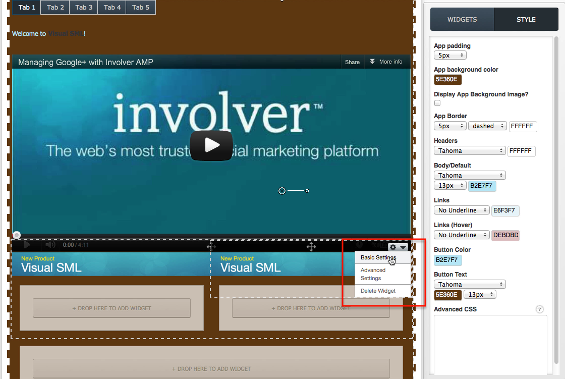
- On the tab, hover over the widget you wish to configure, click on the drop-down arrow that appears in the upper right corner and select Basic Settings to designate the content you want displayed.
- Save your settings.
- Hover over the widget again and select Advanced Settings to adjust any display options. Ex. set the number of tweets, stories or images to display or to enable Like Buttons if available.
- Click the Orange Save button in the bar at the top and visit your Facebook page to see your changes reflected on the tab.
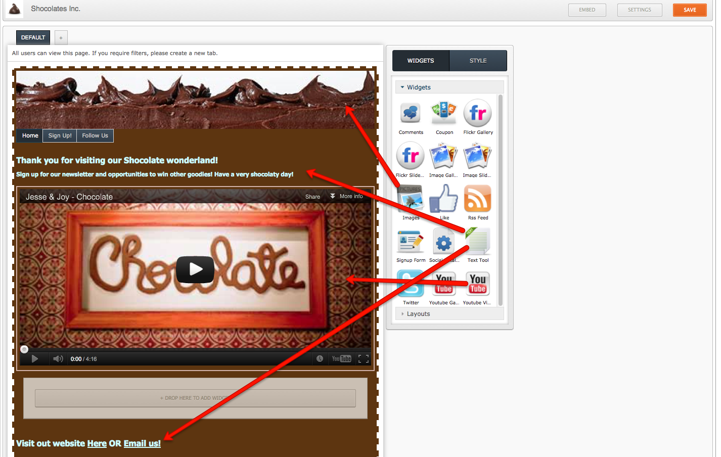
Here we've configured the images widget on top to look like the top of a piece of cake. We've used the Text Tool to put a header and footer on the page, the footer will remain on all states of this tab. Then we've put a little music video about chocolate in the center using the YouTube Video widget.
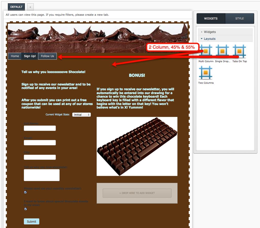
Here, you can see that the second tab has been selected and we've arranged our Text Tool, Signup, and Images widgets across two columns configured using the Multi-Column Layout widget to be 45% of the width of the tab on the left and 55% on the right. Also, the signup tab includes a success state (not shown here) that has been configured with out Coupon widget!
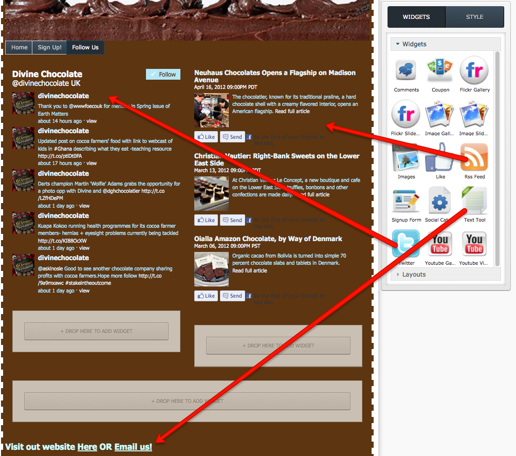
On our last tab here we've included a Titter and an RSS Feed, using our Twitter and RSS Feed widgets respectively. The footer is still shown at the bottom and is made clickable using our HTML editor in the Text Tool widget.
Check out the finished product here!
Configuration Settings for Available Widgets:
This is updated weekly to include additions to our product, check back often for new available widgets.
- Comments Widget
- Coupon Widget
- Flickr Gallery Widget
- Flickr Slideshow Widget
- Image Gallery Widget
- Image Slideshow Widget
- Images Widget
- Like Widget
- Pin It Widget (Pinterest)
- Pinterest Widget
- RSS Feed Widget
- Signup Form Widget
- Social Catalog Widget
- Text Tool Widget
- Twitter Widget
- YouTube Gallery Widget
- YouTube Video Widget
Layout Options:
- Two Column: Use this tool to create two containers of equal width that are side by side.
- Multi-Column: Use this tool to create any number of columns of any width.
- These containers can be configured to the display 1 or more containers of any width you want on the tab.
- Hint: You can change the Multi-Column containers into two columns of unequal widths to create a unique display of your widget content.
- Widgets dropped into these containers will take on the size of the container
- These containers can be configured to the display 1 or more containers of any width you want on the tab.
- Single Dropzone: Use this tool to add one container to the tab. Can be dragged to another spot on the tab as well.
- Tabs on Top
- Allows you to create navigation states for your tab
- Configure the number of navigation tabs necessary for your overall tab as well as what you want those navigation tabs to be called. Ex: Home, Photos, Videos, Signup Here!, Contact US, etc.
- After you place this widget on the tab, you can drag any widgets into the space created directly underneath the tabs to design what you want displayed on that tab. Widgets can be moved into or out of a specific tab by dragging them to another container outside of the tabs on top widget.
Watch the Video here of how to Configure your widgets.
Click here to jump to the next section for documentation on our Filtered Views (targeted content).