 |
Knowledge Base/Visual SML/Visual SML Documentation
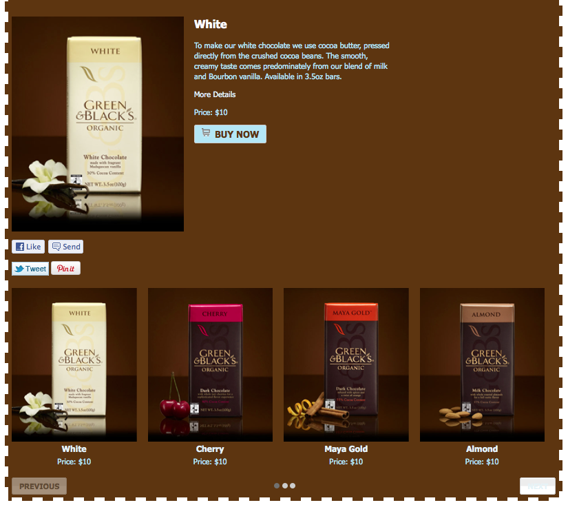
Social Catalog Widget
- Social Catalog - Display a catalog of products to your customers with links to buy the items. You can import product items from a feed, or add items by locating them on your computer.
- Basic Settings: (No default Settings)
- Click on Add New Item
- Enter Product Information:
- Title: Enter in the title of the item here.
- Description: Add some information describing your application here.
- Image: Add a new image by selecting the blue ‘add new image’ button. Select ‘browse’ and locate the image on your computer. For best results, this image should be a minimum of 220x220. Entering a name and caption is for internal purposes only, does not display externally and is optional.
- Enter Product Details:
- Price: Enter the price of the product here. For example, enter “€50” to show it’s 50 Euros, “$50” or “50 USD“ to show it’s 50 Dollars, etc.
- Buy URL: If the item is available for purchase somewhere on the web, enter in the URL here and the user will be redirected to this location after selecting “Buy Now”.
- SCHEDULING – Choose when to publish a specific item as the featured item and when to remove it.
- Publish At: Choose when you would like the item published to your catalog as the featured item. Selecting this will generate a calendar pop-up where you will choose a date and time.
- Expire At: Choose when you would like the item to appear as ‘expired’ in your catalog. Selecting this will generate a calendar pop-up where you will choose a date and time. Leave this as is to have the item never expire. If you have chosen an expiring date and time, you will also have the option to archive the image after expiration. This will remove the item from public view.
- Click ‘save’ at the very bottom in order to save this information.
- Click on Import from Feed - If you’d like to pull in your products from a feed, we currently offer this for the following feed types: shopping.com, google(csv), google(xml). Here is a sample of a feed that will successfully populate the application: http://involver.com/social_catalog/shopping.com.chocolates.csv
- Product Feed URL: Enter a feed URL from one of the supported feed types.
- Product Feed Type: Specify which type of product feed you are using.
- Selecting ‘next’ will generate a list of all items located on the feed. Select which items you would like to add to the catalog, as well as whether you want the item to be active (go live right away once saved) or inactive (sent to the archived item’s tab to be made public at a later time). You can also just click on Select all
- Once the items have been added, you will be notified. When you are ready, you can close this dialog to return to the settings.
- Editing Catalog Settings: Once all your items have been added to the catalog, you can edit them at any time. Each item in the active catalog has five editing options.
- Edit: return to the settings for a specific catalog item. For more information on specific settings, see “add new item” above.
- Archive: selecting this will remove the item from public view, and send it to your “archived items” tab.
- Feature It: selecting this will showcase the item at the top of the application. You may only feature one application at a time. Items that are featured at the top will also appear in the full catalog listed below.
- Delete: selecting the ‘x’
- Rearrange: select the (?) icon to the left of each item to drag and drop the items into the desired order. The item shown first here will also show first on the application (underneath the feature item, if one is selected).
- Catalog Settings:
- Image Crop: Images will be cropped vertically by default. If you’d like to crop your images landscape or square, select the preferred option here. Once you choose a different crop style, you will need to return to each item in the catalog individually, select ‘edit’ and then ‘edit’ again next to each image. From here you will crop or re-crop the image to the specified shape.
- Show Price in Catalog View: Choose whether or not to display the price you assigned to each image.
- Advanced Settings:
- Enter Number of Items per Row
- Enter Number of Rows to display
Set the look and feel of this widget in the Style settings on the right.
- Click on the bar that appears across the top of the widget to select it if you haven't done so already
- Next click on the Style tab in the toolbox to the right.
- Minimize Page by clicking the bar and click into Current Widget to open a new set of styling options for that widget.
- Settings include the following options:
- Padding: Create space around the content of the widget to alter how it appears in respect to the widget's border and background.
- Enter any pixel width for the Top, Right, Bottom and Left sides of the widget.
- Margin: Create space around the entire widget, including the padding, to alter how it will appear next to other widgets.
- Enter any pixel width for the Top, Right, Bottom and Left sides of the widget.
- Font: Set the font and size for any text that might appear in the widget. (Note: Does not apply to all widgets.)
- Headers: Select the font and size of the Headers (titles) in the widget.
- Body/Default: Select the font and size of the text that appears in the widget.
- Button Text: Select font and size of the button text. (Only certain widgets contain buttons, i.e. Twitter (Follow) and Signup (Submit).)
- Color: Click into the field to enter a hex code, or choose from the color selector that appears.
- Background: Color will appear behind this widget specifically.
- Border: Color of the border you place around this widget. (Pattern and size of border can be determined below)
- Header: Color of any titles.
- Body: Color of any text.
- Links: Color of any links.
- Links (hover): Color any link will change to when the cursor is moved over the link.
- Button: Color of any buttons, i.e. Follow or Submit.
- Button Text: Color of the text inside the button.
- Links: Select Underline or No Underline to designate how links are displayed in the widget.
- Border: Choose the size and pattern for a border that will wrap around the individual widget including the padding but excluding the margin.
- Size range: 1px-5px and 10px
- Patterns: Solid, Dotted, Dashed, Inset, Outset, Double
- Advanced CSS: Use this to create a more complex look of the widget that is not limited to the choices offered by the pre-set widget styling options. Any settings entered here will override any settings made in the options above.
Go to another Widget:
- Comments Widget
- Coupon Widget
- Flickr Gallery Widget
- Flickr Slideshow Widget
- Image Gallery Widget
- Image Slideshow Widget
- Images Widget
- Instagram Widget
- Like Widget
- Photo Contest Widget
- Pin It Widget (Pinterest)
- Pinterest Widget
- RSS Feed Widget
- Signup Form Widget
- Social Catalog Widget
- Text Tool Widget
- Twitter Widget
- Video Contest Widget
- YouTube Gallery Widget
- YouTube Video Widget