 |
Knowledge Base/Visual SML/Visual SML Documentation
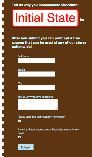
Signup Form Widget
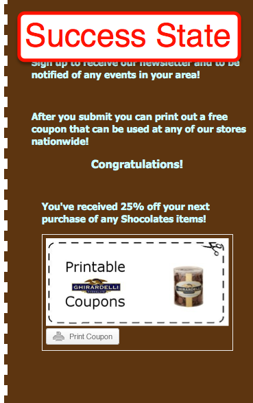
- Signup Form - Includes Initial State for the signup fields and a Success State which allows a new widget to appear upon submission. (Scroll down below the images to view instructions to download your signups.)
- Basic Settings: (Default displays signups fields for Email, Full Name, Phone. Only Email is configured when entering the settings)
- Optional: Enter the Signup Success Redirect URL and upon completion, users can be automatically directed to a new URL.
- Optional: Enter email address if you choose to have entries emailed to you.
- Set Max signups per user: Choose from Unlimited, 1, 2, 3, 4, 5, 10, or 15.
- Set Allow more signups after: Choose from 1, 2, 3, 4, 5, 6, 7, 14, or 30 days.
- Set signup fields (Label, type, and if required to submit)
- Address Line 1
- Address Line 2
- City
- Country
- Custom Check box
- Set default to checked or unchecked
- Custom String (One line entry for users)
- Custom Text Area (Unlimited character entry for users)
- Full Name
- Phone (validation included)
- State (validation included)
- Zip (validation included)
- Optional: Select to integrate with Salesforce to have entries directly inputted into your Salesforce account.
- Save Settings
- Select Success State
- Drop another widget to be displayed upon submission into the container that appears and configure as necessary.
- Export your Signups:
- Click into your Basic Settings for the Signup widget.
- Click on the link at the top that says Download Signups for Excel
- Save the file to your computer and open in Excel.
Set the look and feel of this widget in the Style settings on the right.
- Click on the bar that appears across the top of the widget to select it if you haven't done so already
- Next click on the Style tab in the toolbox to the right.
- Minimize Page by clicking the bar and click into Current Widget to open a new set of styling options for that widget.
- Settings include the following options:
- Padding: Create space around the content of the widget to alter how it appears in respect to the widget's border and background.
- Enter any pixel width for the Top, Right, Bottom and Left sides of the widget.
- Margin: Create space around the entire widget, including the padding, to alter how it will appear next to other widgets.
- Enter any pixel width for the Top, Right, Bottom and Left sides of the widget.
- Font: Set the font and size for any text that might appear in the widget. (Note: Does not apply to all widgets.)
- Headers: Select the font and size of the Headers (titles) in the widget.
- Body/Default: Select the font and size of the text that appears in the widget.
- Button Text: Select font and size of the button text. (Only certain widgets contain buttons, i.e. Twitter (Follow) and Signup (Submit).)
- Color: Click into the field to enter a hex code, or choose from the color selector that appears.
- Background: Color will appear behind this widget specifically.
- Border: Color of the border you place around this widget. (Pattern and size of border can be determined below)
- Header: Color of any titles.
- Body: Color of any text.
- Links: Color of any links.
- Links (hover): Color any link will change to when the cursor is moved over the link.
- Button: Color of any buttons, i.e. Follow or Submit.
- Button Text: Color of the text inside the button.
- Links: Select Underline or No Underline to designate how links are displayed in the widget.
- Border: Choose the size and pattern for a border that will wrap around the individual widget including the padding but excluding the margin.
- Size range: 1px-5px and 10px
- Patterns: Solid, Dotted, Dashed, Inset, Outset, Double
- Advanced CSS: Use this to create a more complex look of the widget that is not limited to the choices offered by the pre-set widget styling options. Any settings entered here will override any settings made in the options above.
Go to another Widget:
- Comments Widget
- Coupon Widget
- Flickr Gallery Widget
- Flickr Slideshow Widget
- Image Gallery Widget
- Image Slideshow Widget
- Images Widget
- Instagram Widget
- Like Widget
- Photo Contest Widget
- Pin It Widget (Pinterest)
- Pinterest Widget
- RSS Feed Widget
- Signup Form Widget
- Social Catalog Widget
- Text Tool Widget
- Twitter Widget
- Video Contest Widget
- YouTube Gallery Widget
- YouTube Video Widget