8.2.3 Central Pane of Page Designer
The central pane in Page Designer contains five tabs: Layout, Gallery, Component View, Page Search, and Help. The topics that follow provide detailed discussion of how to use these tabs when editing a page.
Parent topic: Understanding Page Designer UI Elements
8.2.3.1 Layout Tab
The Layout tab displays in the central pane of Page Designer and is a visual representation of how the components are positioned on the page. The Layout tab features context menus. By selecting a component and right-clicking, you can delete, move, or copy the component to other regions, or new regions on the page. You can also move existing regions, items, and buttons relative to other components by simply clicking on the component and dragging it to the new location. For example, you can place items next to one another by dragging the second item to the end of the first item and dropping it in the dark yellow box that appears when you hover in the desired location. You can quickly add new components to an existing page by dragging the component from the Gallery up to the desired position within the Layout tab.
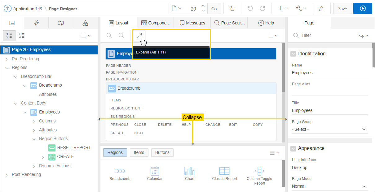
You can adjust the size of each pane by selecting and dragging the horizontal and vertical splitters. To expand or collapse each pane, click the small triangle labeled Collapse in the center of each splitter. Alternatively, you can click the Expand button to make the Layout tab larger and then Restore to return it to the previous size.
Tip:
Hidden items do not display in the Layout tab, but do display in the Rendering tree.
Key features of the Layout tab include:
-
Context menus. Right-click a component or control to display a context menu.
-
Quick Access to the Property Editor. Select a component or multiple components to display the corresponding attributes in the Property Editor in the right pane.
-
Drag and Drop . Move, copy, and reorder regions, items, and buttons by dragging and dropping. You can also add new regions, items, and button by dragging them from the Gallery and dropping them to the desired position on the page.
-
Tooltips. Position the mouse over a component or control to view a tooltip of basic information, such as the region type, item type, and so on.
Tip:
When dragging components to a new position, such as dragging an item onto the same line as an exiting item, you need to drag the component into the desired position and wait until the grid changes and the new drop position displays. See "Adding a Region, Item, or Button by Dragging and Dropping".
Layout Menu
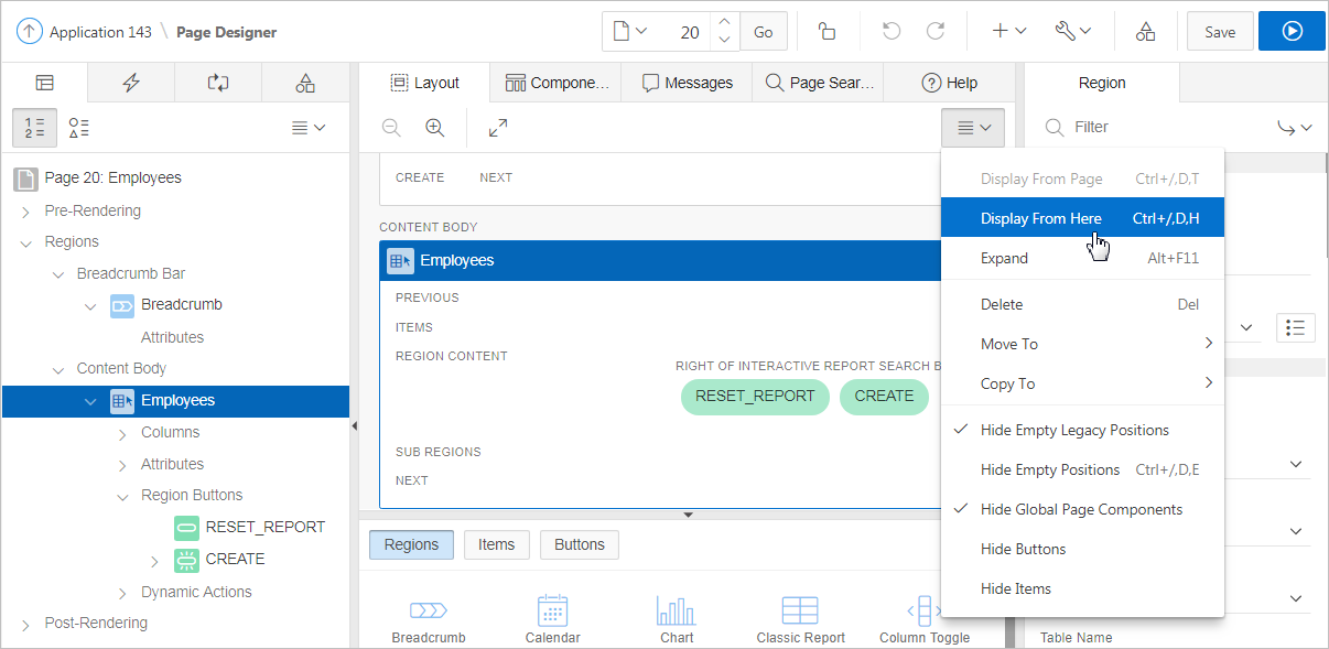
The Layout menu displays on the right side of the pane. Use this menu to customize the type and amount of information that displays and to delete, move, and copy selected components. To have a specific region fill the the Layout tab, select the region and select Display from Here from the Layout menu. The selected region fills the Layout tab. To restore the view, select Display from Page.
Parent topic: Central Pane of Page Designer
8.2.3.2 Gallery
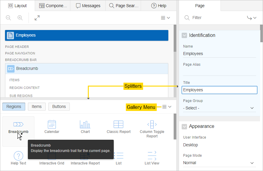
The Gallery displays beneath the Layout tab in the central pane of Page Designer. The Gallery contains three tabs: Regions, Items, and Buttons. When you pass the cursor over a control or component, a tooltip displays that describes it. You can adjust the size of the pane by dragging the horizontal and vertical splitters. To collapse or restore the Gallery pane, click the small triangle in the center of each splitter.
You can add new controls and components to a page by selecting the control or component from the Gallery and dragging and dropping them into the Layout tab. Alternatively, you can select a control or component in the Gallery and right-click to view a context menu.
Gallery Menu
The Gallery menu displays on the right side of the Gallery pane. By default, the Gallery only displays supported controls and components. To view unsupported controls and components (such as legacy application components), enable Show Unsupported Components on the Gallery menu. To view legacy controls and components, enable Show Legacy Components on the Gallery menu.
Parent topic: Central Pane of Page Designer
8.2.3.3 Component View Tab
Tip:
The Component View tab was added in Oracle Application Express release 5.1 to assist developers with the transition from Legacy Component View to Page Designer. Legacy Component View was desupported in release 18.1.
The Component View tab displays in the central pane of Page Designer and presents user interface elements and application logic by component type. The Component View tab consists of following sections:
-
Page Rendering. Page rendering is the process of generating a page from the database. Use the Page Rendering section to modify controls that impact the rendering of a page, including page attributes, regions, buttons, items, page rendering computations, and page processes.
-
Page Processing. Page processing is the process of submitting a page. A page is typically submitted when a user clicks a button. Use the Page Processing section to specify application logic such as computations, validations, processes, and branches. In general, the Application Express engine runs this logic in the order it appears on the page.
You can adjust the size of the Component View tab using the window splitters. Alternatively, you can click the Expand button in the upper left corner to maximize the window and then click Restore to return it to the previous size.
To edit a component, click the component name and the Property Editor highlights the corresponding attribute in the right pane. Unlike the Layout tab, the Component View tab does not offer a visual representation of a page or support the dragging and dropping of page components. To preview the position of components on a page, click Layout or run the page.
To add a new control, component, or process, click the Create icon to the right of the section name.
Parent topic: Central Pane of Page Designer
8.2.3.4 Messages Tab
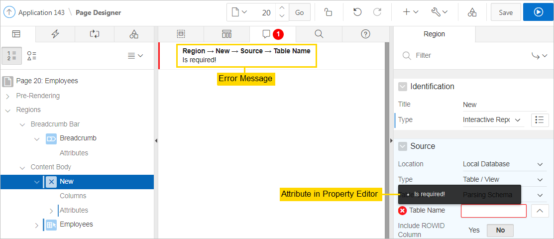
The Messages tab displays in the central pane of Page Designer. When you create components or edit attributes in Page Designer, the Messages tab displays errors and warnings you need to address. The Messages tab displays a red or yellow badge indicating the number of messages you need to address. Clicking on a message changes the focus within Property Editor to the corresponding attribute associated with the error or warning. To view Help, click the Help tab and then select an attribute within the Property Editor located in the right pane.
The Message tab displays two types of messages:
-
Errors - Error messages display in red. Selecting an error message displays the associated attribute in red in the Property Editor. You must address errors before a page can be saved.
-
Warnings - Warning messages display in yellow. Selecting a warning message displays the associated attribute in yellow in the Property Editor. You can save a page without addressing warning messages.
Tip:
Components that have errors or warnings display in red with a X icon or yellow with a triangle icon in both the left pane and the Layout tab.
8.2.3.5 Page Search Tab
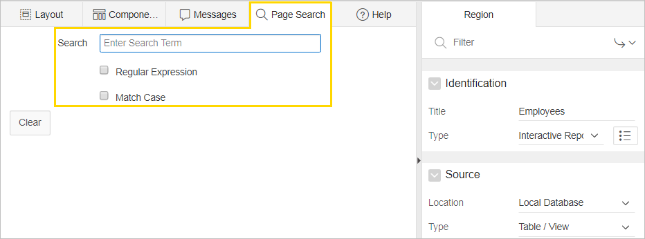
The Page Search tab displays to the right of Messages in the central pane. Use Page Search to search all page metadata including regions, items, buttons, dynamic actions, columns, and so on. To search a page, enter a search terms in the field provided. To match the case, select Match Case. To search for a regular expression, select Regular Expression.
Parent topic: Central Pane of Page Designer
8.2.3.6 Help Tab
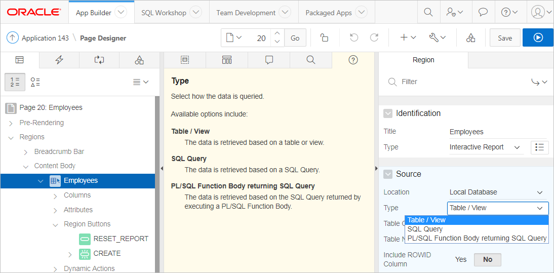
Page Designer includes Help for every Property Editor attribute. To view Help, select the attribute and click the Help tab. Once you activate the Help pane, the content that displays changes every time you select another attribute. In this example, the Source, Type attribute is selected and the Help tab describes what the attribute is for and the available options.
See Also:
Parent topic: Central Pane of Page Designer
