Features for Fields in Link Analysis
Use the following features to work with the fields in the Link visualization:
Topics:
Add More than Two Fields
Add more than two fields to the analysis. Each field that is added for analysis appears as a column in the Groups Table.
Consider the following example:
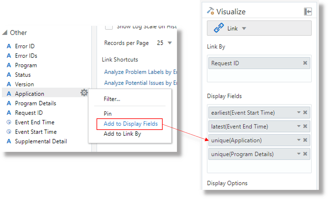
Select the field from the Fields panel, click the Options ![]() icon, and use the Add to Display Fields option to extract their values.
icon, and use the Add to Display Fields option to extract their values.
As a result, the Groups table has the columns for the fields Event
Start Time, Event End Time,
unique(Application), and unique(Program
Details).
Rename the Fields by Editing the Query
By default, the fields that you add to the Value panel will be displayed in the column names of the Groups Table with the name of the function that was used to create the field. Edit the query to give names to the fields.
Consider the following example for the query that is currently used to run link feature:
'Log Source' = 'EBS Concurrent Request Logs - Enhanced'
| link 'Request ID'
| stats earliest('Event Start Time') as 'Request Start Time',
latest('Event End Time') as 'Request End Time',
unique(Application),
unique('Program Details')
| eval 'Time Taken' = 'Request End Time' - 'Request Start Time'
| classify topcount = 300 'Request Start Time', 'Time Taken' as 'Request Analysis'
To change the names of the fields unique(Application) to
Application Name and unique('Program
Details') to Job, modify the query:
'Log Source' = 'EBS Concurrent Request Logs - Enhanced'
| link 'Request ID'
| stats earliest('Event Start Time') as 'Request Start Time',
latest('Event End Time') as 'Request End Time',
unique(Application) as 'Application Name',
unique('Program Details') as Job
| eval 'Time Taken' = 'Request End Time' - 'Request Start Time'
| classify topcount = 300 'Request Start Time', 'Time Taken' as 'Request Analysis'After renaming the fields, you can refer to the fields using the new names. The column names in the Groups Table will have the new names of the fields.
Add More Fields for Analysis Using Size and Color
In the bubble chart, two fields are used to plot along the x-axis and y-axis. The remaining fields can be used to control the size and color of the bubbles in the chart.
Two fields are used in the chart to plot along X and Y axes. To add more fields for analysis in the bubble chart,
-
From Analyze menu, click Create Chart. The Analyze dialog box is displayed.
To edit an existing chart, click the
 Settings icon next to the title of the chart, and click Edit
Chart. The Analyze dialog box is displayed.
-
Select the field to plot along the X-axis. This must be a numerical field.
-
Select the field to plot along the Y-axis. This must be a numerical field.
-
In the Size / Color panel, select the fields that must be used for defining the size and colors of the bubbles in the chart. Any fields can be used for controlling the color, but numeric fields must be used to control the size of the bubbles.
-
Select the field to Correlate.
-
Click OK.
Additionally, Group Count is available as a field to control the size and color.
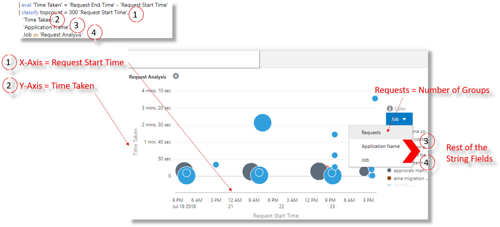
The classify command is now run with multiple fields, in the order
specified in the Analyze selection. The following bubble chart shows multiple
fields:
In the above example,
- The field
Request Start Timeis plotted along X-axis - The field
Time Takenis plotted along Y-axis - The string fields
Application NameandJobare used for controlling the size and color of the bubbles in the chart
Furthermore, the Groups alias is changed to Requests, and Log Records alias is changed to Concurrent Request Logs.
Mark the Unit for a Field at Query Time
Use the unit( ) function of the eval
command to mark the unit of a field in the Link user interface.
For a complete list of the supported units, see Supported Types for the unit Function.
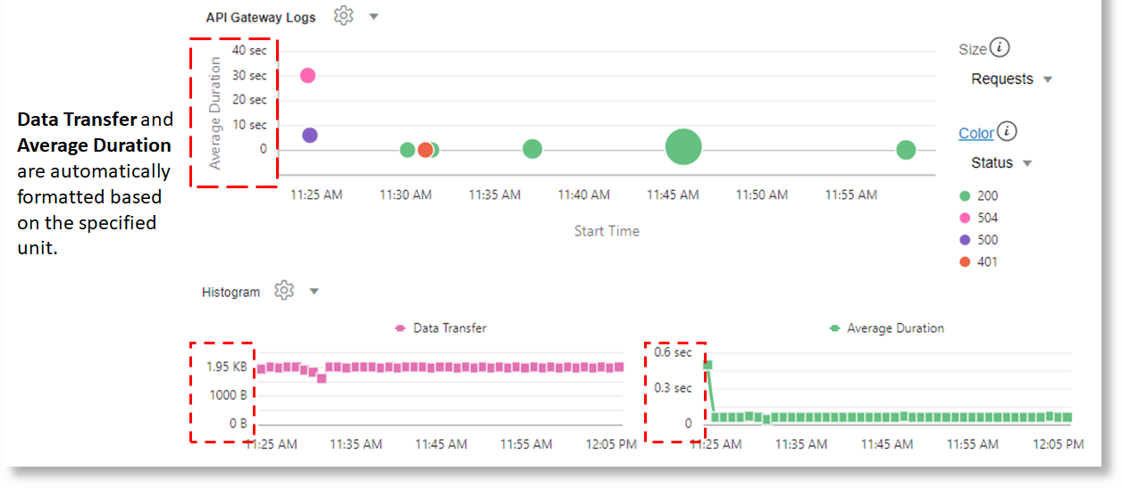
A field with a size or duration type unit would be used to format the values in the Link
Analyze chart, addfields, histograms and the Link table. In the
following example, Data Transfer and Average Duration
are automatically formatted based on the specified unit:
'Log Source' = 'OCI API Gateway Access Logs'
| link 'OPC Request ID'
| stats avg('Content Size Out') as 'Total Bytes',
        avg(Duration) as 'Duration (sec)',
        unique(Status) as Status
| eval 'Data Transfer'     = unit('Total Bytes', byte)
| eval 'Average Duration'  = unit('Duration (sec)', sec)
| fields -'Duration (sec)', -'Total Bytes'
| classify 'Start Time', 'Average Duration',
          'Data Transfer', Status as 'API Gateway Logs'
Mark a Field Type as Percentage or Microsecond
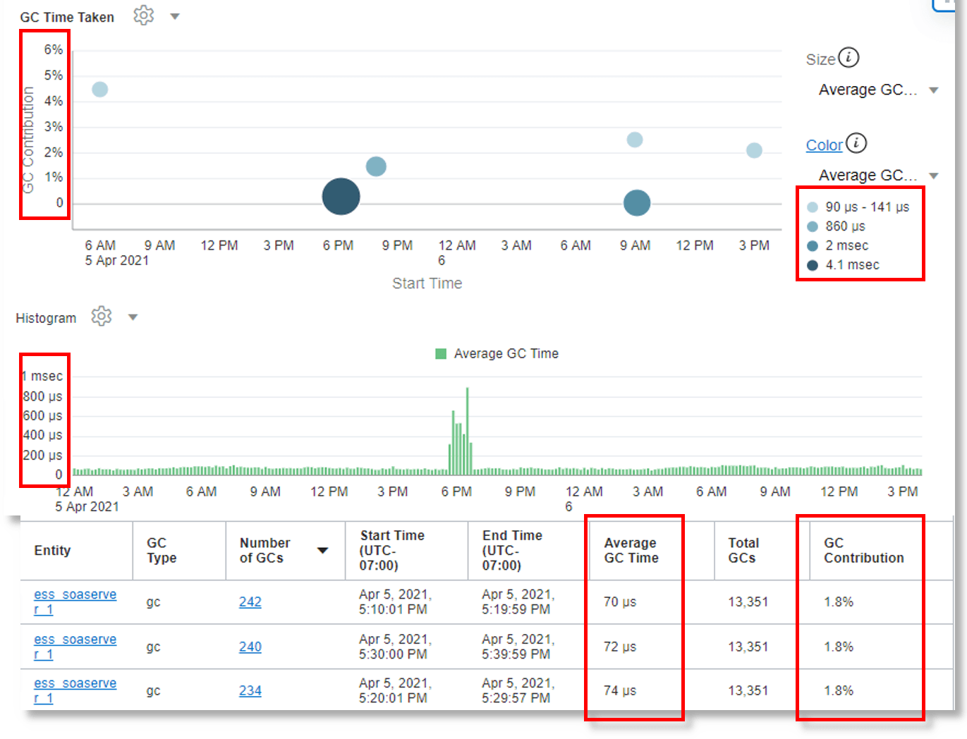
In addition to hour, minute, second and millisecond, you can now mark a field as containing value in microseconds or percentage value.
Consider the following example which illustrates use of microsecond and percentage field type:
| *
| eval GC = unit('GC Time', micro)
| link span = 5minute Time, Entity, 'GC Type'
| rename Count as 'Number of GCs'
| stats avg(GC) as 'Average GC Time'
| eventstats sum('Number of GCs') as 'Total GCs' by Entity
| eval 'GC Contribution' = unit(100 / ('Total GCs' / 'Number of GCs'), pct)
| classify 'Start Time', 'GC Contribution', 'Average GC Time' as 'GC Time Taken'

