Setting Grid Use Properties
On the Use tab in the Grid Properties dialog box, you control data entry, row style, and display options, as well as whether your grid has a pop-up menu in the navigation bar at runtime. Both the grid and scroll area share many of the same attributes. Refer to the proceeding term tables for information about these shared settings.
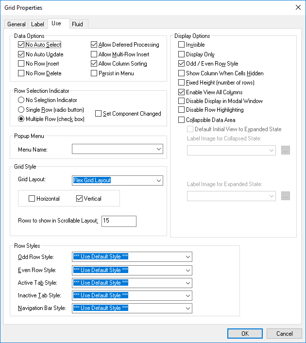
This example illustrates the fields and controls on the Grid Properties dialog box: Use tab. You can find definitions for the fields and controls later on this page.
Data Options
This table describes the data options properties:
| Field or Control | Description |
|---|---|
|
No Auto Select |
Suppresses the system from retrieving data from the database automatically. Select to populate the grid or scroll area with data using the ScrollSelect PeopleCode functions. See PeopleCode Language Reference: RowScrollSelectNew function. |
|
No Auto Update |
Suppresses the system from automatically updating data based on the existing key list. Select when the grid or scroll contains work field controls that should affect only a page and not the underlying database. |
|
No Row Insert |
Suppresses the Add button in the body area so that the user cannot insert rows. If this option is selected, PeopleSoft Application Designer automatically selects and disables the Invisible check box on the Insert tab of the properties dialog box for the body area. |
|
No Row Delete |
Suppresses the Delete button in the body area so that the user cannot delete rows. If this option is selected, PeopleSoft Application Designer automatically selects and disables the Invisible check box on the Delete tab of the properties dialog box for the body area. |
|
Allow Deferred Processing |
Set by default, this option ensures that the grid or scroll area processes in deferred mode. This setting overrides any individual field-level settings in your level-based control. |
|
Allow Multi-Row Insert (Allow Multiple Row Insert) |
Enables the user to add multiple blank rows at once to a grid after a page is displayed. This feature is available only in Add and Update modes. When the user clicks the Add Multiple Blank Rows button, a JavaScript prompt appears so that the user can specify the number of rows to insert; the user can insert between 1 and 99 rows. Note: The Allow Multi-Row Insert option is not supported and is ignored (if enabled) on fluid grids. |
|
Allow Column Sorting |
Enables the end user to perform temporary sorts in a grid at runtime by clicking the column headings. The default is selected to allow column sorting automatically. |
|
Persist in Menu |
Important: Drop-down menus and other forms of classic navigation are no longer supported. Stores the most recent transaction search in browser memory or web server memory and makes the results accessible through the drop-down navigation menu structure. To specify which fields appear as columns in the search results grid, use the Persist Grid Column in Menu property. Note: This property applies only to fields that appear in grids on pages that are used as custom, application-specific search pages. See Setting Record Field Use Properties. Note: If multiple grids exist on a custom search page and you enable this property on more than one grid, the system stores the search for only the first grid as it appears in the page order on the Order tab. You must enable recent search results caching at the system level in the web profile for this property to take effect. |
Multirow Insert Option
Each time that a user adds a row to a grid or scroll area requires a transmission to the application server. With the multirow insert option, this transmission occurs only once when the user wants to add multiple blank rows. Selecting this option can significantly enhance the user’s experience when doing data entry and also meets the developer’s goal of limiting page processing.
At design time in PeopleSoft Application Designer, this feature is disabled by default. If the No Row Insert check box is selected, then the Allow Multi-Row Insert check box is deselected and disabled. Where the multirow insert button appears, in the row or in the footer, depends on how you define the grid or scroll area properties on the Label tab.
You can set any occurs count for your grid. When the end user inserts n rows, the occurs count for the grid or scroll area is temporarily increased to n + 1 (if necessary), showing one row of context plus the new rows. If you select an unlimited occurs count for the grid, this temporary adjustment is not necessary.
Note:
This feature should not be enabled for grids and scroll areas with effective-dated rows.
When the user saves the page, normal save processing runs, including save-edits on all rows. New, unchanged rows are not saved. After save processing, new, unchanged (and unsaved) rows are deleted from the buffer. The only exception is when only one row exists and it is new and unchanged. This row remains in the buffer, even though it has not been saved, because a rowset must always contain one row.
For an end user, pressing the Alt+7 keys works the same with the multirow Add button as it does with the standard Add button.
Row Selection Indicator
These options enable the user to select one or more rows in the grid and scroll area. At runtime, indicators appear to the left of row numbers for grids and in the upper left corner for scroll areas. A transmission to the server triggers the selection of the row or rows that the user designates. These selections can then be detected in PeopleCode via the selected property on the row class for each row of data.
| Field or Control | Description |
|---|---|
|
No Selection Indicator |
This value is the default selection. Prevents the user from selecting rows on the transaction page. |
|
Single Row (radio button) |
Enables the user to select a single row in a grid or scroll area. Inserts a radio button to the left of each row that the user can select. |
|
Multiple Row (check box) |
Enables the user to select multiple rows in a grid or scroll area. Inserts a check box to the left of each row that the user can select. Users can select as many rows as needed. |
|
Set Component Changed |
Enables the user to receive a save warning if a change is made to a row selection indicator in the grid. At runtime, the transaction page uses this option to set the PPR_CHANGED flag. This option is deselected by default. This property ensures that if any changes occur to the grid, the data is saved to the database. If you disable this property, any row insert, row delete, or field change on the rowset using PeopleCode would not cause the system to treat the component data as changed. |
Note:
For the row selection options, PeopleCode can change the selected property, which affects which boxes are selected when the page is regenerated.
Popup Menu
Select a preset pop-up menu from the drop-down list box. The pop-up menu button appears in the left-hand corner of the navigation header at runtime.
Row Styles
You can control the color, font, and other characteristics of a row, active tab, inactive tab, and navigation bar by specifying a style in the drop-down list box for each of the row style options.
Grid Style
These options enable the advanced grid properties available with scrollable grid layout only.
See Applications User’s Guide: Viewing Data in Scrollable Layout Grids.
| Field or Control | Description |
|---|---|
|
Grid Layout |
See the table below for descriptions of each grid layout option. |
|
Rows to show in scrollable layout |
Enter n (number) to set the height of the scrollable grid to n visible rows. This value represents the number of rows to show when Scrollable Grid Layout is selected and the Vertical Scrollbar check box is selected. If this number is greater than the Occurs Count set on the General tab, then no vertical scroll bar appears, regardless of whether the Vertical Scrollbar check box is selected. If this number is lower than the Occurs Count and the Vertical Scrollbar check box is selected, then a vertical scroll bar appears and this number of rows will appear in the scroll area. The scroll bar will scroll over the entire Occurs Count number of rows. To see more rows in this case, use the row navigation controls on the grids navigation bar. If this field is set to 1, then the vertical scroll bar will not appear except in View All mode, in which case the scroll bar will display the number of rows listed in the Occurs Count setting. The default value is 15. |
|
Horizontal |
Select to activate a horizontal grid scroll bar at the bottom of the scrollable grid. Note: This option affects scrollable grid layout only. |
|
Vertical |
Select to activate a vertical grid scroll bar at the right side of the grid. Note: This option affects scrollable grid layout only. |
Note:
Some of the grid layout types are supported only for classic pages; these all begin with the word Classic. Others are intended only for fluid pages; these do not begin with the word Classic.. If you add a classic grid layout type to a fluid page, in some situations the system displays a JavaScript error. For example, if on a fluid page, you select Classic Grid Layout for a grid, then at runtime you will see a JavaScript error when working with the grid, such as when adding new rows. To resolve the error, select Flex Grid Layout for the grid layout type for the fluid page.
| Grid Layout | Description |
|---|---|
|
Classic Grid Layout |
Original grids are the standard grid layout in releases prior to PeopleTools 8.50. With original grids, you can see navigation headers and footers; insert, multi-row insert, and delete buttons; and grid separator tabs. If the Personalize link is enabled by the developer, you can search for data within the grid, sort grid data; and rearrange, freeze, and hide columns to personalize your grids. |
|
Classic Scrollable Grid Layout |
Unlike original grids, scrollable grids take advantage of AJAX technology, which enables you to change the grid structure and content directly on the grid. You can make changes to scrollable grids directly from the transaction page without using the Personalize link. Additionally, scrollable grids can be configured to scroll data within the grid control so as to keep frozen columns or column headers from scrolling out of view. Scrollable grids enable you to navigate from cell to cell vertically and horizontally. Important: If you have a Classic Scrollable Grid Layout grid displaying over 300 rows and you encounter performance issues in the browser, Oracle recommends that you convert the grid to the Classic Grid Layout. This allows the page in the browser to scroll, but not the grid. This reduces the overhead of keeping the grid column headers fixed and they will scroll along with the rest of the page content. Note: For scrollable grids, PeopleTools does not support any other style class apart from the default style classes applied to scrollable grids by the system. The styles applied to scrollable grids should not be customized, and you should not apply custom styles. Note: With Scrollable Grid Layout selected for a grid, on mobile devices, such as tablets or smartphones, the system displays the grid on the mobile device as Original Grid Layout. Note: HTML area controls should not be inserted into grids set to Scrollable Grid Layout. The system cannot calculate an HTML area's width and height data, which is required for the grid columns to be aligned and to display the correct number of grid rows. |
|
List Grid Layout (Unordered) |
Used to contain a list grid for displaying lists of items. It represents a grid as an unordered list (using <ul> and <li> tags). List Grid is not a table grid. Therefore the proper use can be to have a grid with only one visible grid column. |
|
Data Grid Layout |
Select so users will not see the grid displayed on the fluid page, as if the grid is hidden. The data in the grid is stored in two JavaScript variables, as in one for the grid header columns and one for grid row data. You need to write custom JavaScript to use the grid data stored in the two variables. |
|
Div Grid Layout |
Represents a grid as a structure of HTML <div> elements. This allows for the dynamic creation of structures on a page that are not restricted to the display of tables or lists. It creates a structure of containers that allows more dynamic displays of data, if needed. |
|
Flex Grid Layout |
A table-based grid recommended for displaying tabular data on a fluid page. This grid layout type is based on the Original Grid Layout, but enhanced to take advantage of the “flex” model on fluid pages. |
|
Classic List Grid Layout (Unordered) |
Creates a bulleted list in a one-column grid. The system generates an unordered list with <ul> </ul> HTML tags instead of <table> </table> tags, indicating the content is an unordered list containing rows of list item tags (<li> </li>) for the rows of data. |
|
Classic List Grid Layout (Ordered) |
Creates a numbered list in a one-column grid. Similar to the unordered list, except that instead of unordered list tags (<ul> </ul>) tags the system generates ordered list tags ( <ol> </ol> ) to contain the list items. |
|
Classic Presentation Grid Layout |
The system generates the <table> tag with the role = “presentation” clause added to it. This indicates to a screen reader that the grid is for presentation and layout purposes, rather than data. In some cases, you may want to use a table for layout purposes only (keeping elements aligned in a certain way, for example). By specifying this option, PeopleTools adds a WAI-ARIA tag to the table so a screen reader will ignore the table (not treat it as a data table). |
|
List Grid Layout (Ordered) |
Used to contain a list grid for displaying lists of items. It represents a grid as an ordered list (using <ol> and <li> tags). List Grid is not a table grid. Therefore the proper use can be to have a grid with only one visible grid column. |
|
Menu Grid Layout |
Use as a container for a pop-up menu. See Fluid User Interface Developer’s Guide: Creating Fluid Pop-up Menus. |
|
Tab Set Grid Layout |
Use to as a container for a set of sectional tabs embedded on a page. See Fluid User Interface Developer’s Guide: Creating Sectional Tabs on a Page. |
For the Classic List Grid Layout types (ordered and unordered), the following restrictions apply:
-
Only the first edit box or hyperlink column in the grid will be displayed. Any subsequent columns in this type of grid will be ignored as will any other type of column that comes first. For example, push buttons, drop-down lists, check boxes, and so on, will all be ignored and not displayed.
-
The grid will be display only, regardless of how it is set in Application Designer.
-
The Add Row and Delete Row controls will not be displayed on the rows.
-
Odd/Even row highlighting will be disabled, regardless of how it is set in Application Designer.
-
Header and Footer areas that would normally be available in other types of grids will not be displayed. These would normally contain elements like navigation controls, such as (First < 1 – 10 of 80 > Last), the Find and Personalize links, the Download to Excel and Zoom controls, and so on.
-
Column headers will not be displayed.
For the Classic Presentation Grid Layout, these restrictions apply.
-
Odd/Even row highlighting will be disabled, regardless of how it is set in Application Designer.
-
Header and Footer areas that would normally be available in other types of grids will not be displayed. These would normally contain elements like navigation controls, such as (First < 1 – 10 of 80 > Last), the Find and Personalize links, the Download to Excel and Zoom controls, and so on.
-
Column headers will not be displayed.
The grid layout type can also be specified in PeopleCode. See PeopleCode API Reference: Layout property: Grid class for more information.
Display Options
| Field or Control | Description |
|---|---|
|
Invisible |
Select to make the grid or scroll area and its associated fields and records invisible. Use this setting for work grids or scrolls for which you want the underlying processing to be transparent to users. Typically, you associate invisible work grids and scrolls with PeopleCode Scroll functions that enable you to further control application processing. |
|
Display Only |
In some cases, you might design grids that enable users to view but not change information. Select this check box if you do not want the user to enter data into the fields in any of the rows. |
|
Odd/Even Row Style |
Selected by default, this attribute displays the grid with contrasting colors by row. The Odd Row Style and Even Row Style drop-down list box options appear instead of the single Row Style option in the Row Styles group box. Note: Odd/even row styling is not supported for fluid grids. |
|
Show Column When Cells Hidden |
Select if you want the columns to appear even if all of the cells in a column are hidden. Columns do not collapse. |
|
Fixed Height (number of rows) |
Select to set the grid to a height corresponding to the number of rows in the occurs count attribute. The grid remains fixed at that height even if the actual number of data rows varies from that number. If the fixed height property is not used, the size of the grid dynamically changes based on the occurs count and the number of data rows retrieved. |
|
Enable View All Columns |
Displays an expand all button to the right of a tabbed grid, enabling the user to view all columns of the grid by scrolling to the right using the horizontal scroll bar of the browser instead of selecting the grid tabs. The Show Grid Tab button appears when columns are expanded to enable the user to view the tabs again. |
|
Disable Display in Modal Window |
Select to disable the zoom capability of the grid. |
|
Disable Row Highlighting |
Select to disable grid row highlighting. By default, when an end user hovers the mouse over a row or selects the row, the system highlights that row to indicate it is the row of current focus. However, highlighting can be distracting or unnecessary for some interfaces for varying reasons, such as the form factor of the device displaying the page. |
|
Collapsible Data Area |
Select to create a collapsible grid or collapsible scroll area. When a grid or scroll area is collapsed, the user is presented with a header bar that includes a small image that the user must click to activate or expand the data area. Selecting this option enables the Default Initial View to Expanded State check box. You can also select the label image to represent the collapsed and expanded states. Note: Collapsible data areas are not supported for fluid grids and scroll areas. |
This example illustrates a collapsible grid in the collapsed state.

This example illustrates the same collapsible grid in the expanded state.