Setting Grid Label Properties
Access the Grid Properties dialog box. Select the Label tab.
This example illustrates the fields and controls on the Grid Properties dialog box: Label tab. You can find definitions for the fields and controls later on this page.
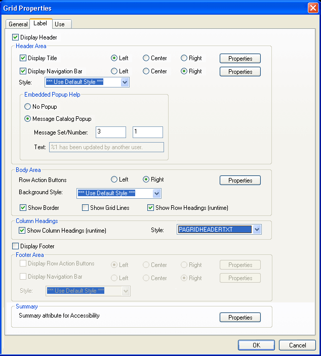
The Grid Properties, Label tab provides five main grid setting areas for you to configure:
-
Header Area.
-
Body Area.
-
Column Headings.
-
Footer Area.
-
Summary.
Certain grid label properties such as label text and summary text can also be set through PeopleCode.
See PeopleCode API Reference: Grid Class Properties.
Header Area Properties
Use the header area properties to configure the title properties, the navigation bar properties, and embedded help properties associated with the grid. These properties enable users to access controls for viewing the previous, next, top, or bottom row; to control the settings for the Find, Personalize, Download, and View All features; and to access embedded help.
The Display Header check box is selected by default and enables access to Header Area properties. To disable the header, clear the Display Header check box.
To configure title properties for the grid:
-
Select the Display Title check box.
-
Select Left, Center, or Right title alignment option.
-
Click the Display Title Properties button to open the Title Properties dialog box.
-
Enter the label text that you want to appear in the grid title.
Field or Control Description Type
Select the type of label text to appear in the navigation bar.
Message Catalog: Select this option to use a message in the Message Catalog as the grid title.
Static: Select this option to enter manual text as the grid title.
Text
Enter the text to appear as the title of the grid. This field is enabled when you select Static as the Label Text Type.
Message Set/Number
Enter the message set number and message number of the message in the Message Catalog to appear as the title of the grid. This field is enabled when you select Message Catalog as the Label Text Type.
To configure navigation bar properties for the grid:
-
Select the Display Navigation Bar check box.
-
Select Left, Center, or Right navigation bar alignment option.
-
Click the Display Navigation Bar Properties button to open the Header Navigation Bar Properties dialog box.
The Header Navigation Bar Properties dialog box contains seven tabs, each pertaining to different settings on the navigation bar. Each of these tabs has the same settings. All settings are set to display by default. Select the Invisible check box that appears in the upper right corner of each tab to hide the tab attribute from the user.
This example illustrates the fields and controls on the Header Navigation Bar Properties dialog box. You can find definitions for the fields and controls later on this page.
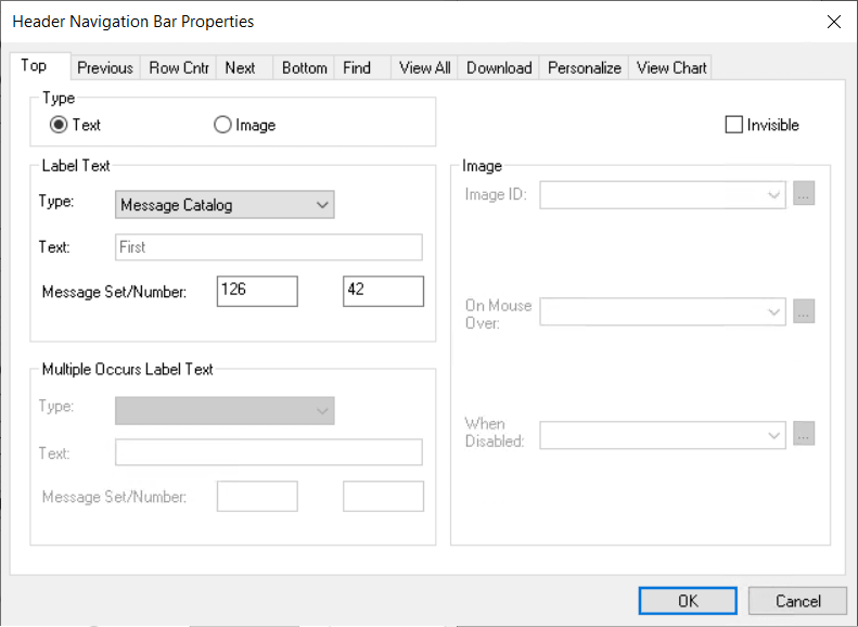
This table describes the tabs on the Header Navigation Bar Properties dialog box:
Field or Control Description Top
Controls the attributes for how a user returns focus to the top of the grid or the first row of data in the grid. Text is the default setting, using First from the message catalog. You can also enter static text.
Previous
Controls how a user can move to a previous row in the grid. Image is the default setting, with the Show Previous Row button as the default image.
Row Cntr (row counter)
Tracks the number of rows in the grid and in which row the cursor holds focus. Text is the default setting with, for example, 1-6 of 6 appearing in the navigation bar if there are six rows in the grid.
The Image Type is not enabled on this tab.
Note: The row count that appears is controlled by the occurs count that you set on the General tab in the Grid Properties dialog box (unless the user displays all). Using the previous example, if the occurs count is set to 5, then the row counter is 1-5 of 6.
Next
Brings focus to the next row in the grid. Image is the default setting with the Show Next Row button appearing to the right of the row counter.
Bottom
Controls the attributes for how a user moves focus to the last row of the grid. Text is the default setting, using Last from the message catalog. You can also enter static text.
Find
Displays a link that enables the user to search any field in the grid or scroll area. You can select either text or an image to represent the find feature. The Find feature searches for matches in edit boxes, display-only fields, disabled fields, dynamic links, and text in long edit boxes. It does not find column headings, field labels, text values in icons, static links, and hidden fields, nor does it search outside the grid.
Note:The system ignores fields in HTML areas when running a Find request.
In fluid grids, all fields on the Find tab are unavailable for editing. Only the Invisible check box is available for selection.
View All
Enables the user to view all rows of data at once. Text is the default setting using View All as the message catalog entry.
Download
Available for grids only. Displays a download image button in the header or footer bar that enables users to download all active, non-hidden rows to a Microsoft Excel spreadsheet, regardless of how many rows are visible on the screen. The default for this setting in the header area is Invisible. For the footer area of a grid, the download button appears by default when you select the Display Navigation Bar check box in the Footer Area group box of the Label tab in the Grid Properties dialog box.
Important:In Application Designer, select the Allow Embedded Excel Functions check box only when you want to allow certain character field data to be interpreted as Excel functions in the downloaded spreadsheet data.
Note:When you download a column of links comprised of numeric values, the values are downloaded as numbers instead of as quoted strings unless doing so causes Excel to modify the format of the numbers.
Note:Microsoft Excel may display Unicode comma-delimited data differently because Microsoft Excel may be expecting a tab-delimited file. If display abnormalities occur, you have two options. In Microsoft Excel, after highlighting the first column, you can select Data, Text to Columns and select the options required to set Microsoft Excel to expect a comma-delimited file. Or, in Application Designer change the file layout from comma-delimited to tab-delimited. Keep in mind that changing the file layout properties in PeopleSoft Application Designer could cause the data to change such that other applications may no longer recognize the data. Also, changing the file layout properties may impact more than one application, if that file layout is shared.
In fluid grids, all fields on the Download tab are unavailable for editing. Only the Allow Embedded Excel Functions and Invisible check boxes are available for selection.
Personalize
Available for grids only.
For classic grids, the Invisible check box is deselected by default, which displays a Personalize link in the header bar that enables the user to access all grid personalization options. See Disabling Grid Personalization on Classic Grids.
For fluid grids, two options are available:
-
Personalize Columns – Select to display the Personalize button in the grid header. The Personalize button allows users to change the order of grid columns, hide or show columns, freeze or unfreeze columns on tabbed grids, and specify the sort order on up to three columns.
-
Save Sort – Select to display the Sort button in the grid header. The Sort button allows users to specify a sort on one column and save this sort personalization.
Note: Save Sort is selected by default on fluid grids.
View Chart
Available for grids only.
Displays a view chart image button in the header bar that enables users to generate a chart from grid data at runtime. The default for this setting in the header area is Invisible.
On the View Chart tab, the default label type is Image, and a default image is provided.
Note:
For Fluid grids, you cannot modify the Label Type or Label Text properties; Fluid grids always use the default image for the View Chart option.The View Chart tab remains enabled in Application Designer even when the selected grid type does not support chart. This is by design because through PeopleCode you can change the grid type at runtime. If the rendered grid type does not support chart, the View Chart property is ignored at runtime.
Only grids with a flat table structure, that is, one field per grid column, support the chart functionality, which includes the following grid types:
- Classic Grid Layout
- Classic Scrollable Grid Layout
- Flex Grid Layout
The chart functionality works on these page modes: Classic, Classic Plus, and Fluid.
For information on generating charts using the View Chart button, see Generating Charts Using Grid Data
-
To configure embedded help pop-up properties for the grid, select from these options:
Note:
Embedded help is not supported for group boxes, grids, and scroll areas on fluid pages.
| Field or Control | Description |
|---|---|
|
No Popup |
Select this option to disable embedded pop-up help. This is the default. |
|
Message Catalog Popup |
Select this option to enable the embedded pop-up help icon on the grid at runtime. Selecting this option enables the Message Set/Number edit boxes. |
|
Message Set/Number |
Enter the message set number and message number of the message catalog entry to appear when the user clicks the embedded help icon. |
|
Text |
Displays the message that appears when the user clicks the embedded help icon. This field is display-only. |
View All Feature
The View All feature provides a threshold to enable the user to view the data in manageable pieces. If the database returns a number of rows for the grid or scroll area that is greater than the threshold, the View All link displays "View <threshold value>." This feature also modifies the occurs count and the values for the number of non-displayed rows left to scroll through.
The Next and Previous buttons retrieve rows according to the size of the threshold. If the database returns a total number of rows for the grid or scroll area that is less than the View All threshold, then the View All link on the navigation bar remains and functions as is.
The following example uses the View All threshold, occurs count, and total rows in database values:
-
View All threshold = 100
-
Occurs count = 10
-
Total rows in database = 160
These values result in the following for the user:
This example illustrates the fields and controls on the Viewing 10 rows. You can find definitions for the fields and controls later on this page.

When the user selects View 100, the view value changes to reflect the original occurs count set for the grid. The value for the number of non-displayed rows changes to 100 to match the View All threshold, and the View 100 display changes to View 10:
This example illustrates the fields and controls on the Viewing 100 rows. You can find definitions for the fields and controls later on this page.

If the Occurs Count, which you define in the properties for grid and scroll areas, is set to a number greater than or equal to the view all threshold, the threshold takes precedence. The View All display changes to View <threshold value> and the link is unavailable. If you select Unlimited Occurs Count, the grid or scroll area displays all rows in the buffer.
Body Area Properties
Use the body area properties to configure the row action buttons and set display properties for the body of the grid.
This table describes the Body Area properties:
| Field or Control | Description |
|---|---|
|
Row Action Buttons |
Select to display Insert and Delete buttons on each grid row at runtime. The action buttons can appear on the left or right side of the grid. Click the Properties button to open the Body Area Row Action Button Properties dialog box. |
|
Background Style |
Select a background style to display for the grid as a whole. The style selected here applies to all areas of the grid that are not covered by other elements. |
|
Show Border |
Select to display a standard border around your grid. The default is selected. |
|
Show Grid Lines |
Select to show grid lines on the grid. The default is to not display grid lines (this option is deselected). This setting should remain deselected as grid lines are set through the style class. Note: Show Grid Lines has no effect on fluid applications. Grid lines (if required) are applied through grid styles. |
|
Show Row Headings (runtime) |
Select to number the rows at runtime. This option is selected by default. Note: The row headings column appears at design time even if Show Row Headings (runtime) is not selected. This enables you to more easily select the grid if necessary. |
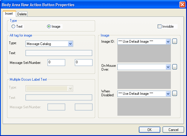
Click the Row Action Buttons Properties button in the Body Area group box to open the Body Area Row Action Button Properties dialog box. It contains two tabs: Insert and Delete. The default settings for these tabs are to display the Insert and Delete buttons. Alternatively, you can select static or message catalog text, or you can make these items invisible so that they do not appear.
This example illustrates the fields and controls on the Body Area Row Action Button Properties dialog box. You can find definitions for the fields and controls later on this page.
Column Heading Properties
You can set the grid to display column headings, and you can select the style in which to display them. Select a predefined column heading style from the drop-down list box or use the default. Changing styles alters the foreground, background, and font in the column headings, making it different from the data rows. The default for Show Column Headings is selected.
Footer Area Properties
In the footer of your grid, you can display row action buttons and a navigation bar. To enable either of these features, select the appropriate check box, Display Row Action Buttons or Display Navigation Bar, and click the Properties button to configure the settings. Clicking the Properties button opens a separate dialog box: Footer Row Action Button Properties or Footer Navigation Bar Properties, respectively.
The row action buttons are the same for the footer area as those described for the body area. The navigation bar property options are the same as those described for the header area. However, all other navigation bar settings for the footer are invisible by default.
Summary Properties
Summary properties enable you to provide a brief description of the functionality and content of the grid. This property is pertinent for users who access the application by using screen readers. The default value for the Summary Text field is the same as the Title of the scroll area. You can also enter static text or use the Message Catalog to store the summary information.
Access the Summary Properties dialog box.
This example illustrates the fields and controls on the Summary Properties dialog box. You can find definitions for the fields and controls later on this page.
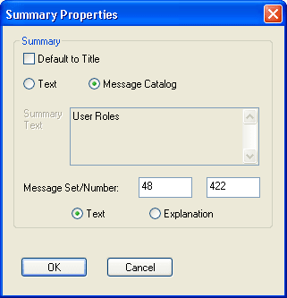
This table describes the summary properties of the grid:
| Field or Control | Description |
|---|---|
|
Default to Title |
Select this check box to have the summary property the same as the grid title. Deselect this check box to activate the Text and Message Catalog options. |
|
Text |
Select this option to enter up to 254 characters in the Summary Text field. Selecting this option disables all Message Catalog option related fields. |
|
Message Catalog |
Select this option to choose a message stored in the Message Catalog. Selecting this option disables all Text option related fields. Select one of these two options:
|
To change the Summary properties:
-
Click the Properties button located in the Summary group box.
-
Clear the Default to Title check box to activate the other Summary options.
-
Enter static text or enter a Message Set and Number to retrieve information from the message catalog.
-
Click the OK button.
-
Save the page.