Setting Grid General Properties
Access the Grid Properties dialog box. Select the General tab.
This example illustrates the fields and controls on the Grid Properties dialog box: General tab. You can find definitions for the fields and controls later on this page.
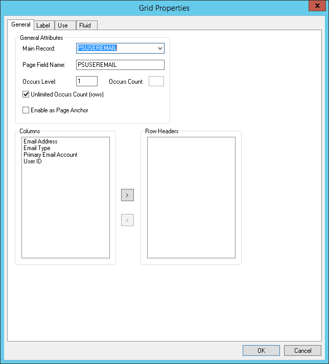
General Attributes
| Field or Control | Description |
|---|---|
|
Main Record |
Select the record that contains most of the fields that you want to use in the grid. Fields that you display in the grid that are not from the main record should be display-only or related fields, which you can set on the Use tab of the properties dialog box for that column. |
|
Page Field Name |
Enter a name for the grid. The default is the main record for the grid, however, you can rename the grid as long as it is a unique name for the page or component. This name is used by the PeopleCode GetGrid function to create a grid definition. See PeopleCode API Reference: Understanding File Layout, PeopleCode Language Reference: GetGrid function. |
|
Occurs Level |
Enter a 1, 2, or 3 to represent at which level the grid resides on the page. Having an occurs level for the grid enables you to designate the hierarchical parent-child relationship. Entering 1 specifies that the grid is at the first level. Entering 2 specifies that a grid is at the second level and is a child of, or nested in, the first level of data, and so on up to 3. A grid can be nested in another level-based control, but it cannot be nested in another grid. See Level-Based Controls. |
|
Occurs Count |
Enter the number of rows to display initially at runtime. Note: When an occurs count is set to a number other than 1, the grid displays the specified number of rows. However, when it is set to 1, the grid displays as many rows as possible within the physical space allocated for the grid control at design time. |
|
Unlimited Occurs Count |
Select instead of setting an occurs count if you want the system to display all rows of data in the buffer for this grid. Navigation links do not appear at runtime and the size of the grid depends on the number of rows in the buffer. |
|
Enable as Page Anchor |
Select to apply an anchor tag to serve as a jump destination on the page. |
Columns and Row Headers
The Row Headers list box enables you to specify which column in the grid should be used for the row header when presenting a data table for screen readers. The default row header generated is the first display-only edit field. Therefore, by default, all of the columns in the grid appear in the Columns list box; the value in the Row Headers list box is blank (no column selected).
When selecting row header values for tabbed or non-tabbed grids, consider these points:
-
For optimal results, it is recommended to use display-only or disabled fields as the row headers.
-
PeopleTools does not perform any validation regarding whether a column can be made a row header, such as in the case of a radio button field. Implementation teams need to select appropriate values.
-
With tabbed grids, when all tabs are expanded the system uses the row header from the first tab.
-
If a row header is specified, PeopleTools generates the field label of the table cells as column header + row header. If no row header is specified, PeopleTools generates the field label as the column header.
Separate considerations apply to non-tabbed grids versus tabbed grids:
-
For non-tabbed grids: The Row Header list box appears on the Grid Properties dialog box: General tab. You can select up to two columns as the row header. If you select a custom value, at run time, PeopleTools generates the row header using the column value (or values) you selected.
-
For tabbed grids: The Row Header list box on the Tab Separator Properties dialog box: General tab. Just as with non-tabbed grids, the default row header generated is the first display-only edit field. You can select up to two columns as the row header for each tab separator with the column names to be selected from the group of columns under control of that tab separator. If you select a custom value, at run time, PeopleTools generates the row header using the column value (or values) you selected.
If you have any frozen grid columns set as a row header in a tabbed grid, the system applies that value to all tabs in the same grid, which will override previous values selected. Likewise, if a frozen grid column is deselected as a row header, the system applies those changes to all tabs in the same grid, requiring you to select a new row header value as needed.
For more information on tabbed grids, see Creating Tabbed Grids.
Related Topics