Specifying Background Attributes
Access the class dialog box and select the Background tab.
This example illustrates the fields and controls on the PSEDITBOX (Class) dialog box: Background tab. You can find definitions for the fields and controls later on this page.
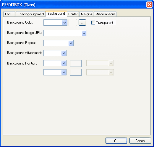
| Field or Control | Description |
|---|---|
|
Background Color |
Specify the background color of an element. |
|
Background Image URL |
Set the background image of an element to an image file that was previously defined. When you set a background image, also set a background color to use when the image is unavailable. When the image is available, it appears on top of the background color. |
|
Background Repeat |
If you specify a background image, indicate whether the image is repeated and, if it is, how many times. |
|
Background Attachment |
If you specify a background image, indicate whether it is fixed to the canvas or whether it scrolls along with the content. |
|
Background Position |
If you specify a background image, set its initial position. Values are: Top: Aligns the background to the top of the element. Left: Aligns the background to the left of the element. Center: Aligns the background to the midpoint of the element (typically an image). Bottom: Aligns the background to the bottom of the element. Right: Aligns the background to the right of the element. Length: Specifies the length of the background and the unit of measure. Percentage: Refers to the value of the line-height property of the background itself. It raises the baseline of the element (or the bottom, if it has no baseline) the specified amount above the baseline of the parent. Negative values are possible. For example, a value of −100% lowers the element so that the baseline of the element is where the baseline of the next line should have been. This setting allows precise control over the vertical position of elements without a baseline, such as images used in place of letters. |
Examples of Percentage and Length Value Pairs and Keywords
This table lists background positions, value pairs, and their effect:
| Background Position | Value Pair | Effect |
|---|---|---|
|
Percentage |
0 and 0 |
Places the upper, left-hand corner of the image in the upper, left-hand corner of the box that surrounds the content of the element (that is, not the box that surrounds the padding, border, or margin). |
|
Percentage |
100 and 100 |
Places the lower, right-hand corner of the image in the lower, right-hand corner of the element. |
|
Percentage |
14 and 84 |
Places the point that is 14 percent across and 84 percent down the image at the point that is 14 percent across and 84 percent down the element. |
|
Length |
2cm and 2cm |
Places the upper, left-hand corner of the image 2 centimeters (cm) to the right and 2 cm below the upper, left-hand corner of the element. |
|
Top Left or Left Top |
NA |
The same as 0 percent and 0 percent. |
|
Top Center or Center Top |
NA |
The same as 50 percent and 0 percent. |
|
Right Top or Top Right |
NA |
The same as 100 percent and 0 percent. |
|
Left Center or Center Left |
NA |
The same as 0 percent and 50 percent. |
|
Center and Center |
NA |
The same as 50 percent and 50 percent. |
|
Right Center or Center Right |
NA |
The same as 100 percent and 50 percent |
|
Bottom Left or Left Bottom |
NA |
The same as 0 percent and 100 percent. |
|
Bottom Center or Center Bottom |
NA |
The same as 50 percent and 100 percent. |
|
Bottom Right or Right Bottom |
NA |
The same as 100 percent and 100 percent. |
Note:
If you set only one percentage or length value, the system sets the horizontal position only and the vertical position becomes the default 50 percent. If you set two values, the first one is the horizontal position. You can set negative positions and combinations of length and percentage values, for example 50 percent and 2 cm.