Specifying Miscellaneous Attributes
Access the class dialog box and select the Miscellaneous tab.
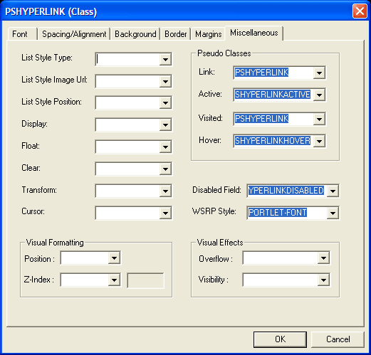
This example illustrates the fields and controls on the PSHYPERLINK (Class) dialog box: Miscellaneous tab. You can find definitions for the fields and controls later on this page.
| Field or Control | Description |
|---|---|
|
List Style Type |
Specify the appearance of the list-item marker if the List Style Image URL field is blank or if the system cannot display the image that the URL referenced. |
|
List Style Image Url (list style image URL) |
Specify the URL containing the image to display as the list-item marker. |
|
List Style Position |
Specify how the list-item marker is drawn relative to the content. Values are: Inside and Outside. |
|
Display |
Specify how an element appears on the canvas, which might be a printed page or a computer display. Values are: Block: Opens a new box. The box is positioned relative to adjacent boxes. Typically, elements like H1 and P are block types. ListItem: Similar to block except that a ListItem marker is added. In HTML, LI typically has this value. Inline: Results in a new inline box on the same line as the previous content. The box dimensions are based on the formatted size of the content. If the content is text, it might span several lines and each line will have a box. The margin, border, and padding properties apply to inline elements but do not affect line breaks. None: Deactivates the display of the element, including children elements and the surrounding box. |
|
Float |
Specify how the element floats with the text. Values are: None: Causes the element to appear where it appears in the text. Left and Right: Causes the element to move to the left or right, and the text wraps on the right-hand or left-hand side of the element, respectively. With a Left or Right value, the system treats the element as block-level and ignores the Display property. |
|
Clear |
Specify the sides of an element on which floating elements are not accepted. Values are: Left: An element appears below any floating element on the left-hand side. Right: An element appears below any floating element on the right-hand side. Both: An element appears below any floating element on the left-hand and the right-hand side. None: Floating elements are allowed on all sides. |
|
Transform |
Use for text elements only. Values are: Capitalize, Uppercase, Lowercase, and None. |
|
Cursor |
Specify the appearance of the cursor when it passes over an element. |
|
Disabled Field |
Specify the appearance of the link when the link (or field) is disabled. |
|
WSRP Style |
Important: WSRP is desupported in PeopleTools 8.61, and currently exists for backward compatibility only. |
Pseudo Classes
Pseudo classes are mechanisms that extend the expressiveness of style sheets. Using pseudo classes, you can change the style of page links based on whether and when the links have been visited. Pseudo classes do not exist in HTML; that is, they are not visible in the HTML code.
PeopleSoft applications uses pseudo classes to specify how a browser indicates to a user the status of links in a document that the user is viewing. For example, a browser might display a document link in a different color than the rest of the text.
| Field or Control | Description |
|---|---|
|
Link |
Specify the normal appearance of a link. |
|
Active |
Specify the appearance of a link that is actively selected. |
|
Visited |
Specify the appearance of a link that has been visited. |
|
Hover |
Specify the appearance of a link when it is designated but not activated. For example, when the cursor hovers over a box that an element generated. |
Visual Formatting
| Field or Control | Description |
|---|---|
|
Position |
The position property places an element in a static, relative, absolute, or fixed position. Static: The page element always has the position the normal flow of the page gives it (a static element ignores any top, bottom, left, or right declarations). This value is the default. Relative: The page element moves relative to its normal position, for example, left:20 adds 20 pixels to the left position of the element. Absolute: The page element is positioned at the specified coordinates relative to its containing block. The position of the element is specified with the left, top, right, and bottom properties. Fixed: The page element is positioned at the specified coordinates relative to the browser window. Absolute: The page element is positioned at the specified coordinates relative to its containing block. The position of the element is specified with the left, top, right, and bottom properties. |
|
Z-Index |
Positioning of elements in CSS occurs in three dimensions, not just two. The placement of elements along this third axis, a z-axis, is exactly what this property controls. The third dimension is perpendicular to the screen, giving the screen a sense of depth. Elements can be overlapped, with higher or closer elements obscuring elements that are lower or farther away (element transparency becomes an important issue with this capability). The rendering box for each element is automatically assigned an integer z-index stacking level based on its context in the document. Boxes with greater z-axis numbers will appear in front of boxes with lower z-axis numbers (0 and negative numbers are allowed). Explicitly setting the z-index property for an element box not only sets its z-position relative to other element boxes in its current context, it also initiates a new stacking context hierarchy that affects the current element box and its child elements. If two or more boxes have the same stacking level within the same context, then they are rendered back to front in the order of the document tree. If no z-index property is set for an element box, then it inherits the stacking level of its parent element box. |
Visual Effects
| Field or Control | Description |
|---|---|
|
Overflow |
This property specifies whether the content of a block-level element is clipped when it overflows the element box (which acts as a containing block for the content). Visible: This value indicates that content is not clipped; it may be rendered outside the block box. Hidden: This value indicates that the content is clipped and that no scrolling mechanism should be provided to view the content outside the clipping region; users will not have access to clipped content. You specify the size and shape of the clipping region using the Clip property. Scroll: This value indicates that the content is clipped and that if the user agent uses scrolling mechanism that is visible on the screen (such as a scroll bar), a box should display the mechanism whether any of its content is clipped. This setting avoids any problem with scroll bars appearing and disappearing in a dynamic environment. When this value is specified and the target medium is print or projection, overflowing content should be printed. Auto: The behavior of this value is user agent-dependent, but it should cause a scrolling mechanism to be provided for overflowing boxes. |
|
Visibility |
This property specifies whether the boxes generated by an element are rendered. Invisible boxes still affect layout (set the Display property to None to suppress box generation altogether). Visible: The generated box is visible. Hidden: The generated box is invisible (fully transparent) but still affects layout. Collapse: This property may be used in conjunction with scripts to create dynamic effects on rows and columns. If used on elements other than rows or columns, Collapse has the same meaning as Hidden. |