Working with Grid Tabs and Scroll Bars
Developers might design the grid so as to group and separate columns with tabs. Developers might also include vertical and horizontal scroll bars in the grid control. Both grid tabs and scroll bars enable you to view all data columns and have some advantages when used together in scrollable grids. This section discusses:
-
Grid tabs
-
Grid scroll bars
-
Cell navigation
Grid Tabs
Grid tabs enable you to view groups of data columns without scrolling to the right. By clicking the Show All Columns button just below the grid's navigation header, you can view all columns in the grid. Showing all columns, if used in conjunction with grid scroll bars, cause a horizontal grid scroll bar to appear.
To view all columns without tabs:
-
Click the Show All Columns button just below the grid's navigation header
-
When the grid expands, use either the horizontal grid scroll bar, if enabled, or the browser scroll bar to scroll left and right to view the data columns.
Note:
If the expanded grid has many frozen columns, the page might expand so that the horizontal browser scroll bar appears and must be used to view all columns.
To restore the grid to its original state, click the Show Tabs button.
Grid Scroll Bars
On scrollable grids, developers can configure horizontal and vertical scroll bars to appear within the grid control, which enables you to scroll through data within the grid. Note these points about grid scroll bars:
-
An advantage of grid scroll bars is that frozen columns and column headers are stationary.
-
Another advantage is that you can scroll data within the grid without having to use the browser scroll bar, thus other data on the page stays in view.
-
Application developers can configure a scrollable grid to display the horizontal and vertical scroll bars independently of one another.
-
Application developers can configure grid scroll bars and grid tabs to work together or separately.
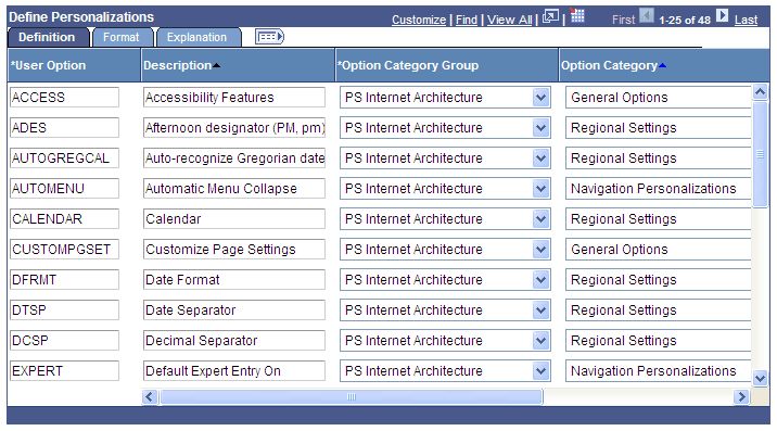
In this example, you see the Define Personalizations grid showing the Definition, Format, and Explanation tabs. Notice the horizontal and vertical scroll bars inside the grid control.
This example illustrates grid scroll bars in the Define Personalizations grid.
Note:
Be aware that the horizontal and vertical scroll bars for the grid appear at the far right and bottom sides within the grid control; the horizontal and vertical scroll bars for the browser appear at the far right and bottom sides of the browser window.
Grid Scroll Bar Pop-up Menus
If you right-click on the horizontal and vertical grid scroll bars, contextual pop-up menus appear.
This example illustrates a scroll bar contextual pop-up menu.
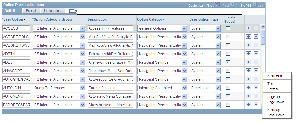
This table describes the contextual pop-up menu options:
| Field or Control | Description |
|---|---|
|
Scroll Here |
Select to move the scroll slider so that the center of the slider is located under the cursor. |
|
Left Edge |
Select to move the horizontal scroll slider to the far left of the grid. |
|
Right Edge |
Select to move the horizontal scroll slicer to the far right of the grid. |
|
Top |
Select to move the vertical scroll slider to the top of the grid. |
|
Bottom |
Select to move the vertical scroll slider to the bottom of the grid. |
|
Page Up |
Select to move the rows up the length of one visible set of rows. For example, if 12 rows are showing in a grid, then selecting this option moves the rows in increments of 12 rows at a time. The bottom row becomes the top row. |
|
Page Down |
Select to move the rows down the length of one visible set of rows. For example, if 12 rows are showing in a grid, then selecting this option moves the rows in increments of 12 rows at a time. The top row becomes the bottom row. |
|
Page Left |
Select to move the columns to the left the width of one visible set of columns. The far right column becomes the left-most column in view. |
|
Page Right |
Select to move the columns to the right the width of one visible set of columns. The far left column becomes the right-most column in view. |
|
Scroll Up |
Select to move the rows up one row. |
|
Scroll Down |
Select to move the rows down one row. |
|
Scroll Left |
Select to move the scroll slider five pixels to the left. |
|
Scroll Right |
Select to move the scroll slider five pixels to the right. |
Cell Navigation
In scrollable grids, you can navigate through cells in these ways:
-
Press the Shift + Up Arrow keys to move up one cell.
Movement ceases at the top of the column.
-
Press the Shift + Down Arrow keys to move down one cell.
Movement ceases at the bottom of the column.
-
Press the Shift + Right Arrow keys to move right one cell.
Movement ceases at the end of the row.
Note:
If you do not hold down the Shift key, the cursor moves only within the current field.
-
Press the Shift + Left Arrow keys to move left one cell.
Movement ceases at the beginning of the row.
Note:
If you do not hold down the Shift key, the cursor moves only within the current field.
-
Press the Tab key to move one field or page element to the right.
Movement continues from row to row and outside the grid.
-
Press the Shift + Tab keys to move one field or page element to the left.
Movement continues from row to row, into the column headers, and outside the grid.
Note:
When using these methods to navigate, the cursor will move to fields within the grid. If grid scroll bars are present, the cursor will cause the grid to scroll as it moves through rows. If grid tabs are present, the cursor will not cause the tab to change as it moves through rows.
Important:
If the grid navigation header is not present or if the Personalize link is not present in the navigation header, then cell navigation is identical to that of the original layout grid.