Setting Properties on the Fluid Tab
Use the Component Properties, Fluid tab to set fluid component properties.
This example illustrates the options on the Fluid tab. You can find descriptions for the options after the example.
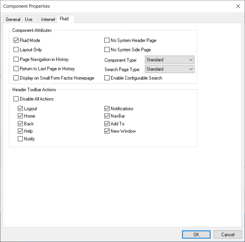
Component Attributes
| Field or Control | Description |
|---|---|
|
Fluid Mode |
Indicates that this is a fluid component. Selecting this check box is required for fluid rendering. |
|
Layout Only |
Select when testing the layout of the pages within the component. When selected the borders of all the group boxes on the page appear in different colors to illustrate the scope of each group box container. |
|
Page Navigation in History |
Enables the system to store the individual pages that are visited within this component in the Back button history. This can also be enabled using the SetTransferAttributes PeopleCode built-in function. Note: By default, only the visit to the component is stored in the Back button history. For more information, see PeopleCode Language Reference: SetTransferAttributes function. |
|
Return to Last Page in History |
Select to return the user to the last viewed page within a component after being transferred to a different component. This setting applies in the event of a transfer between components. The default behavior when using the Back button to return from a transfer between components is to display the initial page of the component, regardless if it was the last viewed page. For example, with Return to Last Page in History selected, if the user was on the third page within the component prior to the transfer to another component, the system displays the third page in the original component after using the Back button to return from the transfer. This can also be enabled using the SetTransferAttributes PeopleCode built-in function. For more information, see PeopleCode Language Reference: SetTransferAttributes function. |
|
Display on Small Form Factor Homepage |
Select to enable the tile for this component to be displayed on fluid homepages and fluid dashboards on small form factor devices such as smart phones. If Display on Small Form Factor Homepage is not selected, the tile for that component will not appear on fluid homepages and fluid dashboards when accessed by a small form factor device. If a fluid homepage does not contain any tiles for components with Display on Small Form Factor selected, that fluid homepage displays an error message on the small form factor device, reading This Homepage is Empty: None of the tiles configured for this homepage are supported on smart phones. Note: If a tile for a fluid component is not displayed on the fluid homepage, users can still access the component using other navigation features, such as the Navigator menu. When a user personalizes a fluid homepage, a visual cue in the form of a smartphone icon appears next to a tile on the Add Tile dialog box indicating which tiles can be displayed on the homepage for a small form factor device. The smartphone icon appears for tiles associated with components with Display on Small Form factor selected. When personalizing a homepage using a smartphone, tiles associated with components that do not have Display on Small Form Factor Homepage selected display a note reading Tile is not supported on this device. See Applications User’s Guide: Working with Tiles on Small Form Factor Devices. |
|
No System Header Page |
Select if you have a custom header page that you want to display instead of the system header page (the default is PT_HEADERPAGE). |
|
No System Side Page |
Select if you have a custom side page for the right panel that you want to display instead of the system side page. The default, PT_SIDE2PAGE, defines the layout of the Related Information panel, which can include fluid related content and simplified analytics. |
|
Component Type |
Select the type of component you are building:
|
|
Search Page Type |
Select the type of search the user will interact with when accessing the component:
For Standard and Master/Detail search types, either a Search Framework search definition or a pivot grid model needs to be associated with the component. For more detailed information on these options and how they are configured, see Implementing Search for Fluid Components. Note: When you enable either a Standard or Master/Detail search type, the system displays Next in List, Previous in List, and Return to Search buttons by default. |
|
Enable Configurable Search |
Enables configurable search for the component, however you must exercise caution before you select this option because you can also enable configurable search for a component using the Manage Configurable Search page. See Search Technology: Guidelines on Using Configurable Search for Fluid Components. The Enable Configurable Search check box is enabled when the Search Page Type is set to Standard. The Enable Configurable Search check box is unavailable when the Search Page Type is set to Master/Detail or None. |
Header Toolbar Actions
Select the options to be displayed in the fluid banner:
| Field or Control | Description |
|---|---|
|
Disable All Actions |
Select to deselect all header toolbar actions. At runtime, the system displays a fluid banner containing no buttons. |
|
Logout |
Select for the Sign Out item to appear in the Actions menu. This feature signs the user out of the PeopleSoft application, returning the user to the system signon page. |
|
Home |
Select for the Home button to appear on the fluid banner. This feature returns the user to the default fluid homepage, as if they’ve just signed on. |
|
Back |
Select for the Back button to appear on the fluid banner. This feature returns the user to the previously visited item. Note: If you switch languages during the middle of a PeopleSoft session (such as during development or testing), the Back button will continue to display the original language. The current language for a session can be switched using PeopleTools, Utilities, International, Preferences. |
|
Help |
Select for the Help item to appear in the Actions menu for the fluid pages in this component. Important: This option is reserved for PeopleSoft-delivered components only. When a user clicks Help, the system displays the PeopleSoft Online Help in a new browser page regardless of the form factor. The Help URL value must be specified the General tab of the web profile to enable any online help (same as for classic components and pages). For more information on configuring online help URL for your PeopleSoft system, see Portal Technology: Configuring General Portal Properties. Note: For fluid applications, you cannot launch online help from modal pages. Note: For the Safari browser, running on iOS in full screen mode, PeopleSoft Online Help is displayed in a full modal page. |
|
Notify |
Select for the Notify item to appear in the Actions menu. When a user selects the Notify item, the Notify window opens and enables a user to send notifications to other users. See Applications User’s Guide: Sending Ad Hoc Notifications from Fluid Components. Note: The Notify option is not available for Activity Guide because Activity Guide has its own mechanism to notify. |
|
Notifications |
Select for the Notifications button to appear on the fluid banner. When a user clicks the Notification button, the Notification window shows the list of push notifications for that user, such as actions and alerts. See Applications User’s Guide: Using the Notifications Panel for more information. Deselect this option to disable notifications while within a specific component. |
|
NavBar |
Select for the NavBar button to appear on the fluid header, providing users with additional navigation features, such as the Navigator menu, Favorites, and other NavBar tiles. |
|
Add To |
Select for Add To items to appear in the Actions menu. This feature enables a user to add a tile for the component to a fluid homepage, the NavBar, or Favorites. Users granted permission to the WEBLIB_PTNUI web library will have access to all three Add To links from the Actions menu unless their permissions are modified by one or more of these roles:
|
|
New Window |
Select for the New Window item to appear in the Actions menu. This feature allows the user to open the current component in a new browser tab (or window). |