Using Group Boxes for Fluid Pages
Group boxes are essential containers used for the layout of the fluid page as well as containers for encapsulating and managing control and widget behavior, positioning, and appearance.
Any fluid page must have at least one over-arching group box to contain all other elements of the page. Depending on the number of controls and complexity of the page, additional group boxes can be added. The group box can be used to indicate visual cues but it can also act as a logical grouping of related controls. Using the fluid properties for a group box, you can override or customize the style at each group box layer.
The following example illustrates the use of multiple group boxes in the layout of the fluid page, clearly separating the page elements into distinguishable parts, enabling individual control if needed. For example, the Page Title group box and the Your Content Sub-Page here group box can have individual styles applied if needed.
Every Fluid page should start with a group box. Typically, the outer group box for primary or secondary pages should have the style of ps_apps_content class, though there are exceptions as with 2 panel display. While the ps_apps_content style would not typically be used in subpages, subpages should reside within a containing group box as well.
This example illustrates how group boxes are used in the layout of the fluid page, clearly separating the page elements into distinguishable parts.
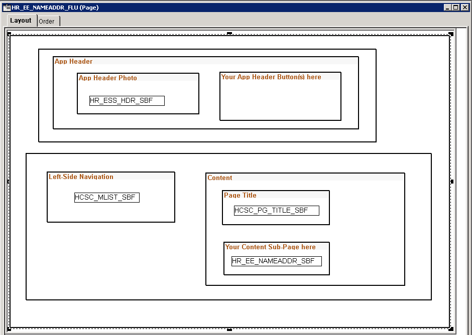
In general, it is recommended to be generous in the use of group boxes to layout and organize your page elements. However, group boxes are not just used for layout purposes. For some controls and widgets, it is required that they be encapsulated within a group box in order to apply behavior characteristics.
In addition to using group boxes as a container with a header (the default type of group box), a group box can have additional functions and behaviors. The most common is the usage of a layout type of group box. Layout group boxes are used to enclose elements for specific layout purposes. Some layouts are defined by styles only.
Some group boxes have additional types, like the Accordion Vertical group box which allows for multiple embedded Accordion group boxes to provide the behavior of a mutually exclusive display of group box, with only one of the Accordion Group boxes expanded and visible at any one time. Group boxes can even be put inside of grids to create new virtual columns containing multiple stacked fields.
Group boxes are the most critical element with which you should become familiar for fluid page development.
Note:
Embedded help is not supported for group boxes, grids, and scroll areas on fluid pages.