Setting Group Box Properties

This section describes properties specific to group boxes on a fluid page that you can set on the Fluid tab of the Group Box Properties dialog box.

This example illustrates the options available on the Fluid tab of the Group Box Properties dialog box. Descriptions of the options follow the example.
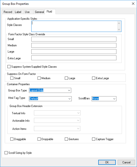
Fluid tab of the Group Box Properties dialog box

Style Classes and Form Factor Style Class Override are common properties to all fluid controls. See Setting Properties on the Fluid Tab.

Field or Control Description

Group Box Type

  • Default: Same as Container. It includes both a header structure and a content structure.

  • Container: Use as a standard container, just as in classic applications, to illustrate groupings of fields.

    See Working with Container Group Boxes.

  • Accordion Vertical/Horizontal/Group Box: Used to implement expandable sections.

    Accordions are a construct where you have a mutually exclusive set of group boxes, only one of which can be expanded at a time (all others collapsed). Accordion Vertical is a container of Accordion Group boxes. The Accordion Group boxes are individual, expandable group boxes within the Accordion Vertical.

    See Working with Accordion Group Boxes.

  • Layout Only: Use for a group box only to contain and position child elements.

    See Working with Layout Group Boxes

  • Panel Control: Use for containing content when creating a side tab.

  • Custom Header Left/Right/Middle/Bottom: Use to add application controls to header page sections.

    See Creating Custom Header Group Boxes

  • Page Title: Used to generate an H1 heading element (<h1>…</h1) that displays either the page title (as would be found in the fluid banner) or the content title (as replicated from the item selected in the left panel in a two-panel implementation). See Working with Two-Panel Implementations.

    Important:Do not place any content or page controls within this group box container.

    If you plan to allow the component that includes your page to be displayed within a fluid wrapper (a fluid activity guide or master/detail component), it is recommended that a Page Title group box (associated with a record field) be placed at the top of your page; this group box will display the content title. You should hide this Page Title group box when the component runs standalone and display it only when your component is displayed within a fluid wrapper. For activity guides (and fluid navigation collections), the activity guide framework automatically updates this page title found in the content area to match the selection made in the navigation panel.

  • Related Field Group: Used to create a FIELDSET collection where the LEGEND (the group box header) is repeated to a screen reader when input type elements are read within the FIELDSET. Typical usage would be when you have a collection of radio buttons based on the same field.

    See Working with Related Field Group Boxes

  • Toggle Container: Use to switch between two group boxes and changes the label of the button controlling the toggle.

    Note:Currently, do not use the Toggle Container option. This option is for internal use only until a future release.

  • Custom Grid Header: Similar to the Custom Header sections, the Custom Grid Header group box type allows you to define a custom area to be available for association with a grid. This is used when defining a grid to look for the available Custom Grid Header defined group boxes to associate with a grid. A custom grid header can be associated only with one grid.

  • Custom Action Menu: Enables the transaction to add to the Actions List displayed in the banner.

  • Popup: A type of group box, where the group box label is rendered as a button (a collapsible image can be used to identify an image as well to be displayed with the text). The button is rendered initially and when selected, the content appears as a Popup area associated with the button.

  • Custom Header Search: Use to create a custom header for component search.

  • Page Tab: Use to take page tabs running horizontally across the top of the component pages, and insert them into the left side page, creating left navigation. For sample usage, refer to PT_SIDE_PAGETABS.

  • Master/Detail Target: Use to contain the target content to be displayed when an item in the master list of a master/detail component is selected. A group box of this type is required on a Master&Detail Target Page page type. In addition, this group box must:

    • Be associated with a record field on the Record tab.

    • Be named PAGECONTAINER_TGT on the General tab.

    • Have the ps_ag-targetcontent application-specific style applied on the Fluid tab.

    For more information on the master/detail approach, see Working with Master/Detail Components.

  • Search Action: Use to synchronize component search actions to the actions displayed in the Actions List (or other area in the header if preferred). This enables a PeopleCode event from the selected action, such as Return To List.

    Note:When selected, also select UL as the HTML Tag Type.

  • Related Content: Use to create drop zones for embedded related content or for dynamic subpages.

  • Menu and Menu Item: Use as a container for a pop-up menu and for each menu item, respectively.

    See Creating Fluid Pop-up Menus.

  • Tab Set and Tab Item: Use as a container for a set of sectional tabs embedded on a page and for each tab, respectively.

    See Creating Sectional Tabs on a Page.

  • Group Box Header Extension: Use as a container for controls that can be used to extend the information displayed in the header of another group box.

    See Creating Group Box Header Extensions.

HTML Tag Type

Selecting an HTML tag type enables you to create proper HTML structure as defined by HTML specifications.

  • Default: Same as DIV.

  • DIV: Set as an HTML 5.0 <div> tag.

  • Section: Set as an HTML 5.0 <section> tag. If creating a section containing an article, you may consider using this group box type.

  • UL: Set as an HTML 5.0 <ul> (unordered list).

  • OL: Set as an HTML 5.0 <ol> (ordered list).

  • LI: Set as an HTML 5.0 <li> (list item). Required to be structurally correct. The <li> should always be within a <ul> or <ol> tag, and nothing else should be directly beneath a <ul> or <ol> except for <li>.

Scroll Bars

  • None: Display group box with no scroll bar.

  • Vertical: Display the group box with a scroll bar on the right side, running top-to-bottom.

  • Horizontal: Display the group box with a scroll bar on the bottom, running left-to-right.

  • Both: Display both vertical and horizontal scroll bars.

  • Carousel: Display the scroll bar in carousel mode (slider mode), where records can be viewed in defined sets by spinning or swiping.

Group Box Header Extension

You can specify three different types of group box header extensions by selecting a group box of type Group Box Header Extension from the list of available extensions, which are identified by tab_order_# | Group_Box_Label.

  • Textual Info: Select a group box containing one or more fields to be displayed as simple textual information.

  • Actionable Info: Select a group box containing one clickable control that will display additional information.

  • Action Items: Select a group box containing one or more controls representing actions associated with the contents of the primary group box (that is, the one with added extensions).

See Creating Group Box Header Extensions.

Draggable

Indicates that content can be dragged out of the group box area. Users initiate drag and drop by using touch on touch screen devices and by using the mouse for desktops and laptops.

Droppable

Indicates that content can be dragged into the group box area.

Gestures

Select for group boxes where the drag, drop, and swipe gestures need to be available. Use to limit the scope of the drag, drop and swipe features so that these events are set and invoked efficiently.

For example, assume you want to allow dragging an element from group box A to group box B, and the parent of these two group boxes is group box C. If you select Gestures for group box C, you do not need to set it individually for group box A and B.

Capture Trigger

Select for a group box that acts as a container "hotspot" for multiple display-only columns and a hidden trigger field.

See for more information.

Scroll Sizing by Style

Indicates that the size of the scroll will be controlled by style.

By default, PeopleTools attempts to control the sizing of the group box to accommodate the size of the current page size. If you want to restrict the size of the group box stylistically (using classes and CSS), you can do this so that the system does not attempt to change the size of the group box as needed.