Chart Class Design Guidelines
These topics provide an overview of how charts represent data and discuss:
-
Charting numeric data sets.
-
Determining the appropriate chart type.
-
Setting chart colors.
-
Setting chart legends.
Understanding How Charts Represent Data
PeopleSoft charts are an alternative means of visualizing tabular data.
For example, here is an example data table (with column headings):
| Product | Color | Created In | Applied in Month | Salesperson | Chart Height* | Units* | Revenue* |
|---|---|---|---|---|---|---|---|
|
Bicycle |
Red |
2012 |
01 |
Terry |
72 |
5 |
360 |
|
Tricycle |
Blue |
2012 |
01 |
Jim |
84 |
3 |
600 |
|
Unicycle |
Silver |
2012 |
02 |
Terry |
72 |
1 |
150 |
* Numeric data
Some of the columns carry numeric measures (in our example, Units, Revenue, and Chart Height in Inches) and other columns have values that describe the data (for example, Product, Color, Month, Year, and Salesperson). Some of the data columns are numeric; others are not.
To create a chart you need to determine which fields you want to see in the chart. Then, you pass those into certain Chart class methods:
-
SetDataXAxis.
-
SetDataYAxis.
-
SetDataSeries.
-
SetDataZAxis
-
SetFunnelDataActual (for funnel charts only).
-
SetFunnelDataTarget (for funnel charts only).
Each of these methods takes RECORD.FIELD as a parameter. In addition, SetDataYAxis can take multiple RECORD.FIELD parameters.
Charting Numeric Data Sets
These sections discuss:
-
Charting one set of numeric data.
-
Charting two sets of numeric data.
-
Charting three sets of numeric data.
Charting One Set of Numeric Data
In general, you pass a field with numeric data to SetDataYAxis and a field with non-numeric data to SetDataXAxis. These two methods are required.
Here’s a simple example. Suppose you want to show revenue by product as a chart. Essentially, this is the rowset that you’ll be working with, a subset of the rowset introduced previously:
| Product | Revenue* |
|---|---|
|
Product |
Revenue* |
|
Bicycle |
360 |
|
Tricycle |
600 |
|
Unicycle |
150 |
* Numeric data
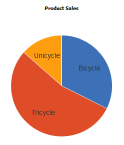
In this case, choose the Revenue field to be passed to SetDataYAxis and the Product field to be passed to SetDataXAxis.
If you choose to display this as a pie chart, you end up with this:
Or, you could display the data as a bar chart:
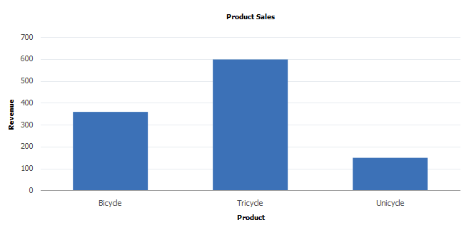
Alternatively, you could display the data with any chart type that can display one dimension of data, such as a horizontal bar, a line, a histogram, or other chart type.
What if you also wanted to show the same information but with additional month information? The table of data that you would be interested in is:
| Product | Month | Revenue* |
|---|---|---|
|
Bicycle |
01 |
360 |
|
Tricycle |
01 |
600 |
|
Unicycle |
02 |
150 |
* Numeric data
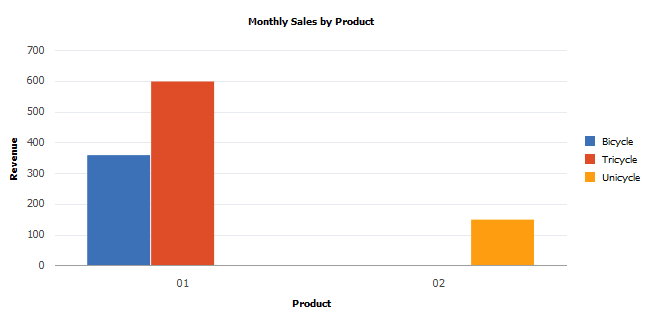
In that case, choose the Revenue field to be passed to SetDataYAxis , the Product field to be passed to SetDataXAxis , and the month field to be passed to SetDataSeries.
You would need to use a chart type that can display two dimensions along with the data. This rules out the pie chart, but you can still use a bar chart:
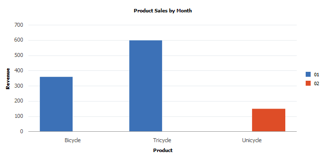
To get a different view of the same data, you can change the method assignments, so that Month is passed in SetDataXAxis and Product is passed in SetDataSeries . The chart that results is this:
Charting Two Sets of Numeric Data
The following chart types allow you to plot two sets of numeric data:
-
Scatter chart
-
Line chart
-
Histogram
-
Funnel chart
-
Overlay chart
The scatter and line charts let you plot one set of numeric data vertically along the y-axis and one set of data horizontally along the x-axis.
The funnel chart lets you plot both sets of numeric data vertically on the y-axis.
Here’s an example of a scatter chart representing the following table of data:
| Tenure* | Salary* |
|---|---|
|
11 |
88000 |
|
12.2 |
96200 |
|
4.6 |
101300 |
|
6.6 |
83000 |
|
14 |
111200 |
|
8.5 |
118000 |
* Numeric data
This example illustrates the scatter chart for the preceding data:
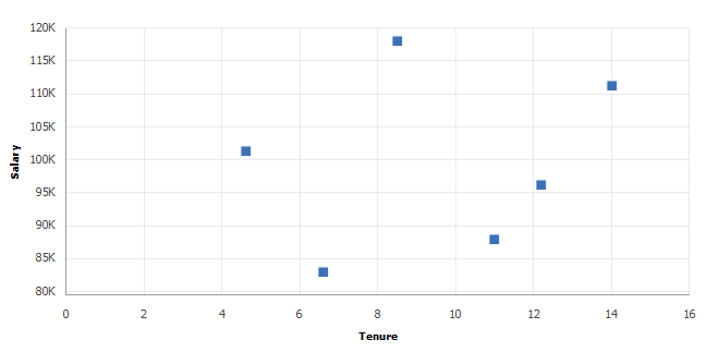
You can also use a line chart to represent the same data. Whereas the scatter chart requires both x- and y-axes to be numeric, the line chart x-axis can be either numeric or non-numeric.
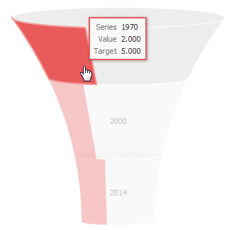
In a funnel chart one set of data is specified using the SetFunnelDataActual method and the other set of data is specified using the SetFunnelDataTarget method.
Here’s an example of a funnel chart that graphs two sets of data, a target amount and an actual amount:
For funnel charts, these additional considerations apply:
-
SetData and SetDataXAxis are required.
-
SetFunnelChartDataActual can be used instead of SetDataYAxis; either are valid.
-
SetFunnelChartDataTarget is optional. When used, SetFunnelChartDataTarget must specify the same record as SetFunnelChartDataActual.
Note:
Legends are not available for funnel charts. The use of Chart class methods and properties for legends has no effect on a funnel chart.
Charting Three Sets of Numeric Data
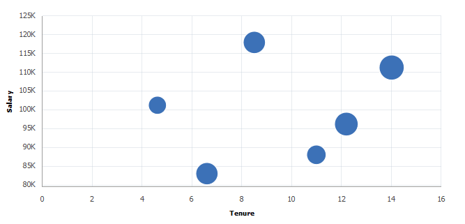
You can use the bubble chart to display three sets of numeric data. The first two sets are along the x- and y-axes just as if you were plotting two sets of numeric data. The third set of numeric data is displayed as the size of the bubble positioned at the (x,y) coordinate in the chart and is set by passing the field in the SetDataZAxis method.
Using the same data as the previous scatter chart example, a third column of numeric data (Age) is included:
| Tenure* | Salary* | Age* | Name |
|---|---|---|---|
|
11 |
88000 |
39 |
Joyce |
|
12.2 |
96200 |
55 |
Tolstoy |
|
4.6 |
101300 |
32 |
Shelley |
|
6.6 |
83000 |
48 |
Tolkien |
|
14 |
111200 |
59 |
Dickens |
|
8.5 |
118000 |
49 |
Hemingway |
* Numeric data
This example illustrates the bubble chart for the preceding data:
Determining the Appropriate Chart Type
Use the following procedures to determine the chart types that are appropriate for your data set:
-
One set of numeric data.
-
Two sets of numeric data.
-
Three sets of numeric data.
Care should be taken when using the line chart with non-numeric data on the x-axis. You should only use it when the data along the x-axis suggests some sort of progression. For example, using a line chart when the x-axis represents a sequence of months is appropriate; using a line chart when the x-axis represents a list of people in alphabetical order probably is not.
Use the following flowchart to determine which chart types are appropriate to your data. In addition, the flowchart visually presents the methods and properties to use with your chart:
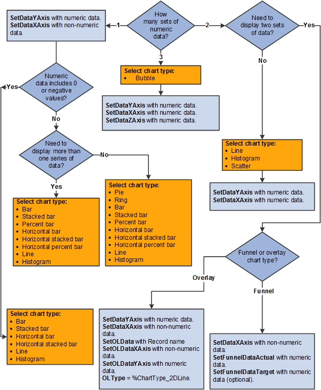
Determining the Chart Type for One Set of Numeric Data
Use the following procedure to determine the chart type and methods and properties to use for one set of numeric data:
-
Use the following flowchart to determine which chart types are appropriate to your data. In addition, the flowchart visually presents the methods and properties to use with your chart:
Pass numeric data to SetDataYAxis.
-
Pass non-numeric data to SetDataXAxis.
-
Does the numeric data include 0 or negative values? If yes, finish by selecting one of these appropriate chart types:
-
Bar
-
Stacked bar
-
Horizontal bar
-
Horizontal stacked bar
-
Line
-
Histogram
Note:
Negative values cannot be displayed in any type of percent bar chart.
-
-
Otherwise, do you need to display more than one series of data? If no, finish by selecting one of these appropriate chart types:
-
Pie
-
Ring
-
Bar
-
Stacked bar
-
Percent bar
-
Horizontal bar
-
Horizontal stacked bar
-
Horizontal percent bar
-
Line
-
Histogram
-
-
Otherwise, select one of these appropriate chart types:
-
Bar
-
Stacked bar
-
Percent bar
-
Horizontal bar
-
Horizontal stacked bar
-
Horizontal percent bar
-
Line
-
Histogram
-
Determining the Chart Type for Two Sets of Numeric Data
Use the following procedure to determine the chart type and methods and properties to use for two sets of numeric data:
-
Do you have other non-numeric data to display? If no, complete steps 2 and 3:
-
Select one of these appropriate chart types:
-
Line.
-
Histogram.
-
Scatter.
-
Funnel (with both actual and target data).
-
Overlay.
-
-
Use these methods and properties for scatter, line, and histogram charts:
-
Pass numeric data to SetDataYAxis.
-
Pass numeric data to SetDataXAxis.
-
-
Otherwise, if you need to display more than one series of data in a funnel chart, complete the following:
-
Pass the non-numeric data to SetDataXAxis.
-
Pass numeric data to SetFunnelDataActual. (Alternatively, pass the numeric data to SetDataYAxis).
-
(Optional) Pass numeric data to SetFunnelDataTarget.
-
Determining the Chart Type for Three Sets of Numeric Data
Use the following procedure to determine the chart type and methods and properties to use for three sets of numeric data:
-
Select the appropriate chart type: Bubble.
-
Pass numeric data to SetDataYAxis.
-
Pass numeric data to SetDataXAxis.
-
Pass numeric data to SetDataZAxis.
Setting Chart Colors
Chart colors are determined in the following ways:
-
Automatically.
-
By using the SetColorArray method to specify an array of color choices.
-
By using the SetDataColor method to specify a field on a record that holds a color value.
Automatic color determination occurs when neither of the other two methods is used. For all charts except pie charts, each data series is assigned a color; all data points within a series share that color. For pie charts each data point is assigned its own color. In that way it’s easier to distinguish pie segments from one another. Here is an example of the base data that will be charted:
| Year | Review Rating | Percent | Color |
|---|---|---|---|
|
2011 |
1-POOR |
2.00 |
0 |
|
2011 |
2-FAIR |
5.00 |
1 |
|
2011 |
3-GOOD |
50.00 |
2 |
|
2011 |
4-VERY GOOD |
20.00 |
3 |
|
2011 |
5-OUTSTANDING |
10.00 |
4 |
|
2011 |
6-NONE |
13.00 |
5 |
|
2012 |
1-POOR |
5.00 |
6 |
|
2012 |
2-FAIR |
10.00 |
7 |
|
2012 |
3-GOOD |
15.00 |
8 |
|
2012 |
4-VERY GOOD |
20.00 |
9 |
|
2012 |
5-OUTSTANDING |
10.00 |
10 |
|
2012 |
6-NONE |
40.00 |
11 |
The Review Rating field is assigned to the x-axis, Percent is assigned to the y-axis, and Year is assigned to the data series:
&cChart.SetData(Record.CJY_RVW_DSTRBTN);
&cChart.SetDataXAxis(CJY_RVW_DSTRBTN.CJY_RVW_RTG);
&cChart.SetDataYAxis(CJY_RVW_DSTRBTN.CJY_DSTRBTN_PCT);
&cChart.SetDataSeries(CJY_RVW_DSTRBTN.CJY_YR);
Note:
In the following examples, because pie charts can display one series of numeric data only, the pie charts reflect data from the first six rows only (the first data series). The bar charts reflect both series of data.
Automatic color generation results in the following bar and pie charts:
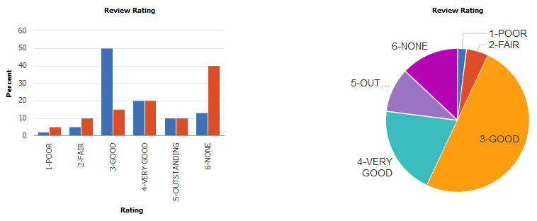
SetColorArray allows you to create an array of color values in PeopleCode and pass that to the charting engine for use in rendering the chart. It works the same way as using automatic color assignment, except that it allows you to pass in a color sequence that differs from the style sheet’s default sequence. For bar charts, each data series is assigned a color; all data points within a series share that color. In the preceding example, all data for the year 2011 is displayed in blue bars; for the year 2012, in red bars. For pie charts each data point is assigned its own color.
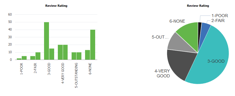
Using the same data as before, the SetColorArray method can be used to specify a color array:
&clr_array = CreateArray(%ChartColor_Black,%ChartColor_Blue,%ChartColor_Cyan,⇒
%ChartColor_DarkGray,%ChartColor_Gray, %ChartColor_Green);

rem The preceding is equivalent to CreateArray(0,1,2,3,4,5);

&cChart.SetColorArray(&clr_array);
Specifying the color array results in these charts:
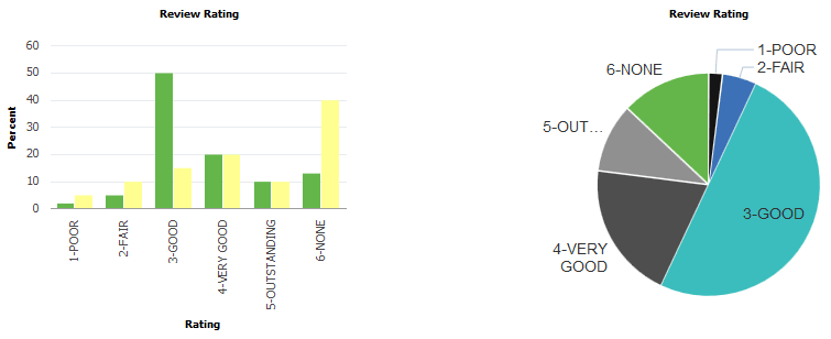
SetDataColor works a bit differently from SetColorArray. By using the value of a record field, SetDataColor provides more granular control of bar chart colors, in that you can vary bar color data point by data point and not by the higher level data series:
&cChart.SetDataColor(CJY_RVW_DSTRBTN.CJY_COLOR);Note that in the preceding data grid, each row of data also includes a color value. The charts that result are:
If both SetColorArray and SetDataColor are set for a chart, SetDataColor takes precedence and SetColorArray is ignored.
Setting Chart Legends
The chart property HasLegend must be set to true for a legend to appear.
&cChart.HasLegend = True;Legend entries are determined in two ways:
-
Automatically
-
By using the SetLegend method to specify an array of legend entries
Here are charts that have automatically generated legend entries:
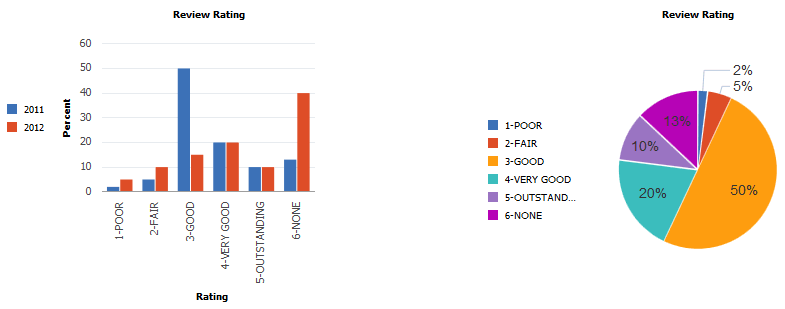
The default position for the legend is to the left of the chart. Set the chart property LegendPosition to move the legend to other locations next to the chart.
A legend entry provides a text description that explains what a color in the chart represents. The colors in the legend are sequenced in the same order as the data and colors are sequenced in the chart.
In all chart types except pie charts, the default legend entries describe the data series. In a pie chart, the default legend entries describe the data points (that is, the pie segments). In a pie chart if you have a legend, each pie chart segment is automatically labeled with the percentage it contributes to the whole.
If you use SetLegend to create legend entries, as an application developer you must ensure that the number of entries in the legend array matches exactly the number of data points that appear in your chart.
&LegendArray = CreateArray("Entry 1", "Entry 2");
&cChart.SetLegend(&LegendArray);
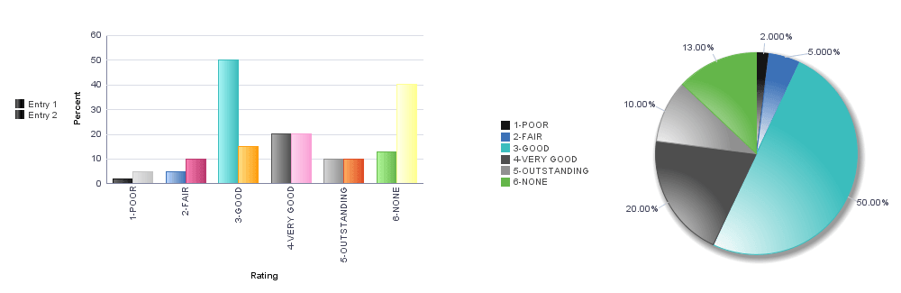
These charts use the specified legend array:
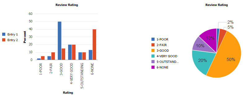
Note that in the case of the pie chart, there were not enough legend entries in the array to account for all the segments in the pie chart. Therefore, for the pie chart, the default legend was used.
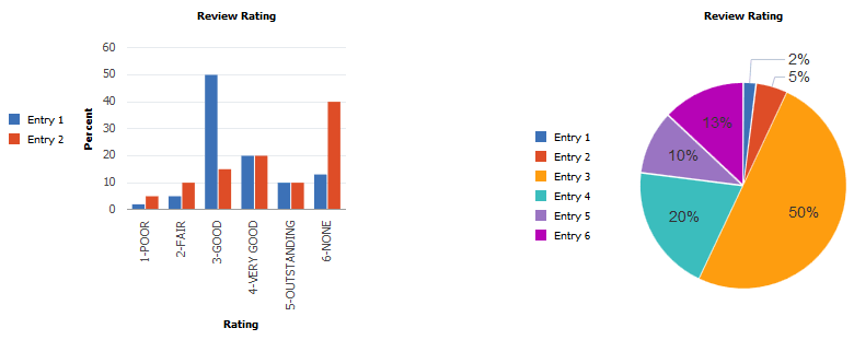
If the number of entries in the array is increased to match the number of pie slices, there are more entries than are needed for the bar chart, which produces several undesirable results.
&LegendArray = CreateArray("Entry 1", "Entry 2", "Entry 3", "Entry 4", "Entry 5", ⇒
"Entry 6");
&cChart.SetLegend(&LegendArray);
The bar chart displays the default legend entries (2) ignoring any additional entries that were supplied in the legend array:
If the number of entries is increased to be larger than needed for either the bar chart or the pie chart, similar undesirable results are displayed for the bar chart.
&LegendArray = CreateArray("Entry 1", "Entry 2", "Entry 3", "Entry 4", "Entry 5",
"Entry 6", "Entry 7");
&cChart.SetLegend(&LegendArray);
In this case, the pie chart reverts to the automatically generated legend:
If color is set by SetDataColor and the default legend is chosen, the bar chart only shows legend entries for the data series.
&cChart.SetDataColor(CJY_RVW_DSTRBTN.CJY_COLOR);
&cChart.HasLegend = True;
The bar chart and pie charts show default legends.
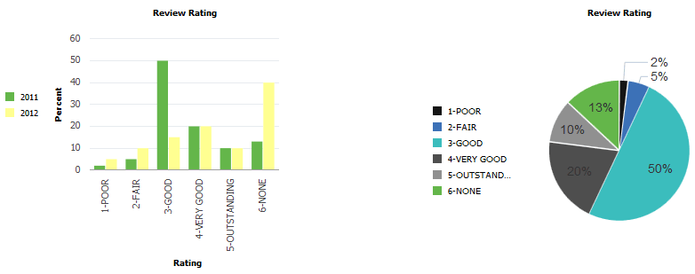
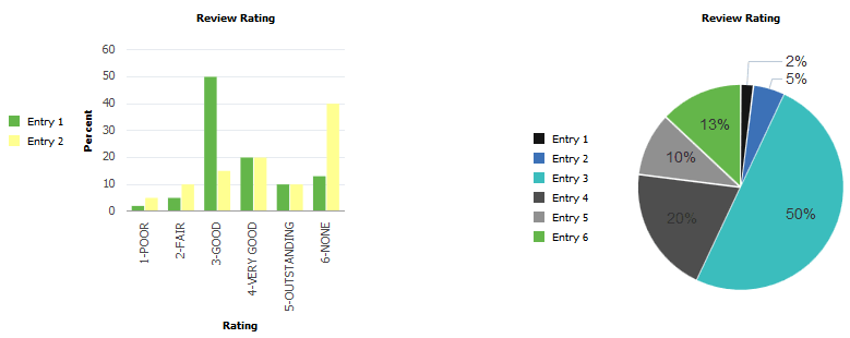
If color is set by SetDataColor and the legend array is larger than needed for either chart type, the results are also undesirable.
&cChart.SetDataColor(CJY_RVW_DSTRBTN.CJY_COLOR);
&cChart.HasLegend = True;
&LegendArray = CreateArray("Entry 1", "Entry 2", "Entry 3", "Entry 4", "Entry 5", ⇒
"Entry 6", "Entry 7", "Entry 8", "Entry 9", "Entry 10", "Entry 11", "Entry 12");
The bar chart displays the default legend entries (2) ignoring any additional entries that were supplied in the legend array.
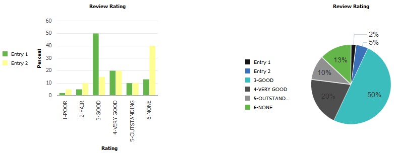
If color is set by SetDataColor and the legend array is the size required by the pie chart, the results are also undesirable.
&cChart.SetDataColor(CJY_RVW_DSTRBTN.CJY_COLOR);
&cChart.HasLegend = True;
&LegendArray = CreateArray("Entry 1", "Entry 2", "Entry 3", "Entry 4", "Entry 5", ⇒
"Entry 6");
The pie chart uses the specified legend array.
If color is set by SetDataColor and the legend array is the size required by the bar chart, the desired results are produced for both charts.
&cChart.SetDataColor(CJY_RVW_DSTRBTN.CJY_COLOR);
&cChart.HasLegend = True;
&LegendArray = CreateArray("Entry 1", "Entry 2");
The legends for both charts are correct. The bar chart uses the specified legend array; the pie chart uses the default legend.