Creating and Using Data Series with Charts
In PeopleSoft applications, chart data series are a grouping of related information. For example, if you were tracking sales for several divisions over many years, each division could be a series. Generally, every series in a chart has a distinct color. You can have more than one series in a chart for comparison. Each line in a line chart represents one series.
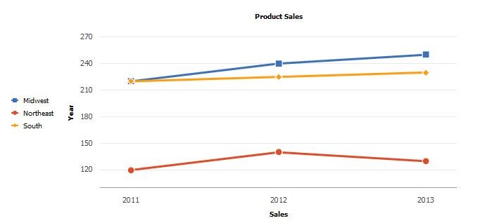
In the following example, the region has been set as the data series:
You can identify the data that you want in each series in two alternative ways:
-
Using the SetDataSeries method.
-
Specifying more than one field with the SetDataYAxis method.
If you use SetDataSeries, you pass into that method a RECORD.FIELD reference. That field will have values for each data item in the chart that associates the data item with a series. For instance, consider this layout of the PRODUCT_SALES table:
| Year | Sales | Region |
|---|---|---|
|
2011 |
120K |
Northeast |
|
2011 |
220K |
South |
|
2011 |
220K |
Midwest |
|
2012 |
140K |
Northeast |
|
2012 |
225K |
South |
|
2012 |
240K |
Midwest |
|
2013 |
130K |
Northeast |
|
2013 |
230K |
South |
|
2013 |
250K |
Midwest |
The relevant PeopleCode would look as follows:
SetDataXAxis(PRODUCT_SALES.YEAR);
SetDataYAxis(PRODUCT_SALES.SALES);
SetDataSeries(PRODUCT_SALES.REGION);
This would produce the red, blue, and yellow lines in the preceding line chart.
If you specify more than one field in SetDataYAxis, each field passed into SetDataYAxis will result in one data series in the chart. For instance, here’s an alternative table layout for the PRODUCT_SALES table:
| Year | SALES_NE | SALES_S | SALES_MW |
|---|---|---|---|
|
2011 |
120K |
220K |
220K |
|
2012 |
140K |
225K |
240K |
|
2013 |
130K |
230K |
250K |
The relevant PeopleCode would look as follows:
SetDataXAxis(PRODUCT_SALES.YEAR);
SetDataYAxis(PRODUCT_SALES.NE,
PRODUCT_SALES.SALES_S, PRODUCT_SALES.MW);
This would also produce exactly the same red, blue, and yellow lines in the preceding line chart.