SetDataYAxis method: Chart class
Syntax
SetDataYAxis(Record_Name.Field_Name1, ...)Description
Use the SetDataYAxis to specify the data to plot in the chart. The y-axis is always considered the data axis.
Note:
For a funnel chart, you can alternatively use the SetFunnelDataActual method to specify this data.
You can pass more than one field to the SetDataYAxis method to specify more than one data series for a chart. Each field passed into SetDataYAxis will result in one data series in the chart. This methodology is an alternative to using the SetDataSeries method to specify more than one data series. See Creating and Using Data Series with Charts for more information.
Parameters
| Parameter | Description |
|---|---|
|
Record_Name.Field_Name1, ... |
Specify the name of the record and one or more fields on that record that contain the data values for the data items for the chart. Note: The number and order of fields specified must correspond to the order specified by the SetDataYAxis method. |
Returns
None.
Example1
Consider the following table containing chart data. This data is organized so that a single column (Amount) is passed to SetDataYAxis and Account Type is passed to SetDataSeries:
| Account Name | Year | Account Type | Amount | URL | Chart Color | Glyphscale |
|---|---|---|---|---|---|---|
|
Revenues |
2010 |
Actual |
8200000 |
http://www.nps.gov/ak/index.htm |
1 |
1 |
|
Revenues |
2010 |
Budgeted |
7600000 |
http://www.nps.gov/as/index.htm |
5 |
3 |
|
Revenues |
2010 |
Forecast |
8100000 |
http://www.nps.gov/az/index.htm |
8 |
5 |
|
Revenues |
2011 |
Actual |
8300000 |
http://www.nps.gov/ca/index.htm |
1 |
1 |
|
Revenues |
2011 |
Budgeted |
7650000 |
http://www.nps.gov/co/index.htm |
5 |
3 |
|
Revenues |
2011 |
Forecast |
7400000 |
http://www.nps.gov/ct/index.htm |
8 |
5 |
|
Revenues |
2012 |
Actual |
8450000 |
http://www.nps.gov/fl/index.htm |
1 |
1 |
|
Revenues |
2012 |
Budgeted |
8000000 |
http://www.nps.gov/ga/index.htm |
5 |
3 |
|
Revenues |
2012 |
Forecast |
6500000 |
http://www.nps.gov/gu/index.htm |
8 |
5 |
However, in the preceding table, there is a considerable amount of redundant data that needs to be passed to the Chart object to create a chart. For the same account there are nine rows of data; and for each year, much of the data is repeated.
Now, consider the same data reorganized as three rows. (For ease of viewing, the data has been split into two tables.)
Chart data part 1:
| Account Name | Year | Actual Amount | Budget Amount | Forecast Amount | URL Actual | URL Budget | URL Forecast |
|---|---|---|---|---|---|---|---|
|
Revenues |
2010 |
8200000 |
7600000 |
8100000 |
<URL_A> |
<URL_B> |
<URL_F> |
|
Revenues |
2011 |
8300000 |
7650000 |
7400000 |
<URL_A> |
<URL_B> |
<URL_F> |
|
Revenues |
2012 |
8450000 |
8000000 |
6500000 |
<URL_A> |
<URL_B> |
<URL_F> |
Chart data part 2:
| Account Name | Year | Actual Color | Budget Color | Forecast Color | Glyphscale | Glyphscale | Glyphscale |
|---|---|---|---|---|---|---|---|
|
Revenues |
2010 |
1 |
5 |
8 |
1 |
3 |
5 |
|
Revenues |
2011 |
1 |
5 |
8 |
1 |
3 |
5 |
|
Revenues |
2012 |
1 |
5 |
8 |
1 |
3 |
5 |
Since the SetDataYAxis method now allows you to specify multiple RECORD.FIELD parameters, you can specify data from multiple columns from the same data record. Doing so reduces the need to have duplicate data in row format. The following PeopleCode program could be used to display the preceding data:
rem Initialize the chart;
&Chart = GetChart(QE_COL_MULTIWRK.QE_CHART_FIELD);
&Chart.Reset();

rem Call function to check the chart type;
&Chart.Type = %ChartType_2DBar;

rem Set chart data record;
&Chart.SetData(Record.QE_COL_MULTI);

rem Set the x-axis;
&Chart.SetDataXAxis(QE_COL_MULTI.LY_YEARS);

rem Set multiple y-axis data columns;
&Chart.SetDataYAxis(QE_COL_MULTI.LY_AMOUNT_ACTUAL, QE_COL_MULTI.LY_AMOUNT_BUDGET, QE_COL_MULTI.LY_AMOUNT_FORCAST);

rem Set multi y-axis colors;
&Chart.SetDataColor(QE_COL_MULTI.LY_CHART_COLOR_1, QE_COL_MULTI.LY_CHART_COLOR_2, QE_COL_MULTI.LY_CHART_COLOR_3);

rem Set multi-column item size;
&Chart.SetDataZAxis(QE_COL_MULTI.LY_CHART_GLYPHSCL1, QE_COL_MULTI.LY_CHART_GLYPHSCL2, QE_COL_MULTI.LY_CHART_GLYPHSCL3);

rem Need labels for all y columns, which now act like series here;
&Chart.SetSeriesLabels(CreateArray("Actual", "Budgeted", "Forecast"));

&Chart.MainTitle = "Multi Columns Y Axis Chart";
&Chart.XAxisTitle = "Year";
&Chart.YAxisTitle = "Revenue";

rem Set the chart legend;
&Chart.HasLegend = True;
&Chart.LegendPosition = %ChartLegend_Bottom;

&Chart.IsDrillable = True;
&Chart.SetDataURLs(QE_COL_MULTI.LY_CHRT_URL_1, QE_COL_MULTI.LY_CHRT_URL_2, QE_COL_MULTI.LY_CHRT_URL_3);
The preceding PeopleCode would produce the following chart:
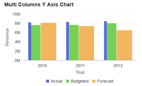
If the SetDataZAxis
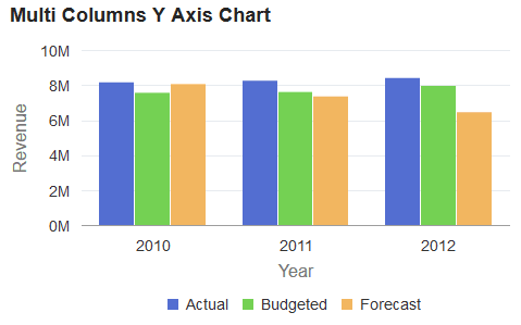
method is commented out of the preceding PeopleCode, the following
chart with equal width bars is produced instead:
rem &Chart.SetDataZAxis(QE_COL_MULTI.LY_CHART_GLYPHSCL1,
QE_COL_MULTI.LY_CHART_GLYPHSCL2,
QE_COL_MULTI.LY_CHART_GLYPHSCL3);
Example2
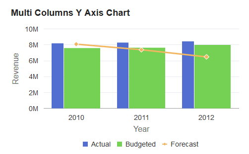
If you want to plot a specific data series differently from the other series, you can use the Series class. The Series class is used in conjunction with the Chart class to override the default chart type (as defined by the Type property for the Chart object) for selected members of the data series. See Using the Series Class for more information on how to use the Series class to override the default chart type.
The addition of the
following code excerpt at the end of the preceding PeopleCode program
allows the forecast data to be plotted as a line chart instead of
as a bar:
Local Series &S1;
&S1 = GetSeries();
&S1.Name = "Forecast";
&S1.Type = %SeriesType_Line;
&Chart.SetSeries(CreateArray(&S1));