Color Contrast Mode for Charts
By default, the adjacent colors in a chart are separated by a gap between the colors and a black border to fulfil accessibility requirements, and this setting is defined by the PTCOLORCONTRAST property, which is specified on the Chart Options page.
PTCOLORCONTRAST is a system-wide setting that defines the color contrast mode for all charts.
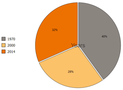
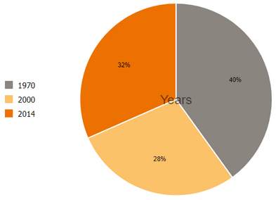
The following examples show the differences between a pie chart that is enabled for color contrast mode and a pie chart that is not enabled for color contrast mode.
Example of a pie chart with the color contrast mode set to enabled, which is the default rendering.
Example of a pie chart with the color contrast mode set to disabled.
You can override the default color contrast mode using either of the following options:
-
Access the Chart Options page () and set the value of the PTCOLORCONTRAST property to 0. The default value is 1, that is, the color contrast mode is enabled.
You should remember that PTCOLORCONTRAST is a system-wide setting.
-
For an individual chart, you can set the chart property IsColorContrastMode, in PeopleCode, to false.
Note:
When you set the color contrast mode using the IsColorContrastMode property for an individual chart, it takes highest precedence. That is, it overrides the color contrast mode, which is set on the Chart Options page, for the individual chart.
For more details, see IsColorContrastMode property: Chart class.