Branding Classic Components
Important:
The Component Branding page can be used with classic components only. If you attempt to add a value for a fluid component, an error message is displayed.
Use the Component Branding page to specify custom style sheet objects and JavaScript objects in addition to those specified by the component’s developer in Application Designer.
Important:
If the current component has an associated component interface definition, then modifying the component definition by adding, deleting, or reordering style sheets or JavaScript objects will invalidate any associated component interface definition. A warning message will be issued when you save such a component on the Component Branding page. Therefore, you must also open and re-validate the associated component interface definitions in Application Designer.
Navigation:
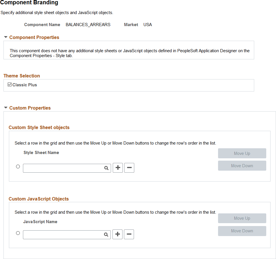
This example illustrates the fields and controls on the Component Branding page. You can find definitions for the fields and controls later on this page.
| Field or Control | Description |
|---|---|
|
Component Name |
Displays the name of the selected component. |
|
Market |
Displays the market for the selected component. |
|
Component Properties |
The Component Properties group box displays the additional style sheet objects and JavaScript objects specified by the component’s developer in Application Designer. These values are display-only, and cannot be modified here. |
|
Theme Selection - Classic Plus |
This option is selected when a classic component has been configured to display with fluid-like styling (which is also referred to as “classic plus”). For more information, see PeopleTools Components Delivered as Classic Plus. Note: While this option can be selected or deselected on this page, the best practice is to set the option on the Style tab of the Component Properties dialog box in Application Designer only after reworking each page in the component for fluid-like styling. See Application Designer Developer’s Guide: Reworking Components for Classic Plus Display. |
|
Custom Properties |
The Custom Properties group box displays the additional, custom style sheet objects and JavaScript objects specified by the portal administrator through the use of this Component Branding page. |
|
Style Sheet Name |
Specify zero, one, or more custom style sheets to be loaded for this component. |
|
JavaScript Name |
Specify zero, one, or more custom JavaScript objects to be loaded for this component. Important: JavaScript objects are stored as HTML objects in the database. The lookup does not differentiate between standard HTML objects and JavaScript objects. Therefore, it is your responsibility to ensure that you have selected valid JavaScript to be loaded with a component. |
|
Move UpMove Down |
Select the row designating a style sheet or a JavaScript object, and then use the Move Up and Move Down buttons to change the order in which the objects are loaded with the component. |