Defining Headers and Footers
Important:
Classic header definitions (DEFAULT_HEADER_TANGERINE, DEFAULT_HEADER_TANGERINE_ALT, DEFAULT_HEADER_SWAN, and DEFAULT_HEADER_CLASSIC), their corresponding branding themes, the drop-down menu, and other forms of classic navigation are no longer supported. The default navigational interface for PeopleSoft applications in the current release is based on the fluid banner and the fluid-like portal header, which can be used for both classic and fluid applications. For information on working with the fluid user interface, see Applications User’s Guide: Working with Fluid Pages and Controls.
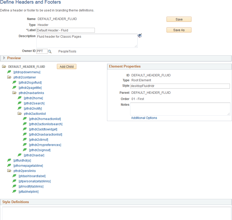
Use the Define Headers and Footers page to create and maintain header and footer definitions by adding elements to a tree structure. The tree structure is represented as:
-
Folders – These are container elements such as the root element (created automatically with the Root Element type) and other elements added as the Basic Container element type. Folders can contain children, which are leaves and other folders.
-
Leaves – These are other elements added with other element types including basic types (Basic Link, Basic Text, Basic Image, and others) as well as specialized element types (Home Link, Sign Out Link, Dashboard Label, and others).
Note:
Header and footer definitions are used on classic homepages and classic pages only. While you cannot directly modify the fluid banner that is displayed on fluid pages, you can modify definitions in a macro set that will customize the look of both the fluid banner and the header that is displayed on classic pages. In addition, you can use the CompanyInfo element to configure a custom banner for classic, fluid, or both; see Configuring a Custom Banner for more information.
Navigation:
This example illustrates the fields and controls on the Define Headers and Footers Page. You can find definitions for the fields and controls later on this page.
| Field or Control | Description |
|---|---|
|
Name |
Displays the ID for the header or footer that was specified when the definition was created. |
|
Type |
Displays the type of the definition:
|
|
Label |
Enter a label for the header or footer definition. |
|
Description |
Enter a description for the header or footer definition. |
|
Owner ID |
Select which product, feature, or application owns this header or footer definition. |
|
Save |
Click the Save button to save changes to the current definition. |
|
Save As |
Click the Save As button to save the current definition with a new ID. |
|
Delete |
At the definition level, a Delete button will be displayed only for those definitions that are not included in a theme definition. Use this Delete button to delete the header or footer definition. |
|
Add Child (in tree structure) |
Select the root element or a container element and then click the Add Child button to add a child element. |
|
Delete (in tree structure) |
Select any element except the root element and then click Delete to delete the element (and any children). |
|
Style Definitions |
Enter any additional free form style class definitions in this long edit box. |
|
Add to Project |
Click the Add to Project link to access the Add To Project page to insert this branding header or footer definition into an ADS project. See Lifecycle Management Guide: Adding Data Set Instances from Object Designer Pages and Migrating Branding Data Using ADSs for more information. |
Preview Section
Expand the Preview section to review the look of the current header or footer definition. The preview is updated after changes are made to any of the elements or style classes used in the definition. Tab out of any changed field or element to see the updated preview.
Important:
The DEFAULT_HEADER_FLUID definition or clones of this definition cannot currently be previewed correctly.
This example illustrates the preview of a header definition.

Element Properties
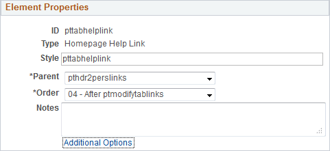
Use the Element Properties group box to review and set properties of the element selected in the tree.
This example illustrates the fields and controls on the Element Properties group box.
| Field or Control | Description |
|---|---|
|
ID |
Displays the ID of the element that was specified when the element was created. |
|
Type |
Displays the element type that was selected when the element was created. Valid element types are defined on the Define Element Types page. |
|
Style |
Enter one or more free form style class names separated by spaces to specify additional formatting for this element. |
|
Parent |
Select a new parent container for this element by container ID. Note: All container elements are listed except children of the current element. |
|
Order |
Select a new placement for this element among its sibling elements within the parent container. |
|
Notes |
Enter any optional notes about this element. |
|
Additional Options |
Click the Additional Options link to view the Additional Options page. |
Additional Options Page
This example illustrates some of the fields and controls that can be found on the Additional Options page.
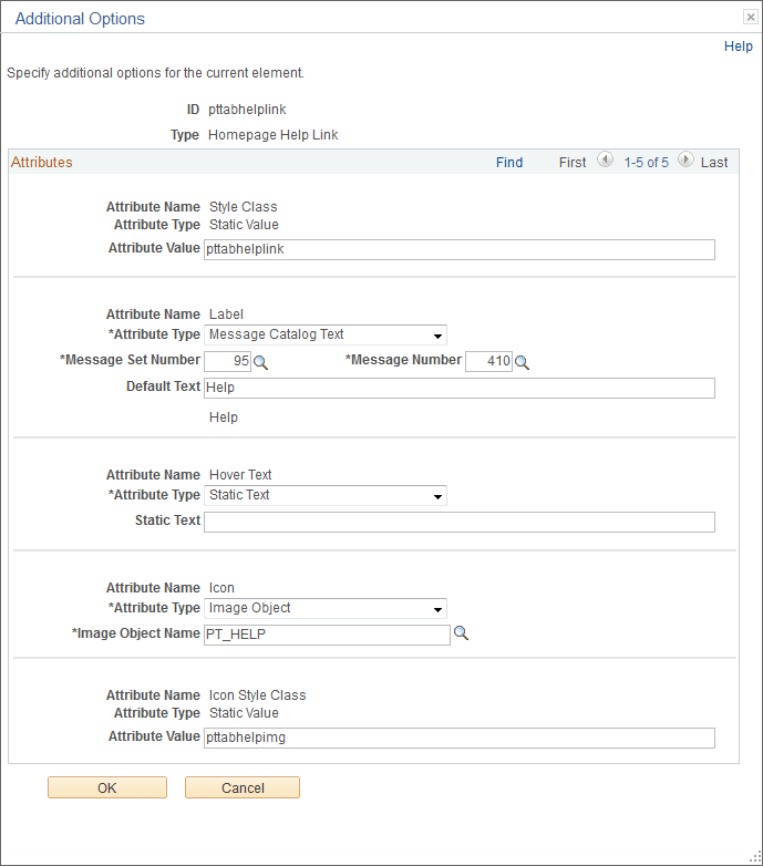
The fields displayed on the Additional Options page are controlled by the application class definition that supports this element type and will vary depending on the element type.
| Field or Control | Description |
|---|---|
|
ID |
Displays the ID of the element. |
|
Type |
Displays the element type. |
|
Attribute Name |
Displays the name of the attribute. |
|
Attribute Type |
Displays the attribute type. For some attributes, this value is not read-only and can be changed. Depending on the attribute type, additional fields are displayed showing the attribute value, static text, message set and number, default text, an object ID, and others. |
Related Topics