Pagelet Development
You can use PeopleTools to develop pagelets as smaller-than-normal pages, just as you would any other PeopleSoft transaction page. PeopleSoft portals are delivered with a suite of pagelets, primarily built using PeopleTools technology. However, you can also base the design of a pagelet on PeopleCode internet scripts (iScripts). Use iScripts only when you can't accomplish the same task with a PeopleSoft transaction page, for example, if you are developing a pagelet that uses external content (content that does not originate in a PeopleSoft application). You can also create pagelets using other leading web-enabling technology such as JavaServer pages (JSP), Java servlets, Microsoft Active Server Pages (ASP), Perl scripts, and common gateway interface (CGI) programs.
A well-designed and well-developed pagelet serves these primary functions:
-
Summarizes data that is relevant, personalized, and actionable. Page space is valuable; pagelets must be more than attractive.
-
Provides links to more detailed information, such as content in another application.
In addition, pagelets should also:
-
Aggregate data from multiple sources.
-
Be simple and intuitive.
-
Be sized appropriately.
The size of pagelets corresponds to the homepage layout that a user chooses. Any pagelet that you design must first conform to the dimensions of the narrow column and optionally, of the wide column. Pagelet width is the only dimension to which you must adhere. The height of pagelets can vary; however, good design principles suggest keeping them as short as possible.
-
Avoid the use of scrollable grids.
Grids that you insert on pagelets are not scrollable by default. If the grid appears on a pagelet and on a standard transaction page, Oracle recommends that you use a non-scrollable grid type to ensure consistent user experiences.
Pagelet Header Icons
The icons that you see in the pagelet header function similarly across most pagelet types. You do not have to use all header icons on all pagelets. You can vary the icons that appear in the header based on business rules or technical constraints.
This table lists and describes the icons that you can use in pagelet headers.
| Term | Definition |
|---|---|
|
|
Click to show the content of the pagelet so that more than just the pagelet header is visible. When you click this icon, in its place you will see the Hide icon. |
|
|
Click to view pagelet help. When you click this icon, any documentation that you configure appears. Not all pagelets provide documentation. |
|
|
Click to personalize the pagelet. When you click this icon, a page appears so that you can change any pagelet settings that you are allowed to configure. The options that you can personalize vary among users and pagelets, and not all pagelets have options that you can personalize. |
|
|
Click to hide the body of the pagelet so that only the header is visible. When you click this icon, in its place you will see the Show icon. |
|
|
Click to force an application server trip so that the pagelet data and settings are current. |
|
|
Click to remove the pagelet from the page. You will be prompted to confirm the action and must accept or dismiss the confirmation. |
 Expand
 Help
Help Personalize
 Minimize
 Refresh
 Remove
Pagelet Example
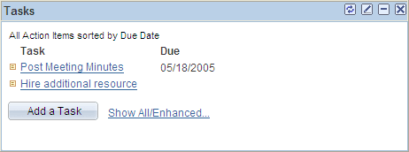
This example demonstrates many characteristics of a well-designed pagelet and the pagelet header icons in the Tasks pagelet.