About Lists
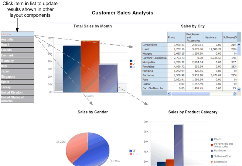
The list component displays all values of a data element in a vertical or horizontal list. When viewed in interactive mode, clicking an item in the list updates the results shown in the linked components of the report.
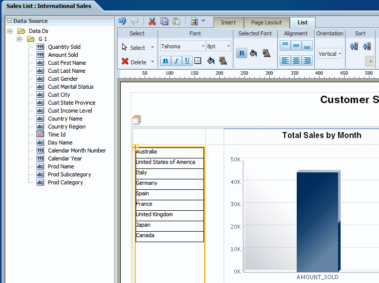
The following figure shows a report that displays multiple charts based on sales data. The list component displays each country with sales data. The list enables the report consumer to quickly see results for each country in the list by clicking the entry in the list.
Customize a List
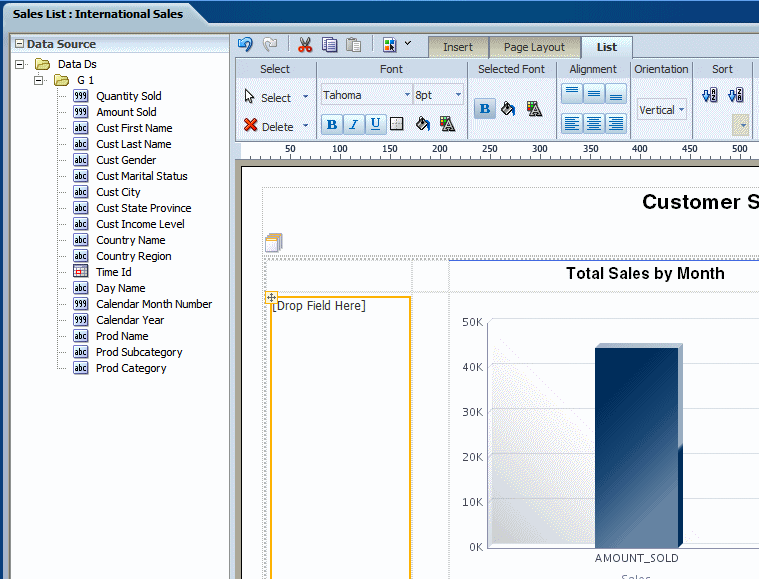
The List tab helps you to edit the font attributes, define border for the list, set background color, etc.
Use the List tab to:
-
Edit the font size, style, and color
-
Define borders for the list
-
Set the background color
-
Edit the font color and background color for the display of selected items
-
Set the orientation of the list
-
Specify the sort order
The following figure shows the List tab:
Customize the Font Style and the Selected Font Style Commands
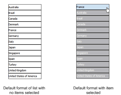
This figure illustrates default formats. The list on the left shows the default format of the list. The list on the right shows the Selected Font default format
Edit the font settings by selecting a font family from the list and adjusting the point size.
By default, the list displays with one point black gridlines. Click the Set Border to adjust the default borders of the list. Use the Background Color and Font Color commands to customize the colors.
The Selected Font commands edit the appearance of the item in a list when it's selected. By default, the selected element is moved to the top of the list, and the background is changed to light blue. You can edit the font weight, background color, and font color that are displayed for selected items.
Customize Behavior of Selected Items
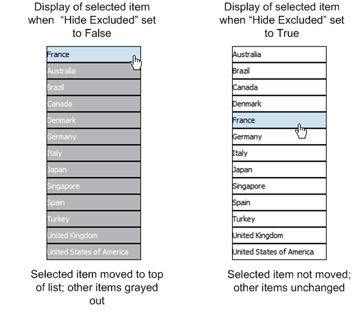
By default, the selected items move to the top of the list and the non-selected items are hidden by a gray fill. You also have the option of not applying this behavior by setting the property Hide Excluded.
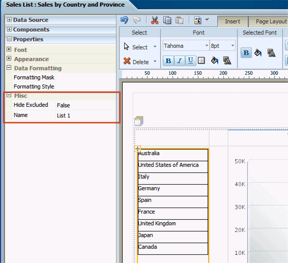
This property is available from the Properties pane when the List component is selected. The Hide Excluded property is highlighted in the following figure:
The following figure shows the difference in the display depending on the setting of the property:
