Add Data Bars to Tables and Pivots
In Oracle Analytics, you can add data bars to cells in table and pivot visualizations to provide a visual representation of measure column values.
A data bar represents the numeric values using a horizontal bar where the length corresponds to the value.
For example, to make a table visualization showing the sales numbers for product categories and subcategories more impactful, you can add data bars to the cells displaying the sales values.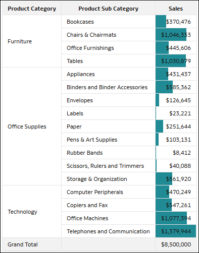
Description of the illustration data_bars_table_example.png
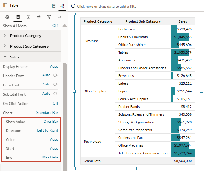
You can configure data bars using the properties available for the measure in the Edge Labels tab of the Properties pane.
| Property | Description |
|---|---|
| Chart |
Specifies the type of data bar displayed. Options
|
| Bar Width |
Specifies the width of a 100% Bar. Options
|
| Show Value |
Specifies whether and where the numeric value is displayed. Options
|
| Direction |
Specifies the direction in which the bar is displayed. Options
|
| Color |
Specifies the color of the data bar. Options
|
| Start |
Specifies the starting value used to calculate the data bar length. Options
|
| End |
Specifies the ending value used to calculate the data bar length. Options
|
This tutorial shows you how to add data bars to tables and pivots.  Tutorial
- On your home page, hover over a workbook, click Actions, and select Open.
- Select your table or pivot visualization.
- Click Properties, then click Edge Labels
 .
. - Expand the measure column you want to add data bars to.
- In the Chart row, click None, then select either Standard Bar or 100% Bar.
- Use the Chart property options to configure the appearance of the data bars and specify the start and end values.
- Click Save.