Assign Colors to Columns
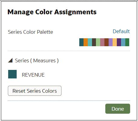
Instead of using the palette’s default colors, you can choose specific colors to fine-tune the look of your visualizations.
- On your home page, hover over a workbook, click Actions, then select Open.
- Click Edit to open the workbook in author mode.
- Click the visualization's Menu, select Color, and then select Manage Assignments.
- Click the box containing the color assigned to the column. From the color picker dialog, select the color that you want to assign to the column. Click OK.
- Specify how you want the color range to be displayed for the
column (for example, reverse the color range, pick a
different color range, and specify how many shades you want
in the color range).
