Create a Gantt Chart Visualization
Add a Gantt chart visualization to your workbook.
To create a Gantt chart, you need the following columns:
- An attribute column or a date time column representing tasks or events
- A date column representing the start times of the tasks or events
- A date column representing the end times of the tasks or events, or a measure column representing the duration of them.
If you use a measure column for duration, Oracle Analytics calculates the end date based on the measure and start date values.
- On your home page, hover over a workbook, click Actions, then select Open.
- In the Data pane, click Visualizations. Under Bar, drag Gantt
 to the canvas.
 - In the Data pane, click Data and drag an attribute column to Category in the Grammar pane.
- Drag the appropriate date column to Start Time under Primary Range in the Grammar pane.
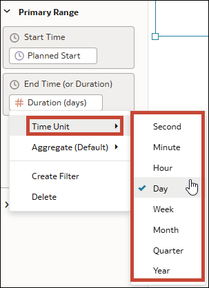
- Drag the appropriate date or measure column to End Time (or Duration) under Primary Range in the Grammar pane.
- If you used a measure column representing the duration, click the column name in the Grammar pane to open the menu. Then right-click Time Unit and select a unit.
- Click Save.
