Format Headers in Pivot Visualizations
You can format the main headers and the data headers in pivot visualizations to customize the look of your pivot and make it easier to read.
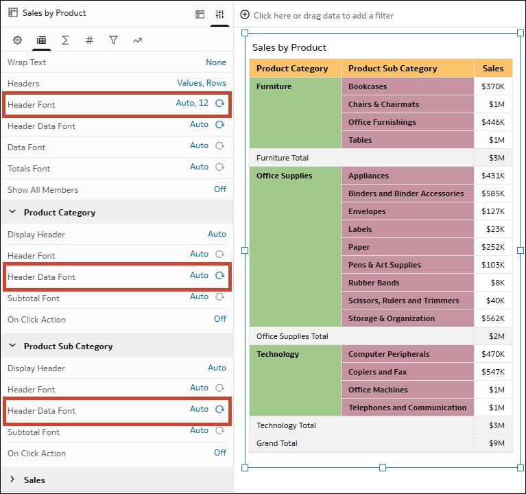
In the Edge Labels tab of the Properties pane, use the top Header Font and Header Data Font rows to change the following for all the main headers and data headers in the visualization:
- Font type
- Font size
- Font style
- Font color
- Background color
- Alignment (left, center, right)
You can also configure those properties for individual data elements to further customize your pivot.
For example, you can use the first Header Font property to configure your main headers to have an orange background using the color #fbc26a and bold, size 12 font. Use the Header Data Font properties under the individual data element sections to configure your data headers to be bold but have a different color background depending on the data element.
Description of the illustration vizproperties_pivot_headers_example.png
- On your home page, hover over a workbook, click Actions, then select Open.
- Click the pivot visualization.
- Click Properties, then click Edge Labels.
- In the Header Font row, click Auto, then configure the options to customize the main header cells across the top of the pivot.
- In the Header Data Font row, click Auto, then configure the options to customize the data header cells throughout the rest of the pivot.
- In Edge Labels, click a data element name to expand its properties, then configure the Header Font and Header Data Font rows to override the header appearance for that particular data element.
- Click Save.