About Overlay Charts
In Oracle Analytics, you can use overlay charts to combine multiple chart layers that share a common category axis, making it easier to compare related measures and identify trends.
Each layer in an overlay chart can use a different visualization type, measure, and formatting. For example, you might create an overlay chart that displays quantity ordered by product category using a stacked bar layer, while a line layer displays shipping costs across the same categories.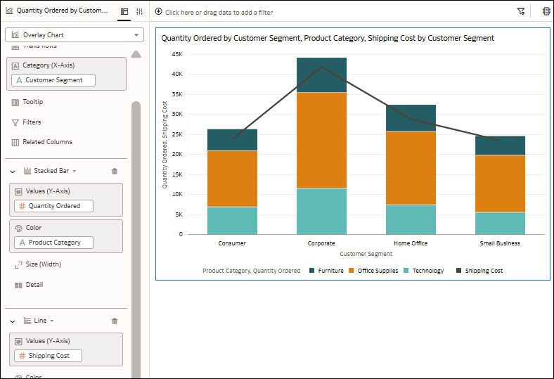
Description of the illustration overlay_chart_example.png
- Bar
- Stacked Bar
- 100% Stacked Bar
- Line
- Area
- Stacked Area
- 100% Area
- Category
- Stacked Category
You can add multiple layers to an overlay chart and configure the appearance of each layer independently using the Data Layers properties.
You can also customize the visualization by configuring axis settings, labels, legends, colors, and layer-specific properties.
This tutorial shows you how to create an overlay chart using a bar graph and a line graph:  Tutorial.