Create an Overlay Chart
Add an Overlay Chart visualization to your workbook.
To create an overlay chart, you need:
- At least one attribute column to use as the shared Category (X-Axis)
- One or more measure columns to display in separate layers
All layers in an overlay chart share the same Category (X-Axis) values. Each layer can use a different measure and visualization type.
- On your home page, hover over a workbook, click Actions, and select Open.
- In the Data panel, click Visualizations
 .
. - Under Bar, drag Overlay Chart
 to the canvas.
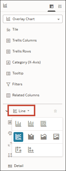
 - In the Grammar pane, in the first layer, click Line and select the visualization type that you want to use.
- In the Data panel, click Data
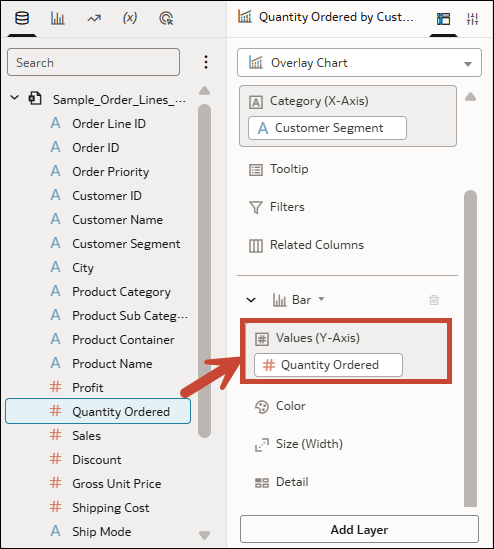
 and drag an attribute column to Category (X-Axis) in the Grammar pane.
 - Drag a measure column to Values (Y-Axis).
- Click Add Layer and select the visualization type that you want to use for the second layer.
- Drag a measure column to Values (Y-axis) for the new layer.
- Click Save.