Tips on Choosing a Visualization
Oracle Analytics provides many types of visualization for building workbooks. As a workbook Use this guidance on choosing the best visualization type for your needs.
Start in the workbook designer on the Visualize panel.
Here're some ways to select the best visualization:
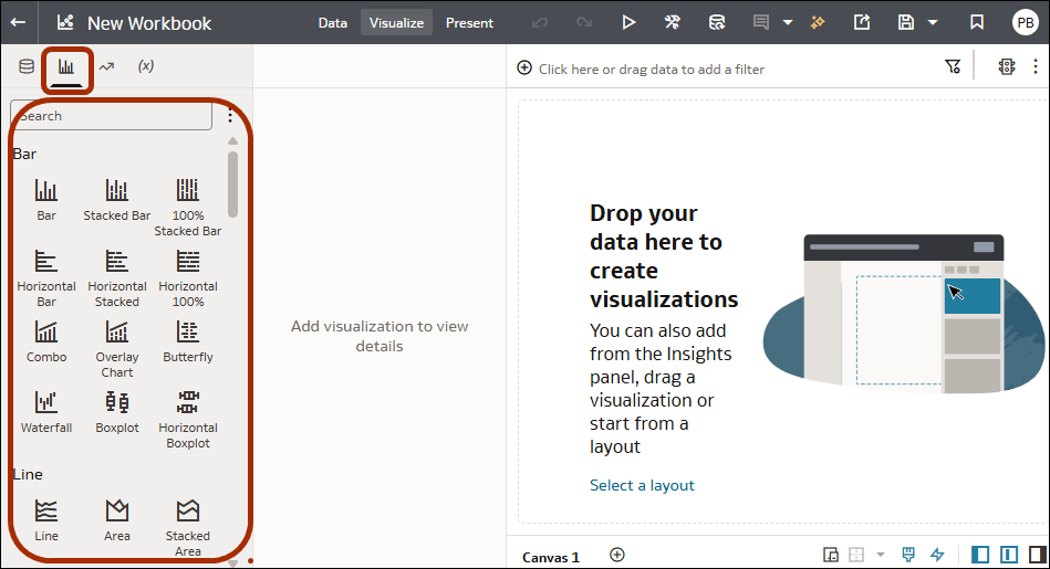
- On the Data Panel, click Visualizations to display visualization types available grouped by category (in Tile View by default).
Use the Menu to change to Objective View, which groups types into function, such as Compare Values and Parts, Analyze Trends, and Discover Patterns.
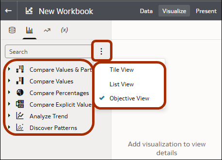
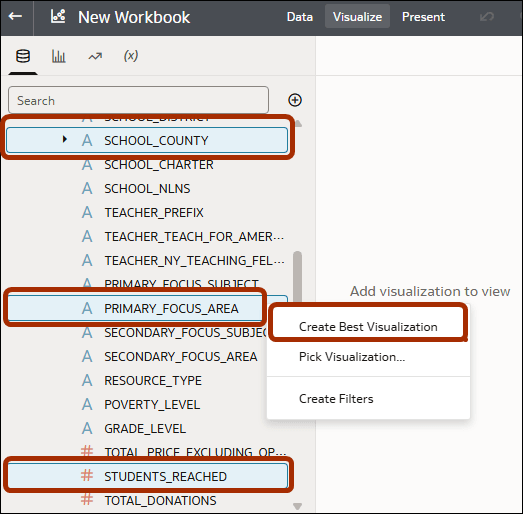
Description of the illustration viztips2.png - On the Data Panel, multi-select the attributes and measures you want to analyze, then right-click and select Create Best Visualization or drag them onto the canvas. Oracle Analytics adds a visualization to the canvas for you, based on the data you selected.
If you're still not sure what type of visualization you need, try one of these:
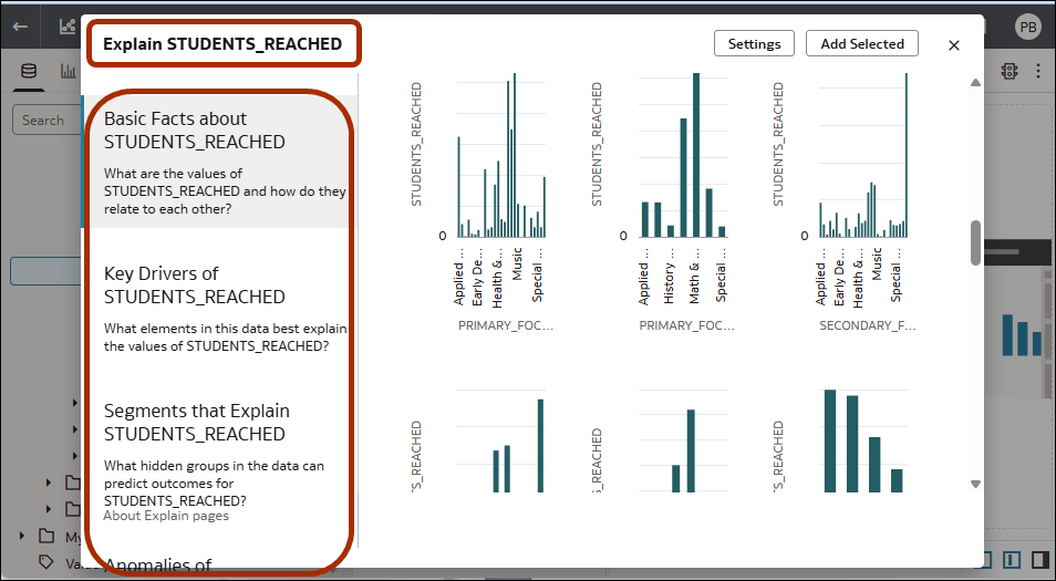
- On the Data Panel, hover over a single measure, then right-click and select Explain <measure>. Oracle Analytics analyzes the measure and creates a number of visualizations for you, based on the categories Basic Facts, Key Drivers, Segments that Explain, and Anomalies. Hover over visualizations you want to use, click Select for Canvas, then click Add Selected to add them to the canvas.
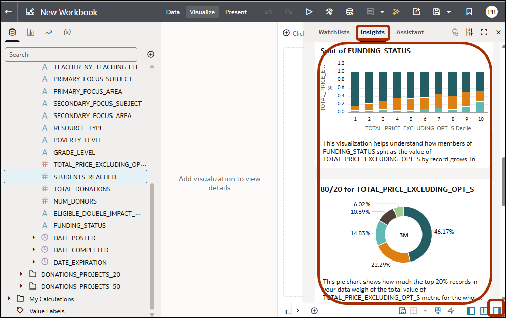
- Use the Insights Panel to view pertinent visualizations that Oracle Analytics suggests. Hover over and click Add Selected to add them to the canvas.
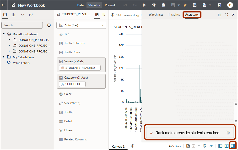
- Use the Assistant panel to type or speak a description of what you want to analyze. Oracle Analytics generates visualizations based on your request.
