Use the Dashboard Filter
Use the information in this section to learn about and add a dashboard filter to a workbook canvas.
About Dashboard Filters
Dashboard filters allow the user to specify filter values for all of the visualizations on a workbook canvas at runtime.
At design time, you can add filters to the workbook's filter bar to limit the data that is included in all canvases on the workbook. After adding these filter, you normally hide them from the end user.
You can add dashboard filters to any of the dashboard's canvases to allow users to select their own values and view specific data for that canvas. At runtime, any dashboard filters values that the user specifies are applied on top of any workbook filters that you as the author added and hid at design time.
The dashboard filter type that you can add depends on the column type:
- List - Use to filter text, non-aggregatable numbers, and dates. This option allows you to include or exclude member, include nulls, toggle between list and top bottom n, and so on.
- List Box - Use to filter text, non-aggregatable numbers, and dates. This option provides a simple list of data values. The List Box dashboard filter type is similar to the List dashboard filter type, and by default contains the All option in the filter's list of selectable values. The List Box filter type doesn't allow users to multi-select values, and doesn't include the extra options that the List dashboard filter type provides, for example Top Bottom N, Exclude, Disable Filter, and so on.
- Range - Use to filter numeric type data element with an aggregation rule set to something other than none.
- Slider - Use to animate visualizations and show dynamically how your data changes over a given dimension such as time.
- Top Bottom N - Use to filter a measure or attribute and display its highest or lowest values.
Filter Data Using a Dashboard Filter Visualization
Use dashboard filters to build filter bars directly onto the workbook's canvases so that the end user can select the data they're interested in.
- On the Home page, hover over a workbook, click Actions (
 ), then select Open.
 - Click the Visualize tab.
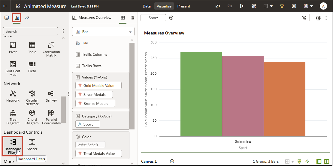
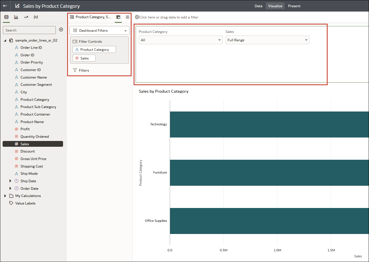
- In the Data Panel, click the Visualizations tab, and drag and drop Dashboard Filters to the canvas.
- In the Data Panel, click the Data tab, and drag and drop one or more
columns to the new dashboard filter to create the individual filters.
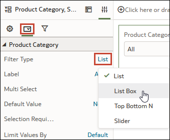
- In the dashboard filter's Properties pane,
click Properties, then click Filter
Controls. Go to the Filter Type field and
select the type of filter you want to include on the workbook.
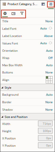
- Use the Properties pane's General, Filter
Controls, and Filters tabs to change how
the filter displays and behaves, for example, allow multi-select, limit values,
label font, background color, and so on.
- Click Save.
Overview to Filtering and Animating Visualizations Using a Slider Dashboard Filter
You can add a slider dashboard filter to a canvas to animate visualizations and show dynamically how your data changes over a given dimension such as time.
As a workbook author, you can configure a slider filter to enable dashboard consumers to select a dimension value interactively, or automatically play through dimension values, similar to a time-lapse video or animation.
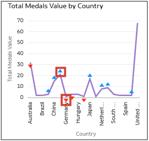
For example, you might analyze the number of gold, silver, and bronze Olympic medals and total medals that countries won between 2000 and 2012. With auto-play set to on, the visualizations change dynamically as the filter automatically plays through the years. In this example, the first visualization shows the number of medals won in swimming, and the second visualization shows the number of medals won by country.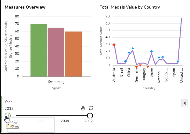
Description of the illustration slider-playing-present.png
Features:
- The slider displays the dimension-based values, with animation controls Play, Speed, and Repeat.
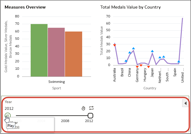
Description of the illustration slider-dashboard-filter.png - With auto-play enabled, consumers can use the Play button to start and stop the animation, and use the Speed option and Repeat to control the playback.
- In this example visualization, blue triangles pointing up indicate more medals won, and red triangles pointing down indicate fewer medals won.
Description of the illustration slider-visualization.png
You can configure all aspects of a slider dashboard filter:
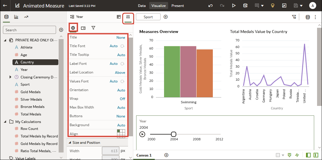
- On the General tab, you can change titles, fonts for titles, labels, and values, and other options such as background and alignment.
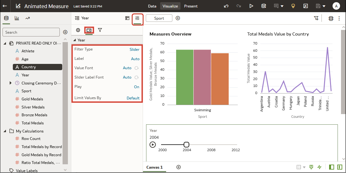
- On the Filter Controls tab, you can change labels, value fonts, and play options. To automatically play through the time values like an animation, set Play to on, or to enable dashboard consumers to select a time value interactively, set Play to off.
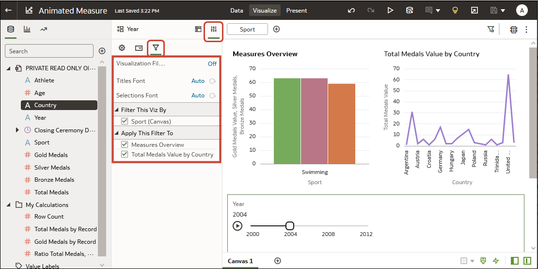
- On the Filter tab, you can choose fonts, and specify which visualizations are updated or 'played' by the dashboard filter.
Filter and Animate Visualizations using a Slider Dashboard Filter
As a workbook author, you add a slider dashboard filter to a workbook canvas so that you can filter and animate visualizations to show dynamically how your data changes over a given dimension such as time.

