Use Explain to Identify the Most Significant Segments of Records in Your Dataset
In Oracle Analytics, right-click a target column in your dataset, select Explain, then select the Segments tab. Within seconds, you can see a list of segments, each represented as a single bar in the top bar chart.
Segments are groups of records in your dataset which the Explain algorithm identified as having different values to the overall dataset average for the target column. The detailed results differ for measures and attributes.
If You're Explaining a Measure Column
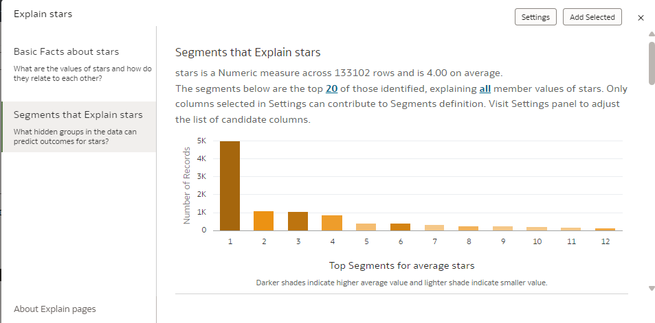
For measures, the Explain segmentation algorithm looks for groups of records in your dataset for which the average value is significantly different from the whole dataset average value. For example, if your target measure is Age and the average age for the whole dataset is 23, then a segment might be a group of records in your data where the age is 55, significantly higher that the whole dataset average. A single segment is defined by a few filters in the dataset that identify a group of records with an unusual average value for the column being explained. For example, the filters might be City and Job Type.
Description of the illustration explain-segment-metric.png
The vertical bar chart at the top indicates the size of each segment in the number of records (height of the bar), while the density of color indicates how far the segment average value is from the whole dataset average value.
The bullet charts at the bottom of the panel each represent a single segment in detail. Descriptions indicate the average measure value for a segment (the target measure), the total number of records in a segment, and the criteria defining a segment. On the chart, the bubble size represents the number of records in the segment, while the color and the position on the x-axis represent how far the average value of the segment is from the average value of the whole dataset (dotted line). You can hover over the chart to see the tooltip that displays these details. You can also adjust the sorting of all these segments, or you can display the list of the detailed segments as a table by editing the panel sorting or panel visualization type on top right of the panel.
If you're interested in a segment, click the segment to add it to your workbook canvas. When you add a segment to your workbook canvas:
- A table visualization is created with the count of rows in the segment and outside the segment.
- A custom calculation defining In or Out of the segment is created, which can be used to aggregate any measure in your dataset by this criteria. This object can also be used as a powerful filter for your canvas, showing how the records in a segment compare with those outside of it.
If You're Explaining an Attribute Column
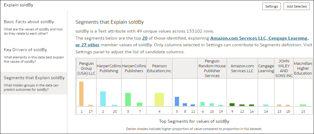
If your target is an attribute, in your overall data each distinct value of that attribute gathers a given proportion of records. For example, a column with two values Yes or No, might have 20% of Yes and 80% of No. The segment algorithm identifies groups of records in your data for which these proportions significantly vary from the average distribution. For example, Segment 1 might be a group of records in your data where Yes is 55% (instead of 20% for the whole dataset), and No is 45% (instead of 80% for the whole dataset). A single segment is defined by a few filters in the dataset that identify a group of records with an unusual distribution for the column being explained. For example, Segment 1 might be defined as all records in a given city and of a given age value.
Description of the illustration explain-segment-attribute.png
Explain scans your data and identifies many different segments. These are non-cumulative, that is, it's possible that a given record may belong to two distinct segments. The vertical bar chart at the top indicates the size of each segment in the records (height of the bar), whereas the color of the bar indicates the member value being analyzed. You can filter out specific member values by clicking the hyperlink in the text at the top of the page.
The horizontal bar charts at the bottom of the panel each represent a single segment in detail. Descriptions indicate the member value (for example, Yes or No) being analyzed, the total number of records in that segment, and the criteria defining the segment. The chart then represents the proportion of this value in the segment (colored zone) compared to the average proportion for the whole dataset (dotted line). You can hover over the chart to see the tooltip that displays this information in greater detail. You can also sort the segments and change how they are listed by editing the panel sorting or panel visualization type on the top right of the panel.
If you're interested in a segment, click the segment to add it to your workbook canvas. When you add a segment to your workbook canvas:
- A table visualization is created with the count of rows in the segment and outside the segment.
- A custom calculation defining In or Out of the segment is created, which can be used to aggregate any measure in your dataset by this criteria. This object can also be used as a powerful filter for your canvas, showing how records in a segment compare with those outside of it.