About Visualizations and Analyses
You use visualizations and analyses to find the answers that you need from key business and analytic data displayed in graphical formats.
Visualizations
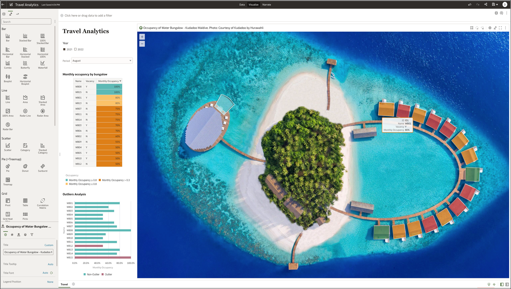
Visualizations enable you to dynamically explore multiple datasets in a graphical way, all within a single interface. You can visualize data from many commonly used data sources. Workbooks enable you to organize and share your visualizations.

Description of the illustration visualizationexample71.png
Analyses
Analyses are queries against your organization's data that provides you with answers to your analytical questions. Analyses enable you to explore and interact with information visually in tables, graphs, pivot tables, and other data views. You can also save, organize, and share the results of analyses with others.

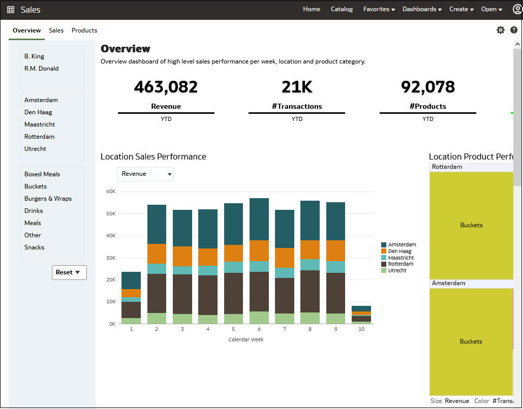
Description of the illustration sampledashboard71.png
Dashboards can include multiple analyses to give you a complete and consistent view of your company’s information across all departments and operational data sources. Dashboards provide you with personalized views of information in the form of one or more pages, with each page identified with a tab at the top. Dashboard pages display anything that you have access to or that you can open with a web browser including analyses results, images, text, links to websites and documents, and embedded content such as web pages or documents.
When you embed an analysis in a dashboard, the analysis automatically displays the most current data every time you access the dashboard. For example, if you need to see weekly sales performance over a range of products and locations you can run the dashboard to view the most up to date information.