What Can I Do with Conditional Formatting?
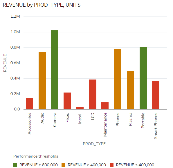
With conditional formatting, you apply rules to your data to highlight when something important happens. For example, you might use stoplight colors to show when revenues meet high, medium, and low thresholds. 
Description of the illustration conditional-format-example-threshold-1.png
You can apply conditional formatting rules to individual visualizations or to all visualizations on a canvas that evaluate using the same column.
Conditional formatting provides a way for business users to see events or changes in their data. For example, if users want to see when revenues meet high, medium, or low thresholds, you can create a conditional formatting rule that colors the revenue data points as green, orange, or red.
As a content author you can:
- Apply rules based on measure values, attribute values, and dates.
- Apply multiple rules at the same time.
- Apply multiple rules to measures and attributes at the same time.
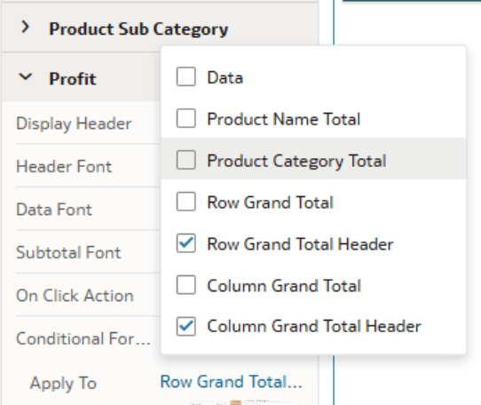
- Apply conditional formatting to data values, subtotals, and grand totals in tables and pivots.
- Change the order in which rules are applied.
- Turn rules on and off.
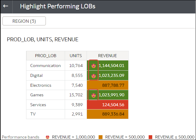
- Emphasize data in table, pivot, and tile visualizations with emojis and icons.
About Visualization-level Rules and Workbook-level Rules
- Visualization-level rules highlight data in a specific visualization in a workbook.
- Workbook-level rules can highlight data in any visualization that contains the column being highlighted.
Using Conditional Formatting with Totals and Sub-totals
For rules targeting measure columns, you can format:
- Subtotal values for any configured sub-total.
- Grand total values.
- Grand total headers.
Types of Comparison
Conditional formatting compares data values with one of the following:
- A set of thresholds.
For example, highlight values in red if my blood pressure is above 90 or under 70, or highlight bike hires in orange where the return date is greater than the end hire-period date.
- A target or goal.
For example, highlight values in red if my costs exceed my budget.
- A percentage of a target.
For example, highlight values in green when I reach 80% of my sales goal.
- A complex expression.
For example, highlight values in green when I achieve 5% growth in sales compared to the same period last year.
You can also apply conditional formatting based on attribute values. For example, you might highlight projects in green if a Status value is 'Open', or highlight projects in blue if a region value is 'East'.
With conditional formatting, you can:
- Format the fill color and color density.
- Format the font, font size, font color, and font style.
- Display emojis and icons in Table, Pivot, or Tile visualizations.
You can also:
- Apply conditional formatting to maps.
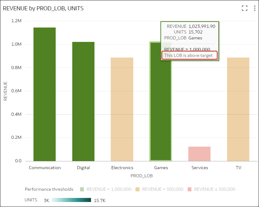
- Add labels, tooltips, and legends. For example, when you hover over a data point, display a label "This LOB is above target" to identify the rule applied.
- Highlight data in Table, Pivot, or Tile visualizations with icons and emojis. For example, you can use an emoji to highlight when revenue exceeds 1,000,000.
- Combine the formatting of values that match more than one rule, using the Enable rule blending option. The format displayed is a combination of the formatting rules, for example, you might see bold text from one rule and a red background from another rule. If you don't blend rules, only the first matching rule is applied (based on the order listed), and subsequent rules are ignored.
Example: you might have these two rules:
- Rule 1 is revenue greater than one million and highlights in green with the italic Calibri font.
- Rule 2 is revenue less than target and highlights in red with the Monospace font.
In this scenario, a revenue greater than one million but less than target has the italic Calibri font with the background highlighted in red.
If you're applying multiple rules to a measure, the last rule that evaluates to true is the one that colors the item. For example, you might have these two rules:
- Rule 1 is revenue greater than one million and highlights in green.
- Rule 2 is revenue less than target and highlights in red.
In this scenario, an item where revenue meets both criteria highlights in red.


