Before you Begin
This tutorial shows you how to create a workbook in Oracle Analytics with multiple canvases and visualization types.
Background
In this tutorial, you create a workbook with three canvases, create filters and data elements from calculations, and use the freeform and auto-fit layout properties in the workbook canvases.
To learn how to develop a presentation for your end users, see:
- Create a Presentation Using Auto Mode in Oracle Analytics
- Create a Presentation Using Manual Mode in Oracle Analytics
What Do You Need?
- Access to Oracle Analytics
- Download sample_order_lines.xlsx to your computer
Create a Dataset
In this section, you create a dataset using the sample_order_lines.xlsx file.
- Sign in to Oracle Analytics.
- On the Home page, click Create, and then click Dataset.
- In Create Dataset, click Drop data file here or click to browse.
- In Create Dataset Table from sample_order_lines.xlsx, click OK.
- Click Save
 . In Save Dataset As, enter
 sample_order_lines, and then click OK.
Description of the illustration sample_order_lines.png
Create the First Canvas in Visualize
In this section, you use the freeform canvas layout to arrange the visualizations and create data elements from calculations to use in the visualizations.
- Click Create Workbook.
- Click the Canvas 1
 tab, select Canvas Properties. In Canvas Properties, click Auto Fit in the Layout row, select Freeform, and then click OK.
 - In the Data
 pane, right-click My Calculations and click Create Calculation.
 - In New Calculation, enter
# of Customersin Name. In the expression field, enterCount, select CountDistinct. In the parenthesis, click column, enterCustand then select Customer Name. Click Validate. Click Save. - Right-click My Calculations and click Create Calculation.
- In New Calculation, enter
# of Ordersin Name. In the expression field, enterCount, select CountDistinct. In the parenthesis, click column, enterOrderand select Order ID. - Click Validate. Click Save.
You can find the calculation data elements in the Data pane's My Calculations folder.

Description of the illustration num_of_calcs.png - Click Save . In Save As, enter
Sales and Profitin Name and click Save.
Add Visualizations to the Canvas
- In the Data pane, select Sales and drag it to the canvas.
- In the Data pane, hold down the Ctrl key, select Profit, # of Customers and # of Orders. Drag the data elements to Sales tile visualization.
The Sales data element is the primary value in the tile visualization. Profit and the calculations are secondary values.

Description of the illustration sales_tile.png - In the Data pane, expand Ship Date. Hold down the Ctrl key, select Ship Date Year and Sales. Right-click, select Pick Visualization, and click Donut
 .
.

Description of the illustration sales_shipdate_year.png - In the Data pane, hold down the Ctrl key, select Sales and Product Sub Category, select Pick Visualization, and then select Picto
 .
.

Description of the illustration sales_prodsubcat.png - In the Data pane, hold down the Ctrl key, select Profit and Product Sub Category, select Pick Visualization, and then select Horizontal Bar.

Description of the illustration profit_prodsubcat.png - Click Visualizations
 . Select the Dashboard Filter
  control and drag it to the canvas.
 - Click Data . Select the following data elements and drag one at a time to the dashboard filter control:
- Order Date
- Order Priority
- Product Sub Category
- Customer Segment
- City
The dashboard filter control enables selecting the filters to apply to the data in the dashboard.

Description of the illustration sales_db_filters.png - Click Visualizations . Select Text Box
 and drag it to the canvas. In the Text Box, click Edit Text. Click B. Enter 24 in Font Sizes, click Align center, and then enter
 Sales and Profit. - Click the Canvas 1 menu , select Rename. Enter
Sales and Profitand click the check.
Description of the illustration sales_n_profit_canvas.png
Add a Second Canvas and Visualizations
- Click Create Canvas
 . Click the Canvas 2 menu , select Rename. Enter
 Customers Salesand click the check. - Click the Customer Sales canvas menu , select Canvas Properties. In Canvas Properties, click Auto Fit in the Layout row, select Freeform, and then click OK.
- Click Data. Hold down the Ctrl key, select Sales and Customer Segment. Right-click, select Pick Visualization, and then select Table.
- In the Data pane, select and drag Customer Segment to Color in the Grammar pane. Select and drag Product Sub Category to Filters in the Grammar pane.

Description of the illustration sales_custseg.png - In the Data pane, hold down the Ctrl key, select City and select # of Customers. Right-click, select Pick Visualization, and then select Table
 .
. - Click Properties
 . In Properties, click Layers
  . In Layer Type, click Auto (Point) in Layer Type and select Heatmap.
 - Click the Sales and Profit canvas tab. In the canvas, select the Dashboard Filter control. Expand the visualization menu
 , select Edit, and then select Copy Visualization.
 - Click the Customer Sales canvas tab. In the canvas, right-click, select Edit, and then select Paste Visualization.
Add Calculations and Visualizations
- In the Data pane, right-click My Calculations and click Create Calculation.
- In New Calculation, enter
Average Salesin Name. In the expression field, enterAvg. In the parenthesis, click column, enterSalesand select Sales. - Expand Operators. Double-click the divisor symbol (/) to add it to the expression. Drag the # of Customers calculation to the expression. Click Validate. Click Save.
Your expression should look similar to the following:
Avg(Sales)/# of Customers
- In the Data pane, right-click My Calculations and click Create Calculation.
- In New Calculation, enter
Average Profitin Name. In the expression field, enterAvg. In the parenthesis, click column, enterProand select Profit. - Expand Operators. Double-click the divisor symbol (/) to add it to the expression. Drag the # of Customers calculation to the expression.
Your expression should look similar to the following:
Avg(Profit)/ # of Customers
- Click Validate. Click Save.
- In My Calculations, drag Average Sales to the Customer Sales canvas. Drag Average Profit to the Customer Sales canvas.
- Click the Sales and Profit canvas. Hover over the Sales and Profit visualization text box, click display toolbar
 .
. - In the toolbar, click Menu, select Edit, and then select Copy Visualization. Click the Customer Sales canvas. In the canvas, right-click, select Edit, and then select Paste Visualization.
- Use the handles to move the text box to a title position in the canvas. Click display toolbar , click Menu, select Modify Text, and then enter
Customer Salesto replace Sales and Profit. Click Save.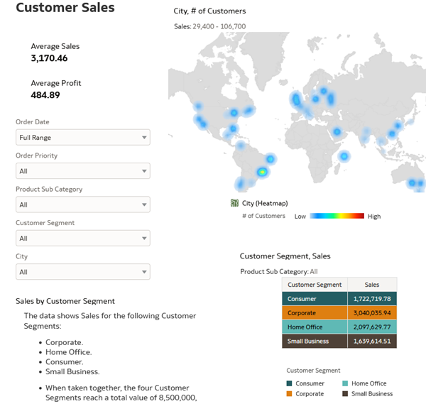
Description of the illustration cust_sales_canvas.png
Add a Third Canvas and Visualizations
- Click Create Canvas . Click the Canvas 3 menu , select Rename. Enter
Detailed Dataand click the check. - In the Data pane, hold down the Ctrl key, select Customer Name, # of Orders, Sales, and Profit. Right-click, select Pick Visualization, and then select Table.
- In the Data pane, drag Customer Name to Filters in the Grammar pane.
- In the Customer Name filter dialog, click Top Bottom N. In Count, click 10 and enter
20. In the By row, click Select Measure and select Profit.
Description of the illustration detailed_data_cust.png - Click the Sales and Profit canvas tab. In the canvas, select the Dashboard Filter control. Expand the visualization menu , select Edit, and then select Copy Visualization.
- Click the Detailed Data canvas tab. In the canvas, right-click, select Edit, and then select Paste Visualization.
- Click Visualizations . Select Text Box and drag it to the canvas. In the Text Box, click Edit Text. Click B. Enter 24 in Font Sizes, click Align center, and then enter
Customer Detailed Data.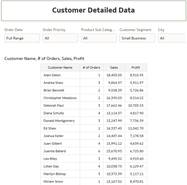
Description of the illustration detailed_data_canvas.png - Click Save .
Learn More
Create Workbook Canvases and Visualizations in Oracle Analytics
F86078-03
April 2025
Learn how to create canvases and visualizations in an Oracle Analytics workbook.
This software and related documentation are provided under a license agreement containing restrictions on use and disclosure and are protected by intellectual property laws. Except as expressly permitted in your license agreement or allowed by law, you may not use, copy, reproduce, translate, broadcast, modify, license, transmit, distribute, exhibit, perform, publish, or display any part, in any form, or by any means. Reverse engineering, disassembly, or decompilation of this software, unless required by law for interoperability, is prohibited.
If this is software or related documentation that is delivered to the U.S. Government or anyone licensing it on behalf of the U.S. Government, then the following notice is applicable:
U.S. GOVERNMENT END USERS: Oracle programs (including any operating system, integrated software, any programs embedded, installed or activated on delivered hardware, and modifications of such programs) and Oracle computer documentation or other Oracle data delivered to or accessed by U.S. Government end users are "commercial computer software" or "commercial computer software documentation" pursuant to the applicable Federal Acquisition Regulation and agency-specific supplemental regulations. As such, the use, reproduction, duplication, release, display, disclosure, modification, preparation of derivative works, and/or adaptation of i) Oracle programs (including any operating system, integrated software, any programs embedded, installed or activated on delivered hardware, and modifications of such programs), ii) Oracle computer documentation and/or iii) other Oracle data, is subject to the rights and limitations specified in the license contained in the applicable contract. The terms governing the U.S. Government's use of Oracle cloud services are defined by the applicable contract for such services. No other rights are granted to the U.S. Government.
This software or hardware is developed for general use in a variety of information management applications. It is not developed or intended for use in any inherently dangerous applications, including applications that may create a risk of personal injury. If you use this software or hardware in dangerous applications, then you shall be responsible to take all appropriate fail-safe, backup, redundancy, and other measures to ensure its safe use. Oracle Corporation and its affiliates disclaim any liability for any damages caused by use of this software or hardware in dangerous applications.
Oracle and Java are registered trademarks of Oracle and/or its affiliates. Other names may be trademarks of their respective owners.
Intel and Intel Inside are trademarks or registered trademarks of Intel Corporation. All SPARC trademarks are used under license and are trademarks or registered trademarks of SPARC International, Inc. AMD, Epyc, and the AMD logo are trademarks or registered trademarks of Advanced Micro Devices. UNIX is a registered trademark of The Open Group.
This software or hardware and documentation may provide access to or information about content, products, and services from third parties. Oracle Corporation and its affiliates are not responsible for and expressly disclaim all warranties of any kind with respect to third-party content, products, and services unless otherwise set forth in an applicable agreement between you and Oracle. Oracle Corporation and its affiliates will not be responsible for any loss, costs, or damages incurred due to your access to or use of third-party content, products, or services, except as set forth in an applicable agreement between you and Oracle.