Before You Begin
This 15-minute tutorial shows you how to create a random dataset, train a predictive model, create a live scenario, and use the datasets and scenarios in visualizations.
Background
In Oracle Analytics, predictive models use several embedded machine learning algorithms to mine your datasets, predict target values, or identify classes of records.
Oracle's machine learning functionality is for advanced data analysts who have an idea of what they're looking for in their data, are familiar with the practice of predictive analytics, and understand the differences between algorithms.
This is the first tutorial in Train and Apply Predictive Models in Oracle Analytics. Read the tutorials in the order listed.
- Create a Random Sample Dataset and Train a Prediction Model
- Inspect and Modify the Prediction Model
- Apply a Predictive Model
What Do You Need?
- Access to Oracle Analytics Cloud
- Download donation.xlsx to your computer
Create a Dataset
In this section, you create a dataset using the donation file. When Oracle Analytics loads numerical data, it's treated as a measure. You learn how to add a custom date format.
- Sign in to Oracle Analytics.
- On your home page, click Create, and then click Dataset.
- In Create Dataset, click Drop data file here or click to browse, select the donation.xlsx file, and then click Open.
- In Create Dataset Table from donation.xlsx, click OK.
- Click the donation tab.
- Right-click the DATE_POSTED column, click Options, and select Convert to Date.
- In Convert to Date, select Custom from the Source Format list, and then enter
dd.MMM.yyyyas the date format. Click Add Step. - Click the PROJECTID column. In Treat As, click Measure and select Attribute.
- Click Save
 . In Save Dataset As, enter
 donationin Name, and then click OK.
Visualize the Data
In this section, you create visualizations with the donation dataset as a baseline to compare with the workbook that uses a random set of the donation data.
- Click Create Workbook. Close the Auto Insights panel.
- Click the Canvas 1 menu
 . Select Canvas Properties.
 - In Canvas Properties, click Auto Fit in the Layout row, select Freeform, and then click OK.
- In the Data pane, right-click My Calculations and select Create Calculation.
- In New Calculation, enter
Number of Projectsin Name. For the expression, enterCountand select Count. In the column placeholder, enterProjand select PROJECTID. Click Validate and click Save. - Drag Number of Projects to the canvas.
The tile visualization shows the number of projects in the dataset.

Description of the illustration num_projects.png - In the Data pane, hold down the Ctrl key, select TOTAL_DONATIONS and DATE_POSTED. Right-click and select Create the Best Visualization.
- In the Grammar panel, right-click DATE_POSTED, select Show By, and then select Quarter.
- In the Data pane, drag TOTAL_DONATIONS to the canvas.
Description of the illustration 3_vizs.png - Click Save. In Save Workbook, enter
Donations_Workbookin Name, and then click Save. Click Go back  .
.
Create a Random Dataset
- On your home page, click Create, and then click Data Flow.
- In Add Data, select the donation dataset, and then click Add.
- In Data Flow Steps, double-click Filter. In Filter, click Add Filter
 . From Available Data, select DATE_POSTED. In Range values, enter
 6/01/2012in the first calendar text box. Enter5/31/2014in the second calendar text box. Click outside the dialog.
Description of the illustration dataset_range_dates.png - Click the donation node. Double-click Add Columns.
- In Add Columns, enter
Random Filterin Name, and then enterRAND()in the Expression field. Click Validate, and then click Apply. - Click the Filter node and click Add Filter next to the DATE_POSTED filter. From Available Data, click Random Filter. Click the End field, enter
.15to select a maximum of 15% of the sample data, and then click End.
Description of the illustration filter_dataset.png - Click Add a step
 on the Filter node, and then click Select Columns. In Select Columns, select Random Filter from the Selected Columns list, and then click Remove selected.
You don't need the Random Filter column in the dataset.

Description of the illustration remove_random_filter.png - From Data Flow Steps, drag Save Dataset to the Select Columns node. In Save Dataset, enter
sample_donation_data. - In Save Dataset under Columns, click Sum in the PROJECTID row, and then select Count from Default Aggregation list.
- In the SCH_LATITUDE and SCH_LONGITUDE columns, select Measure in the Treat As column and click Attribute.

Description of the illustration sample_donation_data_df.png - Click Save. In Save Data Flow As, enter
sample_donations_data_df, and then click OK. - Click Run Data Flow
 to create the sample dataset.
Examine the Sample Donations Dataset
- Click Go back . On your home page, select the sample_donation_data dataset, click the Actions
 , and then select Create Workbook.
 - Click the Canvas 1 menu . Select Canvas Properties.
- In Canvas Properties, click Auto Fit in the Layout row, select Freeform, and then click OK.
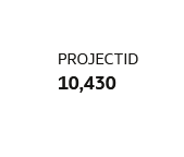
- Drag PROJECTID to the canvas.
Because the sample data is a random selection of records from the dataset, your PROJECTID visualization might not match the results in this visualization.
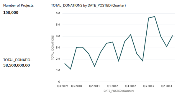
Description of the illustration sample_data_projectid_viz.png - In the Data panel, hold down the Ctrl key, select TOTAL_DONATIONS and DATE_POSTED. Right-click and then select Create the Best Visualization.
- In the Grammar panel, right-click DATE_POSTED, select Show By, and then select Quarter.
- In the Data panel, drag TOTAL_DONATIONS to the canvas.

Description of the illustration sample_data_total_donations_date.png - Click Save. In Save Workbook, enter
donations_random_sample, and then click Save. Click Go back to return to your home page.
Create a Training Model
- On your home page, click Create, and then click Data Flow.
- In Add Data, select the sample_donation_data dataset, and then click Add.
- From Data Flow Steps, double-click Train Numeric Prediction.
- In Select Train Numeric Prediction Model Script, select Elastic Net Linear Regression for model training, and then click OK.
- In Train Numeric Prediction, click Select a column. From Available data, select TOTAL_DONATIONS as the Target.
- Click the Save Model node in the data flow. Enter
elastic_model_1in Model name.
Description of the illustration train_model_dataflow.png - Click Save. In Save Data Flow As, enter
elastic_train_dfin Name, and then click OK. - Click Run Data Flow.
- In the message "Data Flow elastic_train_df complete", click Go back to return to your home page.
- On your home page, click Machine Learning to view the elastic_model_1 output. Click the Actions , and then select Inspect.
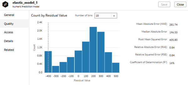
Description of the illustration elastic_model_1_quality.png
Apply the Train Model to a Workbook
In this section, you add the predicted value for total donations to the Total Donations by Date Posted (Month) visualization to view the results of using the elastic model.
- Click Workbooks and Reports.
- On your home page, search for your
donations_random_sampleworkbook. - In the donations_random_sample workbook, click the Actions , and then select Open Click Edit
 .
. - Click the PROJECTID visualization, click Menu , and then select Delete Visualization.
- Click the TOTAL_DONATIONS visualization, right-click and select Delete Visualization.
- In the Data panel, click Add
 , and then click Create Scenario.
 - In Create Scenario - Select Model, select elastic_model_1, and then click OK.

Description of the illustration scenario_in_data.png - Click the visualization. In the Data panel, expand elastic_model_1, select TOTAL_DONATIONS Prediction, and then drag it to Values (Y-Axis) in the Grammar panel.
The green line represents the actual donations data by date posted. The orange line represents the predicted donations.

Description of the illustration total_donat_prediction.png - In the Data pane, select SCH_METRO, drag it to Trellis Columns in the Grammar panel.
The visualization shows the donations data divided into school metro groups: rural, suburban, and urban.

Description of the illustration donations_by_sch_metro.png - In the Grammar panel, click the X in SCH_METRO to remove it from the visualization. Click Save.
Next Steps
Learn More
Create a Random Sample Dataset and Train a Prediction Model in Oracle Analytics
F27510-09
July 2026
Learn how to create a random dataset, train a predictive model, create a live scenario, and inspect the model quality and related datasets in Oracle Analytics.
This software and related documentation are provided under a license agreement containing restrictions on use and disclosure and are protected by intellectual property laws. Except as expressly permitted in your license agreement or allowed by law, you may not use, copy, reproduce, translate, broadcast, modify, license, transmit, distribute, exhibit, perform, publish, or display any part, in any form, or by any means. Reverse engineering, disassembly, or decompilation of this software, unless required by law for interoperability, is prohibited.
If this is software or related documentation that is delivered to the U.S. Government or anyone licensing it on behalf of the U.S. Government, then the following notice is applicable:
U.S. GOVERNMENT END USERS: Oracle programs (including any operating system, integrated software, any programs embedded, installed or activated on delivered hardware, and modifications of such programs) and Oracle computer documentation or other Oracle data delivered to or accessed by U.S. Government end users are "commercial computer software" or "commercial computer software documentation" pursuant to the applicable Federal Acquisition Regulation and agency-specific supplemental regulations. As such, the use, reproduction, duplication, release, display, disclosure, modification, preparation of derivative works, and/or adaptation of i) Oracle programs (including any operating system, integrated software, any programs embedded, installed or activated on delivered hardware, and modifications of such programs), ii) Oracle computer documentation and/or iii) other Oracle data, is subject to the rights and limitations specified in the license contained in the applicable contract. The terms governing the U.S. Government's use of Oracle cloud services are defined by the applicable contract for such services. No other rights are granted to the U.S. Government.
This software or hardware is developed for general use in a variety of information management applications. It is not developed or intended for use in any inherently dangerous applications, including applications that may create a risk of personal injury. If you use this software or hardware in dangerous applications, then you shall be responsible to take all appropriate fail-safe, backup, redundancy, and other measures to ensure its safe use. Oracle Corporation and its affiliates disclaim any liability for any damages caused by use of this software or hardware in dangerous applications.
Oracle and Java are registered trademarks of Oracle and/or its affiliates. Other names may be trademarks of their respective owners.
Intel and Intel Inside are trademarks or registered trademarks of Intel Corporation. All SPARC trademarks are used under license and are trademarks or registered trademarks of SPARC International, Inc. AMD, Epyc, and the AMD logo are trademarks or registered trademarks of Advanced Micro Devices. UNIX is a registered trademark of The Open Group.
This software or hardware and documentation may provide access to or information about content, products, and services from third parties. Oracle Corporation and its affiliates are not responsible for and expressly disclaim all warranties of any kind with respect to third-party content, products, and services unless otherwise set forth in an applicable agreement between you and Oracle. Oracle Corporation and its affiliates will not be responsible for any loss, costs, or damages incurred due to your access to or use of third-party content, products, or services, except as set forth in an applicable agreement between you and Oracle.