Create a Custom Action
To create a custom action, you provide its metadata in a JSON file and its code in a JavaScript file. The metadata contains basic details about the action, any input parameters needed by its implementation method, and optionally, an object for returning values.
Here’s an overview of what’s required to create a custom action:
- Create the Action Files:
- action.json: Contains the metadata for the custom action. Used to define input parameters and to define an object for returning values. This file is also used by the Designer to add the action to the Actions palette, and to display the action's properties in the Properties pane.
- action.js: Contains the code used to implement the custom action.
- Add the Metadata to
action.json. - Add the code for the custom action to
action.js.
Create the Action Files
To create the template action.js and action.json files, for you to start with:
-
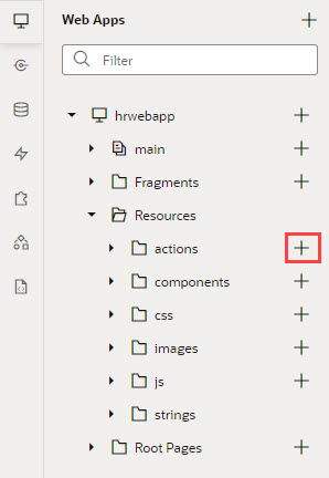
Select the Web Apps tab, expand the Application node (first node) and the Resources node under it, then click the Create Custom Action icon (+) next to the actions node:

Description of the illustration create-custom-action-web-apps-tab.jpg - In the ID field, enter the name of the action group folder for your new custom action, followed by a forward slash and the name of your new action, as in:
<action-group>/<action-name>For example, you might enter
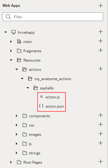
my_awesome_actions/sayhello, wheremy_awesome_actionsis the name of your group folder, andsayhellois the name of your action.The two newly created
action.jsandaction.jsontemplates are stored under the pathresources/actions/<action-group>/<action-name>/, as shown here:
Description of the illustration custom-action-files-navigator1.jpg
Add the Metadata
You provide the custom action’s metadata in the action.json file, which includes:
- The action’s basic details (ID, display name, icon…)
- An object used to return values from the action's implementation method (optional)
- Input parameters needed by the action's implementation method (optional)
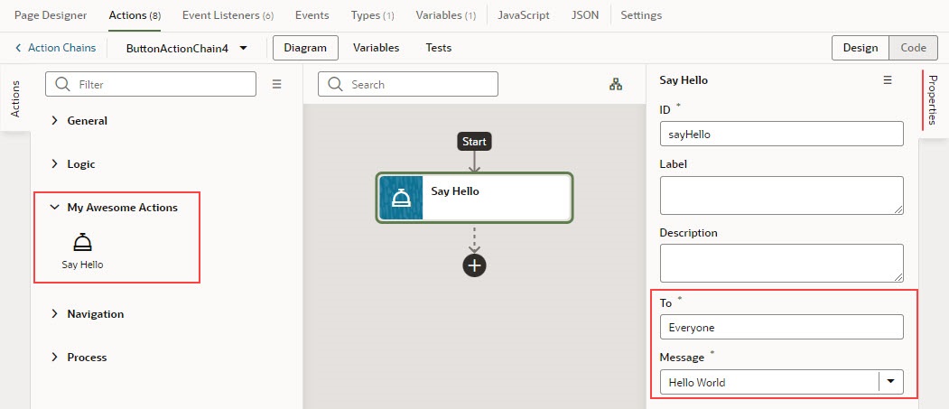
The Action Chains editor uses the metadata to add the custom action to the Actions palette and to display its parameters in the Properties pane:
Description of the illustration custom-action-sayhello-editor-appui-version.jpg
When you created the action.json file, the default parameters, ID and Description were automatically created for you, but their metadata isn’t added to action.json. You only add the metadata for the input parameters and the return object that you want to add to the custom action.
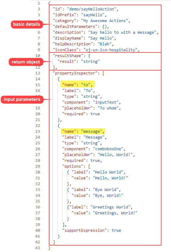
Here's an example of the action.json file for the sample sayHello custom action, with a breakdown of its parts:
Description of the illustration custom-action-parts-metadata1.png
- The first set of properties provide the basic details about the custom action.
- The
resultShapeproperty provides the definition for the object returned by the action's implementation method, which can be used as input for another action when creating an action chain. For instance, the string returned by this action can be an input for an action that writes the string to a log file. - The
propertyInspectorproperty defines the action's input parameters.
Define the Custom Action's Properties
Use this table to help you define the properties for your custom action in the action.json file.
| Property | Required | Description |
|---|---|---|
| "id": "", | Yes | Unique ID for custom action. |
| "category": "My Category", | No | Category to contain custom action in Actions palette. If not specified, action is placed under the default category for custom actions, Custom. |
| "defaultParameters": { }, | No | If input parameters are defined and they need default values, use this property to specify default values for them by specifying the input parameter names and their values (name-value pairs). Defaults are assigned when action is first added to an action chain. |
| "description": "", | No | Brief description of custom action. |
| "displayName": "", | Yes | Name to display in Actions palette. |
| "helpDescription": "", | No | Help text to appear for action when user hovers over action's title in Properties pane and clicks the question mark icon. |
| "iconClass": "", | Yes | Icon to display for action in Actions palette. |
| "idPrefix": "", | No | Used to auto-generate action IDs for actions when they are added to action chains. When action is added to an action chain, action's ID field in the Properties pane is auto-populated. If specified, ID field is populated using this property's value, otherwise, the action's name is used. |
| "resultShape": { "someName": "string" }, | No | If one or more values are to be returned by the implementation method, use this property to define the object to return them. |
| "showInDiagram": "on" | "off" | No | If set to on, action is available on Actions palette of flow diagram.
|
| "tests": { "requiresMock": "on" | "off" } | No |
Setting for action's mock requirements for action chain tests: on: Indicates action needs to be mocked. off: Indicates Visual Builder provides suggestions for expected action results if Default is |
| "propertyInspector": [{}] | No | Metadata for the input parameters needed by implementation method. Input parameters are displayed in Properties pane of Actions editor. |
Define Input Parameters for a Custom Action
Use this table to help you define input parameters for your custom action. In the action.json file, use the propertyInspector property to define the parameters you need:.
| Property | Required | Description |
|---|---|---|
| "name": "", | Yes | Name of input parameter. |
| "help": "", | No | Help text to appear for input parameter when user hovers over parameter's title in Properties pane and clicks the question mark icon. |
| "label": "", | Yes | Label to display for input parameter in Properties pane. |
| "placeholder": "", | No | Hint text to display for input parameter in Properties pane. |
| "required": true | false, | No | Indicates if a value is required for input parameter. |
| "options": [{}], | No | If component property for input parameter is set to comboboxOne or comboboxMany, use this property to specify all of the values to be available for the combobox.
|
| "type": "", | Yes | Parameter's data type, which can be number, string, boolean or object; if the type is not specified, values are stored as strings. |
| "component: "inputText | textArea | comboboxOne | comboboxMany" | Yes | Indicates if parameter is a text field, text box or a combobox with single or multiple selections. |
Add the Code
You provide the code for your custom action using the action.js template file that was created for you when you first created the new action.
To provide the code for your action, use the perform() method, which receives the input parameter, parameters. The input parameter contains the values for the action’s input parameters, as entered in the Properties pane.
How Are Input Parameters Passed?
Here's an example of the perform() method, in action.js, that implements the sample sayHello custom action by using the alert() method:
define(['vb/action/action'], (Action) => {
            'use strict';
            class CustomAction extends Action {
               perform(parameters) {
                  const to = parameters.to;
                  const message = parameters.message;

                  alert(`${message}, ${to}`);

                  if (to && message ) {
                     return Action.createSuccessOutcome({result: to + ", " + message});
                  }
                  return Action.createFailureOutcome({result: "Something wrong, unable to SayHello"});
               }
            }
            return CustomAction;
          });
The values you enter for the action’s input parameters, To and Message, in the Properties pane, are passed to the perform() method using the input parameter, parameters.
Description of the illustration custom-action-properties-inspector-sayhello2.jpg
How are Values Returned?
If you need one or more values returned by the method that implements the custom action, you need to define the object that returns them in action.json. You do so by using the resultShape property.
To return values from the implementation method, you use the createSuccessOutcome() method of the Action class.
As an example, here's the declaration of the return object for the sample sayHello custom action:
"resultShape": { "result": "string" },And here's the code line in action.js using the createSuccessOutcome() method to return a string:
return Action.createSuccessOutcome({result: to + ", " + message});Specify Path to Code
Lastly, you need to tell Visual Builder where the custom action's code file is stored, by adding a requirejs property to the app-flow.json file. Here are the steps:
- In the Navigator, on the Web Apps tab, select the web app, then select the JSON tab to open the
app-flow.jsonfile. - Specify the path to the custom action’s code file by adding a
requirejsproperty inapp-flow.jsonand naming the path, using this format:
“<custom-action-ID>”: “resources/actions/<action_group>/<action_name>”In this example, <custom-action-ID> is the ID for the custom action (case sensitive), as specified in action.json.
Here's an example of specifying the path:
"requirejs": {
   "paths": {
      "demo/SayHello": "resources/actions/my_awesome_actions/sayhello/action"
    }
},