Access Data in Chart Format with Table Hyperlinks
Table Hyperlink data can be viewed in chart format when accessed from a browser. You can customize chart titles, axes, grouping, and chart types to represent your data better. There are multiple types of chart views available to provide a better visualization of your data.
Use Table Hyperlinks and View Data in Chart Format
To view data in chart format, append the ?view=table query parameter to any Table Hyperlink URL.
For example, from a browser enter a Table Hyperlink URL with ?view=table appended:
https://dataaccess.adb.us-ashburn-
1.oraclecloudapps.com/adb/p/F5Sn..._example/data?view=table
You will view the Table Hyperlink data in tabular format.
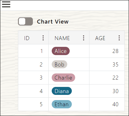
Description of the illustration table-view.png
Toggle Chart View to view the tabular data in form of a chart.
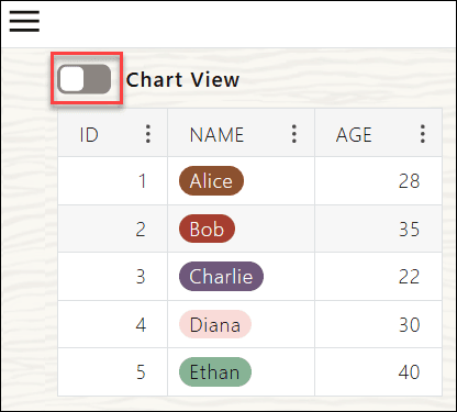
Description of the illustration toggle-chart-view.png
Alternatively, you can also see the Chart View of the tabular data from the Table Hyperlink Hamburger Menu 
on the Table Hyperlink page. See Switch between Chart and Table View for more information.
In addition to toggling between Chart and Table views using the Table Hyperlink Hamburger Menu, you can also split or merge grouped tables and choose which table columns to display from it. See Manage Data with the Table Hyperlink Hamburger Menu to explore Table Hyperlink Hamburger Menu.
Switching to Chart View automatically displays the first column’s data in the chart. The following screenshot displays the data of the ID column in Chart View.
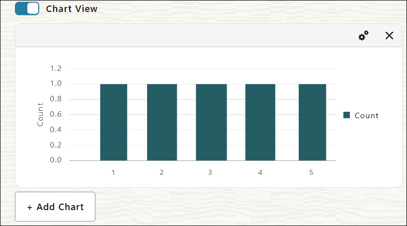
Description of the illustration chart-view-first-column.png
See Create a New Chart for details on creating a chart from column menu of the tabular data.
The data in the table format converts into a chart with default settings. If there is additional data, you can click the Load More Data button at the top of the page to fetch the next page of data.
The system retains your last chart view configuration until you refresh the page. When you toggle between Table and Chart views, you see charts using your last saved configuration. Charts are created dynamically using your Table Hyperlink data.
You can return to the tabular view by toggling off the Chart View switch at the top of the page. Optionally, you can also return to the tabular view by clicking the Show Tables in the Table Hyperlink Hamburger menu.
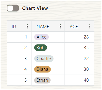
Description of the illustration show-table-view.png
Create a New Chart
Follow these instructions to create a new chart.
-
Click + Add Chart on the Table Hyperlinks page.
A new chart appears with the default Bar chart settings.
-
To return to tabular view, toggle off Chart View from the Table Hyperlink Hamburger menu.
-
Optionally, you can create a chart directly from a column drop-down menu in the data table.
-
Open the column menu and select Create Chart.
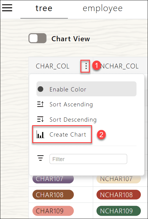
Description of the illustration create-chart-column.png
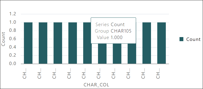
The selected column is automatically used for the X Axis.
In this example, you can view CHAR_COL in X Axis.
Note: When you configure settings for a chart view, the system remembers these settings. If you disable the chart view, perform other actions, and then return to the chart view, the chart is displayed using the previous settings.
-
-
Each chart displays detailed information in a popup when you hover over data points or chart areas.
Customize your Charts
You can customize chart settings such as chart name, type, and orientation. The customizable settings vary depending on the type of the chart. You can configure the chart settings after you create a chart.
To customize a chart view:
-
Click Chart Options on the Chart View you want to customize.
The available chart options vary depending on the type of chart you select.
-
Specify the following field values:
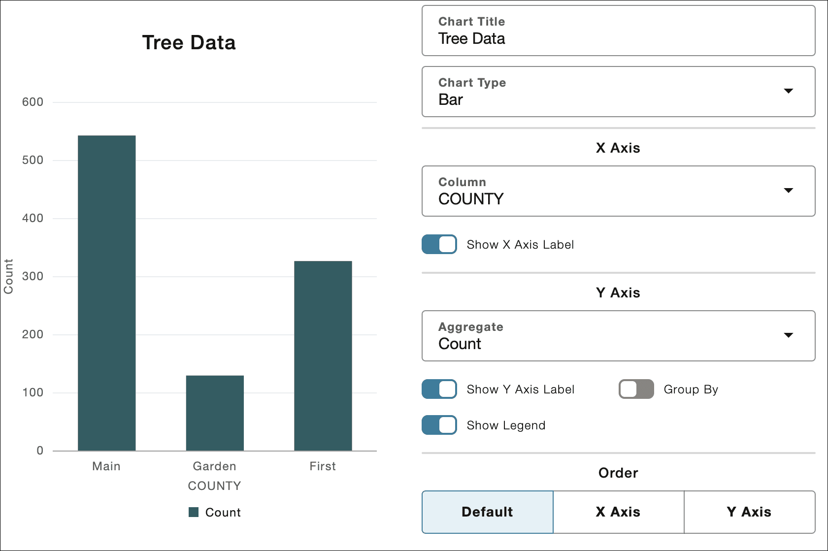
Description of the illustration tree-data.png
a. Chart Title: Enter the name of the chart. For example, Tree Data.
b. Chart Type:You can select any of the following available options from the drop-down. Each chart type supports specific customization options:
-
Bar Chart Customization: When you select Bar in the Chart Type field, you can configure the chart as described in theBar Chart Customization section.
-
Line Chart Customization: When you select Line in the Chart Type field, you can configure the chart as described in theLine Chart Customizations section.
-
Scatter Plot Customization: When you select Scatter in the Chart Type field, you can configure the chart as described in theScatter Plot Customization section.
-
Pie Chart Customization: When you select Pie in the Chart Type field, you can configure the chart as described in thePie Chart Customizations section.
-
Bar Chart Customization
A Bar Chart displays a graphical summary of multiple data values for comparison purposes. The default chart view is a Bar chart.
Description of the illustration chart.png
-
Under X Axis, select any of the column’s data you want to view on the x axis for Column. The default option is the leftmost column from the table view.
-
Under Y Axis, select the following field values:
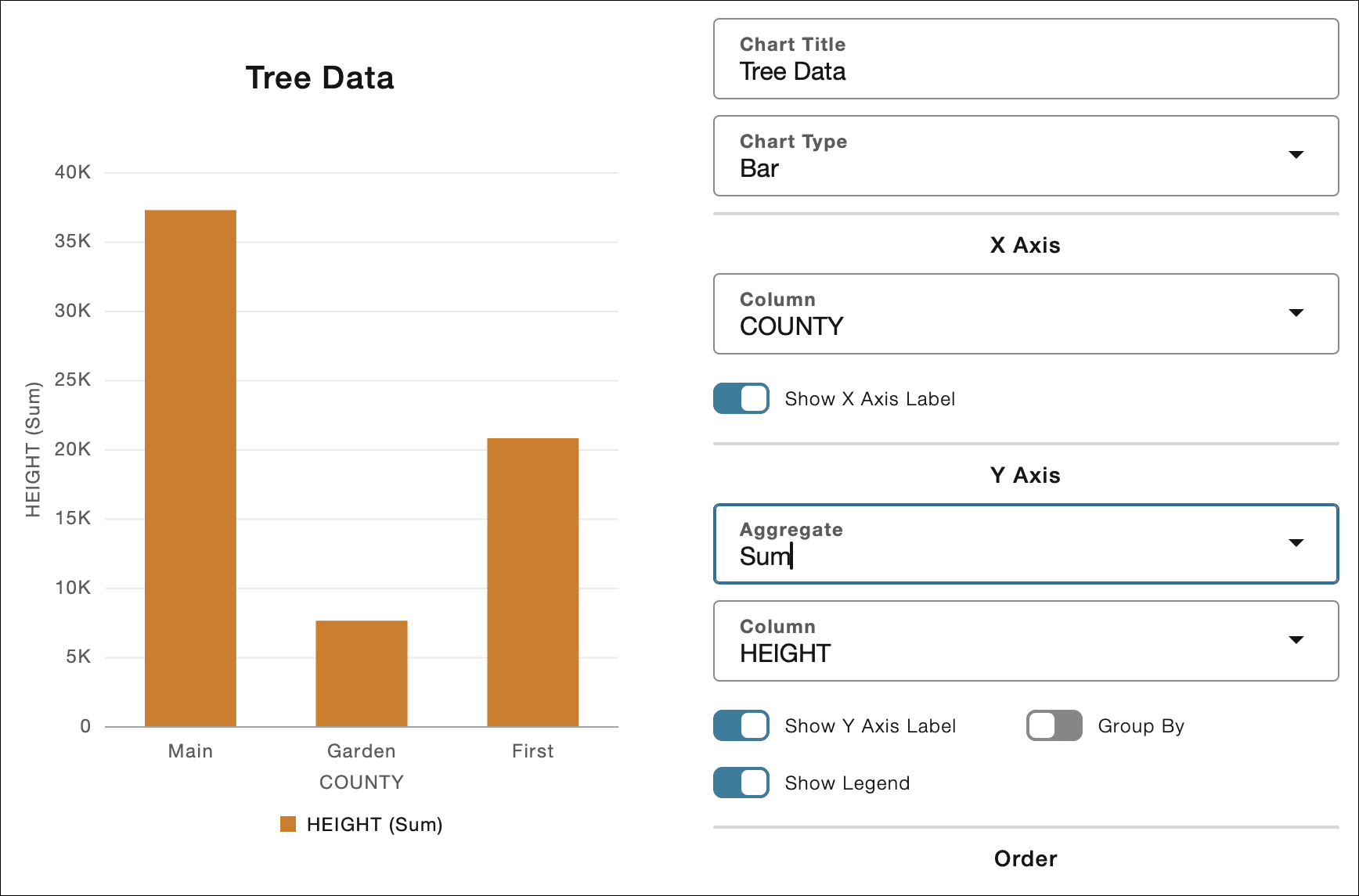
a. Aggregate: Select one of the available aggregation functions you want to perform on the Column field.: Count (default), Sum, Min, Max, or Average.
b. Column: When any other Aggregate except Count is selected, you can view this field to specify which column to aggregate the data on. This field displays only numeric columns, with the default selection being the leftmost numeric column in the table that isn’t already chosen for the X axis.
c. Toggle the Show Y Axis Label switch to show or hide the Y Axis Label.
d. Toggle the Show Legend switch to show or hide the chart legend.
e. You can use Group By to enable secondary grouping. The default group is the leftmost column that hasn’t been assigned to either the X Axis or the aggregation column.
f. You can use Stack to display group bars stacked or side-by-side. This determines whether group bars are displayed stacked on top of each other or side-by-side.
-
Under Order, you can select any of the available options to choose how to display the data:
a. Default: Displays data as it is.
b. X Axis – Sorts data in ascending alphanumeric order by X axis values.
c. Y Axis – Sorts bars by increasing height. This field is not available if you select Group By.
Line Chart Customizations
A Line Chart displays values for one or more resources over a period of time. Each point on the line represents an actual value at a point in time.
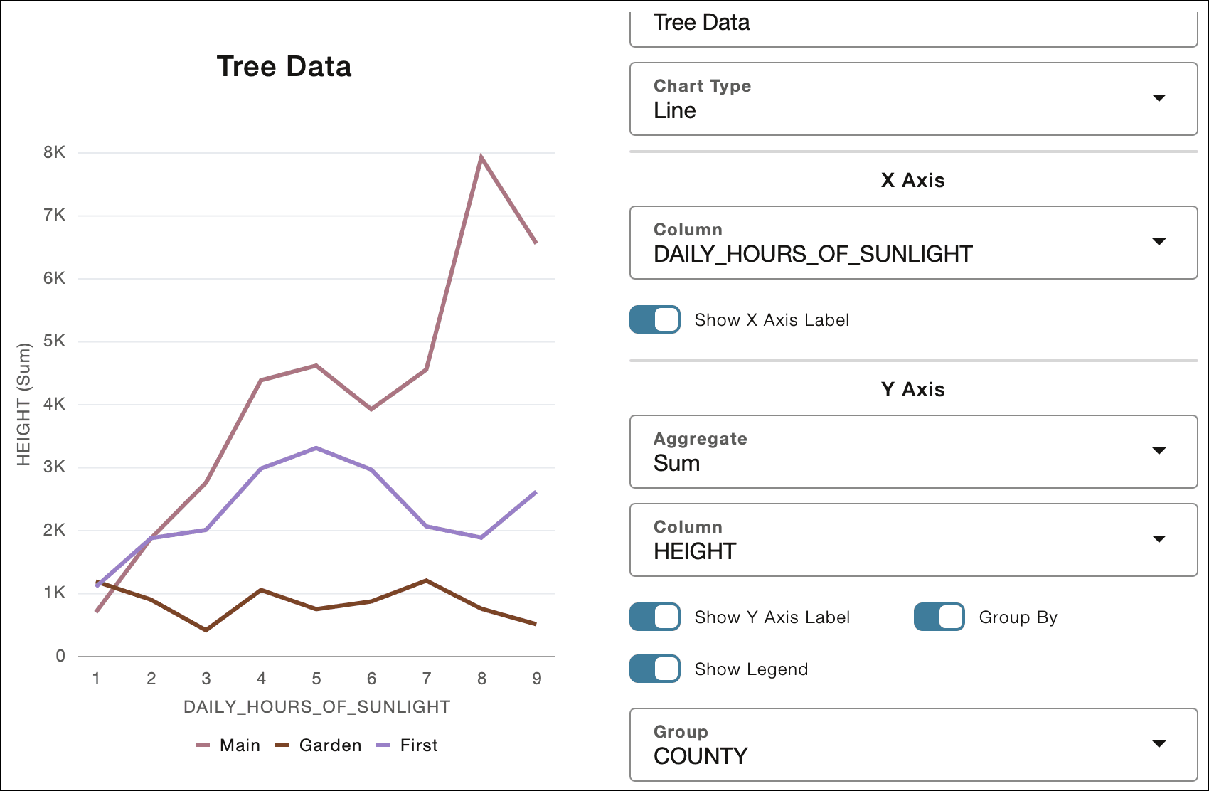
Description of the illustration line-chart.png
-
Under X Axis, select any of the column’s data you want to view on the x axis for Column. The default option is the leftmost column from the table view.
-
Under Y Axis, select the following field values:
a. Aggregate: Select one of the available aggregation functions you want to perform on the Column field.: Count (default), Sum, Min, Max, or Average.
b. Column: When any other Aggregate except Count is selected, you can view this field to specify which column to aggregate the data on. This field displays only numeric columns, with the default selection being the leftmost numeric column in the table that isn’t already chosen for the X axis.
c. Toggle the Show Y Axis Label switch to show or hide the Y Axis Label.
d. Toggle the Show Legend switch to show or hide the chart legend.
e. You can use Group By to enable secondary grouping.
Note: The Stack option is disabled when Group By is enabled.
f. The Line charts are by default arranged in ascending order by X Axis value.
Scatter Plot Customization
A Scatter Charts display data points, with each point representing a dimension value.
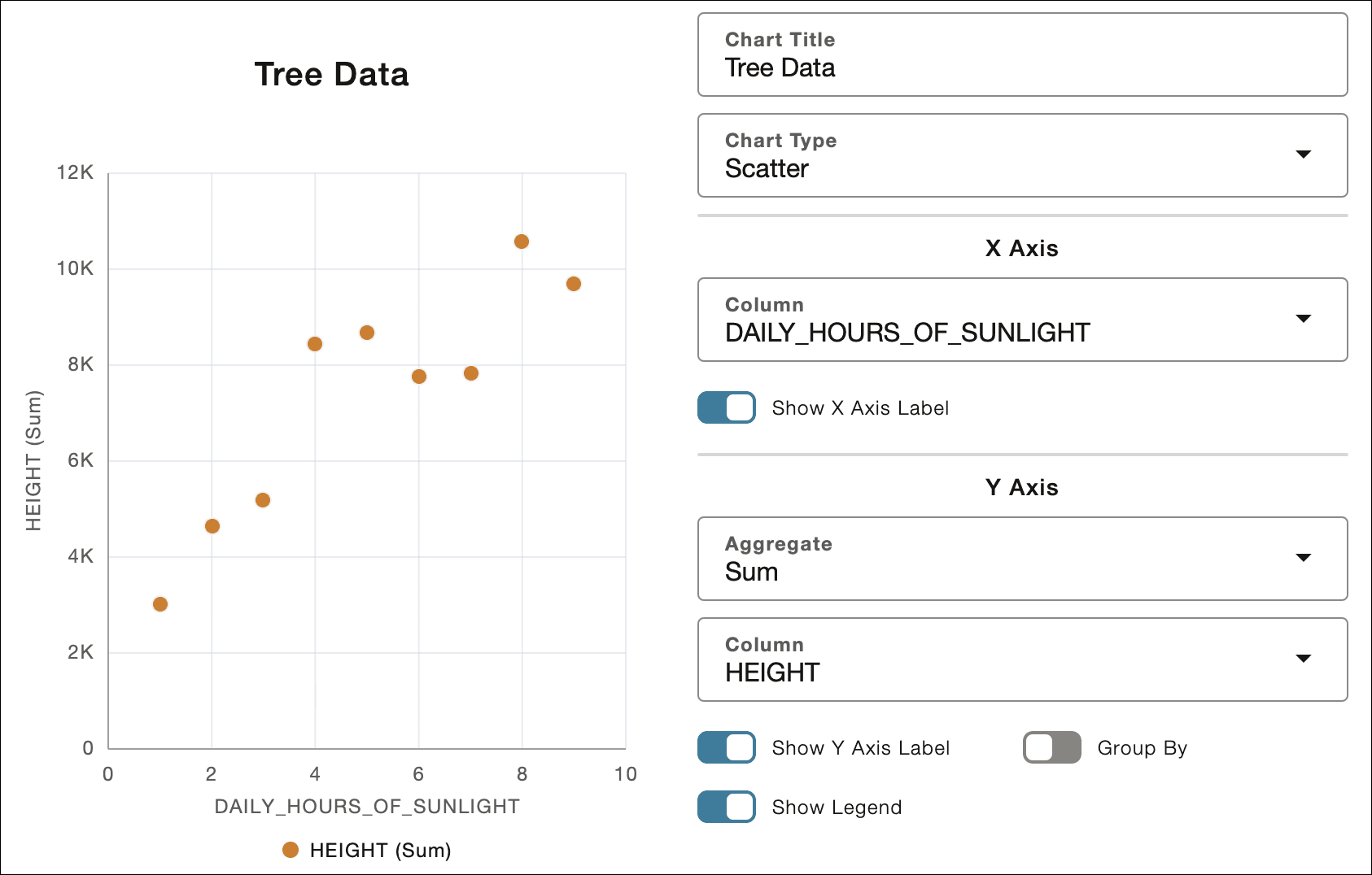
Description of the illustration scatter-chart.png
-
Under X Axis, select any of the column’s data you want to view on the x axis for Column. Only numeric columns are available in the drop-down. The default option is the leftmost column from the table view.
Note: If you select a non-numeric column, you will see an informational message stating that a scatter plot cannot be created using the selected X-Axis column.
You can toggle the Show X Axis Label switch to view or hide the x axis label.
-
Under Y Axis, select the following field values:
a. Aggregate: Select one of the available aggregation functions you want to perform on the Column field.: Count (default), Sum, Min, Max, or Average.
b. Column: When any other Aggregate except Count is selected, you can view this field to specify which column to aggregate the data on. This field displays only numeric columns, with the default selection being the leftmost numeric column in the table that isn’t already chosen for the X axis.
c. Toggle the Show Y Axis Label switch to show or hide the Y Axis Label.
d. Toggle the Show Legend switch to show or hide the chart legend.
e. You can use Group By to enable secondary grouping.
Note: The Stack option is disabled when Group By is enabled.
f. Scatter plots are all arranged in ascending order by X Axis value.
Pie Chart Customizations
A Pie Chart displays a circular graph which is divided into slices to compare data sets with one another.
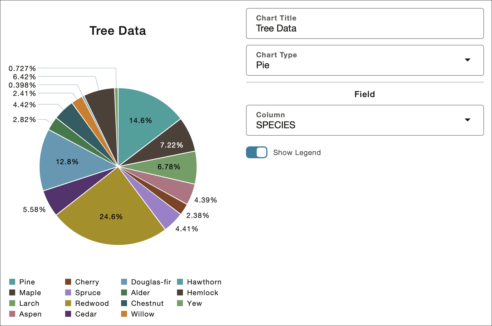
Description of the illustration pie-chart.png
Under Field, select the column that determines the pie chart slices.
Note: The default selection matches the X Axis column used in a Bar Chart.
Toggle the Show Legend switch to show or hide the chart legend.