View the Sites & Channels Analytics Dashboard
The Sites & Channels Analytics Dashboard lets you see usage, utilization, and traffic analytics for your created sites and channels.
To view the Sites & Channels Analytics Dashboard:
-
After you sign in to the Oracle Content and Experience Cloud web application as an administrator, click Analytics in the navigation menu.
-
In the Analytics menu, choose Sites & Channels.
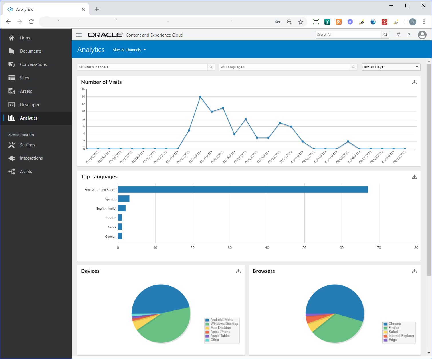
On this dashboard, a service administrator can view analytics for all of their sites and channels in all languages over a period of time. Or you can view analytics for specified sites, channels, and languages.

Description of the illustration sites_channels_dashboard_1.png
The Analytics for Sites & Channels dashboard include the following graphs and charts:
-
A line graph indicates the number of visits over a number of days for sites and channels.
This counts visits that are unique within a 1-hour period. So, if you visit a site 20 times within 1 hour, it still counts as only 1 unique visit.
You can specify how many days your Number of Visits graph covers, like the last 30 days.
-
A bar chart shows the six top languages for site and channel visits.
-
Pie charts show devices and browsers used to visit sites and channels.
-
Bar charts show the most visited and least visited sites and channels over a number of days.
You can download a graph or chart in a CSV file that contains the data being displayed. See About the Charts, Graphs, and Downloadable Report Files for graph and chart features.