Add Components and Section Layouts
Components are the individual parts of a web page. A section layout automatically organizes content added to it, making it easy for a contributor to add content without spending time formatting it on the page.
Add Components
To add a component to a page:
-
Navigate to the page you want to edit and make sure that
 is set to Edit.
-
Click
 and then one of the following types of components:
-
Click Themed to show the list of components that were chosen to be used in the theme associated with the site.
-
Click Custom to show the list of custom components that were shared with you.
-
Click Seeded to show the list of default components available with the service.
-
Click All to show all components that were shared with you.
-
-
Click and hold a specific icon and drag it where you want it on the page. When you drag an item to the page, the boundaries of available slots, section layouts, and any existing items are shown. A placement icon
 or a vertical placement bar
  (put it to the left or right) indicates where the new content will go. A solid border around a section layout or content item indicates you can drop the item and it will be placed automatically. You can have multiple items in a slot and move items on the page just by dragging them to a new location.
-
When you’re in the right location, drop the item onto the page.
-
To adjust the properties for an item, click the item’s menu icon
 and choose Settings. Depending on the item, you’ll need to add text, specify a link to an image, specify a URL to another site or a map, resize the item, or other actions.
Each component has settings such as size, alignment, spacing, color, and borders. These define how the component looks and acts. For example, paragraph settings include font type, font size and other features that determine how text is presented.
To adjust the properties of a component, select the component, and then click ![]() Menu and choose Settings. Different components have different kinds of settings:
Menu and choose Settings. Different components have different kinds of settings:
| Settings | Description |
|---|---|
| General |
General settings include spacing, alignment, and settings that are common among components. |
| Style |
A style is a named set of default values that govern appearance. Styles are defined in the theme. Different themes can have different styles, and within a theme, different components can have different styles. You can also manually specify style settings for a specific instance of a component. |
| Link |
Link settings include the locations of images, documents or other resources used by the component. For buttons and other components that perform actions, link settings also include the triggers and actions supported by the component. |
| Components | Components that include other standard components, such as the article component, provide a list of the individual components and give you access to the settings for each of those components. |
| Custom |
Custom settings are unique to the component and are presented separately from the standard setting groups. Remote components, for example, may store preferences at a unique URL and present them as custom settings. |
Using Section Layouts
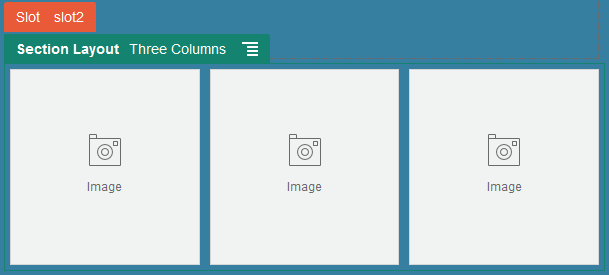
A section layout can automatically organize content into multiple columns, a vertical list, or a set of tabbed areas. A site contributor can add one or more section layouts to a slot to organize content. To add a layout to a page:
-
Navigate to the page you want to edit and make sure that
 is set to Edit.
- Click
 to insert a section layout on your page. Choose the type of layout you want to use and follow the same guidance for placing the item as you use for placing a component.

Description of the illustration section_layout.png
A placement icon ![]() indicates where the section layout will go (above, below, left, right). A
solid border around a section layout or content item indicates you can drop the item
and it will be placed automatically:
indicates where the section layout will go (above, below, left, right). A
solid border around a section layout or content item indicates you can drop the item
and it will be placed automatically:
Description of the illustration section_layout_drop.png
If you are an enterprise user working with structured content items, you can assign a section layout when you add a list of content items to a page and the section layout will automatically format the items on the page.
In addition to the layouts provided, a developer can create additional section layouts to solve particular layout problems or to simplify authoring for contributors. A theme designer can even build section layouts into a slot in a page layout. See Develop Layouts.