Set Component Properties

You can configure component properties for use in a site.

Components are the individual parts of a web page, which include text, titles, images, buttons, dividers, maps, galleries, videos, and so on. When you create a design for a theme, you also must specify the default settings for each type of component. Each component has settings — such as size, alignment, spacing, color, and borders — that define how the component looks and behaves. The settings vary based on the component. You also can choose whether a component properties can be changed by users once it is available in a site in a new theme.

As an example, these steps illustrate how you can configure settings for a Paragraph component:
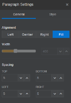
  1. With your development site open in Edit mode, select a page that has a Paragraph component in it, or add a Paragraph component.
  2. Click the Paragraph component, then click component menu icon in the corner of the component, and then choose Settings.

    You’ll see a Settings panel displayed where you can make selections for the component.

    Note:

    The settings options are specific to each type of component. If working with local or remote custom components, you’ll see a Custom Settings link.
  3. For example, you can change the settings for alignment, width, spacing, fonts, style, color, size, and so on.
    The component appearance changes to the new settings.
  4. When you’re finished, click Close icon. Your settings are applied to the page.