4 Use Data Explorer
On the Data Explorer page in Oracle Management Cloud, you can explore operational data to find the information specific to your needs and analyze the data by various dimensions.
Data Explorer enables you to:
-
Perform ad hoc analysis: You can use the attributes in Data Explorer to filter real-time and historical data by entities and other attributes and view specific information.
You can perform:
-
Asset analysis, for example, you can analyze the breakdown of Oracle databases by version.
-
Performance analysis (trends, baselining, and correlation), for example, you can find out the average page response time for your application in the last 60 minutes.
-
Resource analysis (forecasting), for example, you can view the file system usage in the last one month.
-
Custom metrics, for example, you can find out if there is a correlation between the number of orders and the errors in your application.
-
-
Use it as a diagnostics tool: You can use Data Explorer to isolate issues and analyze and correlate the cause and impact.
-
Create widgets and dashboards: Data Explorer enables you to save the analyses and customized metric data visualizations that you’ve created and display them in widgets. These widgets can then be used to create dashboards.
Access Data Explorer
To access Data Explorer, select Data Explorer on the Explorers tile on the Oracle Management Cloud home page or click Data Explorer in the Management Cloud navigation menu.
Filter, Visualize, and Analyze Data Using Data Explorer
On the Data Explorer page, you can filter and search for the metrics you want to display, select your visualization options, and analyze your data.
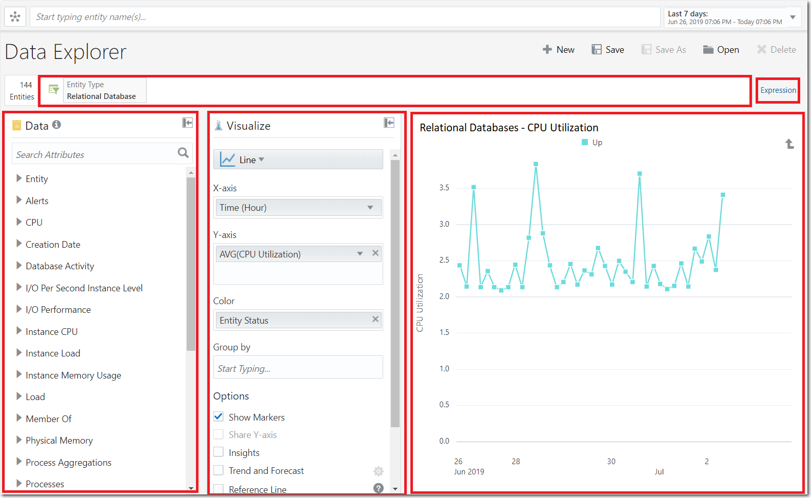
The Data palette on the Data Explorer page lists entity and other attributes. The Visualize column provides the tools required to visually represent the data, making it easier to process. You can use the Attribute Filter to filter your data. For example, you can select an Entity Type and an attribute such as Entity Status or Open Alerts to display related data. You can also click Expression to the right of the Attribute Filter to switch to expression-based filtering, which supports Entity Type, Entity Status, and Tags.
Using the options available in these three major components on the Data Explorer page, you can display advanced analytics, such as trend and forecast, correlation, and categorical analysis.
In the following example, the average CPU utilization metric of all the entities of
the Relational Database entity type for a period of 7 days is displayed in a Line
chart.
Description of the illustration data-explorer.png
Here are a few more examples of what you can use Data Explorer for:
-
View the trend of CPU and memory usage for your database entities (such as Oracle Database, MySQL) for the past 13 months, and forecast the values for the next three months, to detect seasonal trends.
-
Identify all entities with a CPU usage of more than 50% that are running on a specific software version.
-
View top five hosts with the highest memory utilization.
Data Explorer Visualization Options
The visualization options in Data Explorer, such as Line and Donut charts, enable quick and easy interpretation of data.
Here’s the list of visualization options available to you:
| Visualization Option | Description | An example of what you can do... |
|---|---|---|
|
Analytics Line |
View the data as a line, with points marked out for analysis. Specific attributes are measured along the x and y axes, and a third attribute determines the color of the line. |
You can use this visualization option along with the Insights and Trend and Forecast analysis options to display the CPU utilization forecast for an entity type. |
|
Area |
View the data as a filled-in area. Specific attributes are measured along the x and y axes. Data can be grouped according to a third attribute. |
You can use this visualization option to display the performance of a docker container over time, where performance data is categorized by different parameters such as Network I/O Rate. |
|
Bar |
View the data as a bar chart. Specific attributes are measured along the x and y axes, and a third attribute determines the color of the bars. |
You can use this visualization option to display open alerts by severity. |
|
Card |
View the data pertaining to entities in cards, with each card displaying an entity and its critical metrics. |
You can use this visualization option to display the critical metrics of all the entities of an entity type in cards. You can use the Sort By option to sort the entity cards by one of the attributes selected in the Values field or the Entity Status attribute. |
|
Cluster |
View data as a cluster chart, where information is clustered by a specific attribute. Use this option for identifying anomalies. |
You can use this visualization option to display entities of an entity type that are clustered by their memory utilization. These entities are clustered and placed in a quadrant based on the usage and variance of the selected metric. |
|
Correlation |
View specific attributes as correlated data, with a specific attribute measured along the y axis. Time is measured along the x axis, based on the total time period selected using the global time selector. |
You can use this visualization option to display the correlation between the behaviors of different attributes such as SQL service response time and average executions in a database, over a given period of time. |
|
Data Grid |
View data in the form of a grid. You can specify which columns are to be displayed. |
You can use this visualization option to display long active concurrent requests, wherein all the requests that have not been serviced and the corresponding details are listed. |
|
Donut |
View the breakdown of an attribute in a donut chart. |
You can use this visualization option to display the number of entities by breakdown of availability status. |
|
Gauge |
View a specific attribute in a circular or vertical gauge chart. |
You can use this visualization option to display the error percentage, for example the average AJAX error percentage in your application. |
|
Histogram |
View the data as a histogram with a selected attribute measured along the x axis. The data can be grouped according to a third attribute. |
You can use this visualization option along with the Insights analysis option to display the memory utilization of the entities of an entity type and an insight into the number of entities that have high memory utilization. |
|
Horizontal Bar |
View the data as a horizontal bar chart. |
You can use this visualization option along with the Top/Bottom N analysis option to display the top three host entities in terms of memory utilization. |
|
Label |
View a specific attribute as a label for your filtered entities. |
You can use this visualization option to display business metrics. |
|
Line |
View the data as a line, with time displayed along the x axis and specific attributes measured along the y axis. A third attribute can be used to determine the color of the line, while data can also be grouped according to a fourth attribute. Use this option for the following analytics tasks:
|
You can use this visualization option to monitor the page response time of the web pages in your application. You can display the maximum response time of all the pages at different times of the day, to determine what could be causing a delay, and address it. |
|
Pareto Chart |
View data as a bar chart where the values are arranged in descending order and the line represents the cumulative value percentage. You can choose which attributes are measured along the x and y axes. |
You can use this visualization option to display the network read rate of all the entities of an entity type. The bars in the Pareto chart represent individual values in descending order and the line represents the cumulative total. |
|
Scatter Chart |
View data as a scatter chart with specific attributes measured along the x and y axes. |
You can use this visualization option to display values for typically two variables for a set of data, for example CPU and memory consumption, of all the entities of an entity type. |
|
Table |
View the data as a table, with columns for each of the specified attributes. You can also choose to group the data by an attribute. |
You can use this visualization option to categorize information in a tabular format. For example, you can display WebLogic servers by alerts in a table with entity name, WebLogic domain name, open alerts, and entity status columns. |
|
Topology |
View data as a topology chart. Note: This visualization option will be deprecated in a future release and it’s recommended that you use the Topology option in the Global Context instead. |
You can use the Topology option in the Global Context for a complete and interactive overview of all the entities of an entity type or in an application, and their relationships. You can also use the options in the Topology pane to view the status of entities, alert count, and so on. |
|
Treemap |
View the data as a map, showing the entities as cells, where the color of the cells is determined by a specific attribute and the size of the cells is determined by another attribute. |
You can use this visualization option to display storage allocation of all the entities of an entity type, where the color of each cell denotes file system usage and the size denotes file system size. In addition, you can use the Group by option to categorize the information based on the Cloud provider. |
Save Your Analysis in a Widget
When you create an analysis (by filtering data and selecting necessary visualization options) that you want to retain or want to share with others, then you can save it as a widget. Widgets can be used later to create dashboards.
When you save your analysis in a widget, you’re saving:
-
Filters: These are specific values or ranges for values that you select for attributes. Based on the values that you select, data is filtered out from the search results, for example, a specific entity type or entity name.
-
Visualization options: This is the way to portray your data, for example, histogram, or treemap.
-
Analysis: This is the mode of analysis that you select, for example, trending and forecasting.
You can create custom widgets in Data Explorer to meet your specific requirements or you can use the out-of-the-box widgets provided on the Data Explorer page. To view and use the out-of-the-box widgets, click Open on the Data Explorer page. In the list of available widgets, the widgets which have “Created by: ORACLE” under the description are the out-of-the-box widgets.


