Perform Advanced Analytics with Link
Understand the application of the Link feature in performing advanced analytics with the use-case discussed in this topic.
Example Scenarios:
| Use Case | Link Feature | Example Logs |
|---|---|---|
|
Link Trend |
|
|
| Use timestats Command for Time Series Analysis |
Using |
|
| Cluster Similar Time Series |
Using |
- |
|
Link basic features |
|
|
|
Annotate Link results |
|
|
|
Using virtual fields for charts |
|
|
|
Using SQL statement as a field |
|
|
|
Time analysis |
|
|
|
Charts for multiple fields and their values |
- |
|
|
Second level aggregation |
|
|
|
Use Link Navigation Functions to Identify Events in a Database |
Navigation functions |
|
| Using currency symbol in groups table and charts |
|
Visualize Time Series Data Using the Link Trend Feature
Link is used to group the log records by specific fields. The various statistics that you can extract from these groups can be visualized using the bubble chart visualization. The bubble chart visualization is now enhanced to support the Time field as an axis.
The following steps explain how to use the trend feature to analyze the job duration for Oracle E-Business Suite (EBS) Concurrent Requests. Oracle Log Analytics provides out-of-the-box support for EBS Concurrent Request Logs.
Consider the following sample log in the filepath
/u01/oracle/appl_top/req/l7474445.req:
Human Resources: Version : 12.2

Copyright (c) 1998, 2013, Oracle and/or its affiliates. All rights reserved.

AME_MIGRATIONB: Approvals Management Post Upgrade Process
+---------------------------------------------------------------------------+

Current system time is 24-JUL-2018 01:04:29
+---------------------------------------------------------------------------+

**Starts**24-JUL-2018 01:04:30
**Ends**24-JUL-2018 01:04:30
Migration of item class usages successful
+---------------------------------------------------------------------------+
Start of log messages from FND_FILE
+---------------------------------------------------------------------------+
+---------------------------------------------------------------------------+
End of log messages from FND_FILE
+---------------------------------------------------------------------------+

+---------------------------------------------------------------------------+
No completion options were requested.

Output file size:
0
Deleting empty output file.

+---------------------------------------------------------------------------+
Concurrent request completed successfully
Current system time is 24-JUL-2018 01:04:32

+---------------------------------------------------------------------------+
The out-of-the-box log source EBS Concurrent Request Logs - Enhanced
extracts the Request ID field from the filepath. For example, the numeric data
7474445 is the Request ID extracted from the filepath of the above
sample log. The log source also extracts the associated metadata for each Request
ID.
-
Select the log source and switch to Link visualization:
In the Fields panel, click Log Source > Select the EBS Concurrent Request Logs - Enhanced log source > Switch to the Link visualization > Drag and drop the Request ID field to Link By panel to get the list of requests:
The auto-generated query looks like this:
'Log Source' = 'EBS Concurrent Request Logs - Enhanced' | link 'Request ID' -
Extract the request start and end time:
Each request has a start time and an end time printed in the file. If the end time is absent, then the time at which the file is updated is considered as the end time. The log source is configured to capture these values as Event Start Time and Event End Time fields.
Edit the query to extract these fields:
'Log Source' = 'EBS Concurrent Request Logs - Enhanced' | link 'Request ID' | stats earliest('Event Start Time') as 'Request Start Time', latest('Event End Time') as 'Request End Time'earliestis a function ofstatscommand. This sorts the records of each Request ID by time and returns the oldest Event Start Time. Similarly,latestreturns the last Event End Time.You can now view the new fields in the records table:
Request Start Time and Request End Time are automatically detected as timestamps and formatted in your local timezone. When the files are collected, the agent uses the EBS database timezone to interpret the timestamps.
Note:
To ensure that the database timezone is displayed as expected in Oracle Infrastructure Monitoring configuration home, and to avoid mismatch in the values, provide the timezone during the upload. -
Compute request duration:
Now that we have the start and end times for each request, we can compute the duration as the difference between these two fields.
Change the query suitably:
'Log Source' = 'EBS Concurrent Request Logs - Enhanced'
| link 'Request ID'
| stats earliest('Event Start Time') as 'Request Start Time',
latest('Event End Time') as 'Request End Time'
| eval 'Time Taken' = 'Request End Time' - 'Request Start Time'
Time Taken is a new field created for each Request ID group. This would contain the difference between the request start and end Time.
Note:
Oracle Log Analytics automatically detects Time Taken as a duration field, since it is produced by the difference between two timestamp fields. Therefore, it is automatically formatted in a human readable way.
-
Trend for the time taken by the EBS Concurrent Requests :
The Time Taken field can now be analyzed for trends. Click the Analyze icon
 > Select the fields Request Start Time and Time Taken in
the Analyze dialog box > Click OK.
This would automatically change the query to:
'Log Source' = 'EBS Concurrent Request Logs - Enhanced' | link 'Request ID' | stats earliest('Event Start Time') as 'Request Start Time', latest('Event End Time') as 'Request End Time' | eval 'Time Taken' = 'Request End Time' - 'Request Start Time' | classify topcount = 300 'Request Start Time', 'Time Taken'Classifycommand takes two fields, clusters the results, and marks the anomalies where applicable. The results are displayed in the bubble chart.When Time is selected for an axis, the bubble chart automatically switches to the Trend option. To modify the chart options, click the Chart Options icon
 and change the required parameters.
In the resulting bubble chart, Request Start Time is plotted along the x-axis and clusters of Time Taken is plotted along the y-axis:
The time is shown in the local time zone. The size of the bubbles indicate the number of requests.
In the above bubble chart, the request duration of more than four minutes is noticed on the 21st July, 2018. Majority of the requests finished in less than two minutes.
You can click on one or more bubbles to drill down to view the specific requests.
Use timestats
Command for Time Series Analysis
Use the timestats command after the link
command to generate time series data for analyzing statistical trends over time.
In the following example, the Application Access Logs are first grouped by
the fields Time, Server, and Service using the
link command. The output of the link command is
then used to project the trend for Time Taken field, using the
timestats command. The Time Taken field values are plotted
for each unique combination of Server and Service.
'Log Source' = 'Application Access Logs'
| eval 'Duration (sec)' = unit(Duration, second)
| link Time, Server, Service
| timestats name = 'Time Taken Trend by Server and Service'
       avg('Duration (sec)') as 'Time Taken' by Server, Service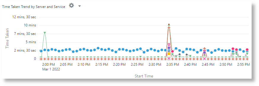
In the above example, the X-axis shows the values from the Start Time field. The Y-axis shows the time taken using the average of the numeric field Duration in seconds. Each series in the chart represents a unique combination of Server and Service.
Cluster Similar Time Series
Use the timecluster command after link to cluster
similar time series together. See Timecluster Command in Using Oracle Log Analytics
Search.
The following query clusters Log Sources that have a similar trend. You can use the ID field to view individual clusters.
* | link span = 1hour Time, 'Log Source' | timecluster sum(Count) as 'Log Trend' by 'Log Source'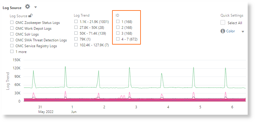
The above image shows clusters of log sources that have similar trend grouped by ID.
Analyze the Access Logs of Oracle WebLogic Server
Consider the example of a data set consisting of Oracle WebLogic Server Access Logs from the log source FMW WLS Server Access Logs. The log records contain data about the access to Oracle WebLogic Server by the users over a specific period of time. These individual log records can be analyzed to get meaningful insight into the usage statistics, the popularity of the URLs, the most active users, and more such data. From the logs, learn to obtain the following results by analyzing the log records with the selection of specific fields for each result:
-
Display the top URLs by Number of Hits
-
Display the anomalies by Number of Hits
-
Display the anomalies by Access Duration
-
Identify the URLs by Upload Size
-
Identify the URLs by Download Size
-
Analyze the correlation between Number of Hits and Download Size
-
Determine the Most Visited Pages
-
Identify the Top Users
-
Identify the Top Users and their Favorite Pages
-
Identify the entry page that drives maximum visits
-
Identify the Entry and Exit path for most users
Note:
-
Use the
renamecommand to change the name of the field to one that’s more relevant for the use-case. -
The
classifycommand lets you analyze the groups, and displays the result in the form of a bubble chart. To simply view the result of the execution of a query in the tabular format, remove theclassifycommand from the query, and re-run it. -
Click the anomalous bubble in the chart to view the details of the anomalous groups. To return to the original result after investigating the bubble, click the Undo
 icon.
icon.
-
When you run the
linkcommand, the group duration is shown in a readable format in the bubble chart, for example, in minutes or seconds. However, if you want to run awherecommand after thelinkcommand to look for transactions that took more than the specified number of seconds (say, 200 seconds), then the unit that you must use is milliseconds.
To retrieve the data set, select a suitable date range, specify the log source, and run the query:
'Log Source' = 'FMW WLS Server Access Logs'Select Link ![]() from the Visualize panel. This’ll display the 'FMW WLS Server Access Logs' groups table and the bubble chart.
from the Visualize panel. This’ll display the 'FMW WLS Server Access Logs' groups table and the bubble chart.
-
To display the top URLs by Number of Hits, group the log records by the value of the URL in the log record, obtain the total count for the URL in each group, rename the default fields in the groups table to suitable values, and display the result in the tabular format. With this analysis, you can determine the URLs that’re most used.
-
Drag and drop the field URI to Link By, remove the field Log Source from Link By, and click the check mark to submit the query.
-
After the query is executed, in the command-line, change the names of the fields Count to Number of Hits, Start Time to First Access, End Time to Last Access, and Group Duration to Access Duration.
-
Remove the
classifycommand from the command-line, and submit the query.The query will be as follows:
'Log Source' = 'FMW WLS Server Access Logs' | link URI | rename Count as 'Number of Hits', 'Start Time' as 'First Access', 'End Time' as 'Last Access', 'Group Duration' as 'Access Duration'
On running the query, you can determine the top URLs by number of hits in the table. The columns are renamed as specified in the rename command.
-
-
To display the anomalies by Number of Hits, group the log records by the value of the URL in the log record, rename the default fields in the groups table to suitable values, and analyze the groups for the URL’s number of hits. With this analysis, you can separate the unusual pattern in accessing the URLs.
Click Analyze, select Number of Hits, and click OK.
The query must change to the following:
'Log Source' = 'FMW WLS Server Access Logs' | link URI | rename Count as 'Number of Hits', 'Start Time' as 'First Access', 'End Time' as 'Last Access', 'Group Duration' as 'Access Duration' | classify topcount = 300 'Number of Hits'This query triggers analysis of the 'Number of Hits' column and creates bubbles representing the commonly seen ranges. The majority of the values are treated as the baseline. For example, a large bubble can become the baseline, or a large number of smaller bubbles clustered together can form the baseline. Bubbles that are farthest from the baseline are marked as anomalies.
So, this displays the anomalous URLs grouped into separate bubbles in the bubble chart. To view the percentage of URLs in each range of number of hits, hover the cursor on the bubbles.
-
To display the anomalies by Access Duration, group the log records by the value of the URL in the log record, rename the default fields in the groups table to suitable values, and analyze the groups for the access duration of the URL. With this analysis, you can separate the unusual pattern in the time spent in accessing the URLs. In continuation to step 2:
Click Analyze, select Access Duration, and click OK.
Access Duration is an indication of the duration for which each URL was accessed. This is computed as the difference between the last timestamp and the first timestamp in the log file for each URL.
-
To identify the URLs by Upload Size, group the log records by the value of the URL in the log record, rename the default fields in the groups table to suitable values, and analyze the groups for the size of the data uploaded. With this analysis, you can identify the URLs that have unusual size of the data uploaded. In continuation to step 3:
-
Drag and drop the field Content Size In to Display Fields.
-
Rename the field Content Size In to Bytes Uploaded by altering the query on the command-line, and run the query.
-
Click Analyze, select Bytes Uploaded, and click OK.
The query will be as follows:
'Log Source' = 'FMW WLS Server Access Logs' | link URI | stats avg('Content Size In') as 'Bytes Uploaded' | rename Count as 'Number of Hits', 'Start Time' as 'First Access', 'End Time' as 'Last Access', 'Group Duration' as 'Access Duration' | classify topcount = 300 'Bytes Uploaded'The Analyze chart displays the groups of URLs by the bytes uploaded.
-
To correlate the Bytes Uploaded data across the time range, you can selectively hide or show charts in the Histogram Chart Options. Explore the other visualization options besides the bar chart.
-
-
To identify the URLs by Download Size, group the log records by the value of the URL in the log record, rename the default fields in the groups table to suitable values, and analyze the groups for the size of the data downloaded. With this analysis, you can identify the URLs that have unusual size of the data downloaded. In continuation to step 4:
-
Drag and drop the field Content Size Out to Display Fields and remove Content Size In from Display Fields.
-
Rename the field Content Size Out to Download Size by altering the query on the command-line, and run the query.
-
Click Analyze, select Download Size, and click OK.
The query will be as follows:
'Log Source' = 'FMW WLS Server Access Logs' | link URI | stats avg('Content Size Out') as 'Download Size' | rename Count as 'Number of Hits', 'Start Time' as 'First Access', 'End Time' as 'Last Access', 'Group Duration' as 'Access Duration' | classify topcount = 300 'Download Size'The Analyze chart displays the groups of URLs by the download size.
-
To correlate the Download Size data across the time range, you can selectively hide or show charts in the Histogram Chart Options. Explore the other visualization options besides the bar chart.
-
-
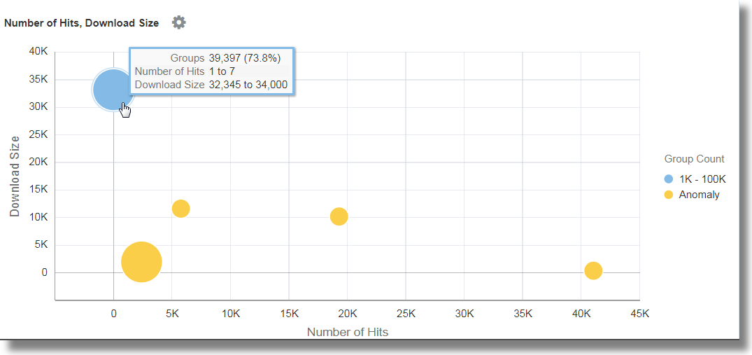
To analyze the correlation between Number of Hits and Download Size, group the log records by the value of the URL in the log record, rename the default fields in the groups table to suitable values, and analyze the groups for the size of the data downloaded and the number of hits. With this analysis, you can identify the URLs that have unusual patterns of size of data downloaded and number of hits. In continuation to step 5:
-
Click Analyze, select the fields Number of Hits, Download Size, and click OK.
-
Remove
topcount=300from the query to see all the bubbles, and run the query.The query will be as follows:
'Log Source' = 'FMW WLS Server Access Logs' | link URI | stats avg('Content Size Out') as 'Download Size' | rename Count as 'Number of Hits', 'Start Time' as 'First Access', 'End Time' as 'Last Access', 'Group Duration' as 'Access Duration' | classify 'Download Size', 'Number of Hits'
In the bubble chart, the field Number of Hits is plotted along the x-axis and Download Size along the y-axis.
The bubbles can be interpreted as follows:
-
73.8% of the URLs were accessed one to seven times.
-
Average download size for the 73.8% of URLs is between 32,345 to 34,000. This tight range implies that a large number of URLs have very uniform behavior with reference to the download size.
-
Since 73.8% is the large majority, the rest of the points are marked as anomalies.
-
With real data, it is common for the system to group .css, .js and image files separately from other URLs because they tend to have different download behaviors.
-
-
To determine the Most Visited Pages, group the log records by the value of the URL in the log record, rename the default fields in the groups table to suitable values, and analyze the groups for the number of unique visitors. With this analysis, you can identify the URLs that’re most visited by the unique visitors. In continuation to step 6:
-
Drag and drop the field User Name to Display Fields.
-
Click the down arrow next to the field name, change the function from Unique to Distinct Count. See the other functions you can select for a numeric field:
-
Rename the field User Name to Number of Unique Users, remove the
classifycommand by altering the query on the command-line, and run the query. The query will be as follows:'Log Source' = 'FMW WLS Server Access Logs' | link URI | stats avg('Content Size In') as 'Bytes Uploaded', avg('Content Size Out') as 'Download Size', distinctcount('User Name') as 'Number of Unique Users' | rename Count as 'Number of Hits', 'Start Time' as 'First Access', 'End Time' as 'Last Access', 'Group Duration' as 'Access Duration' -
Click Analyze, select the field Number of Unique Users, and click OK.
The table lists the URLs and the corresponding number of unique users, helping us to identify the URLs that were most visited by unique users. From the table, you can also determine the number of hits that each URL has.
The analysis shows that more than 99% of the URLs have 0 or 1 unique users. This would be the case for URLs that don't need a login, or are seldom accessed. Drilling down to any of the smaller bubbles will point to the specific pages, how many hits they typically have, and how many unique visitors.
-
-
To identify the Top Users, group the log records by the value of the user name in the log record, rename the default fields in the groups table to suitable values, and analyze the groups for the number of hits. With this analysis, you can identify the most active users.
-
Edit the command-line to remove all the filters:
'Log Source' = 'FMW WLS Server Access Logs' | link URI -
Drag and drop the field User Name to Link By, remove URI, and run the query.
-
Remove the
classifycommand, rename the default fields in the command-line, and run the following query:'Log Source' = 'FMW WLS Server Access Logs' | link 'User Name' | rename Count as 'Number of Hits', 'Start Time' as 'First Access', 'End Time' as 'Last Access', 'Group Duration' as 'Access Duration'The table is sorted by the number of hits by the user.
-
To view the user behavior by access, click Analyze, select the field Number of Hits, and click OK.
-
Click the anomalies to identify the users who have recorded higher or lower number of hits compared to the other users.
-
-
To identify the Top Users and their Favorite Pages, group the log records by the value of the user name in the log record, rename the default fields in the groups table to suitable values, and analyze the groups for the number of unique pages. With this analysis, you can identify the least and most active users, and their favorite pages. In continuation to step 8:
-
Drag and drop the field URI to Display Fields. Change the function from Unique to Distinct Count.
-
Rename the field URI to Number of Unique Pages by altering the query in the command-line, and run the query.
-
Click Analyze, select the field Number of Unique Pages, and click OK.
-
-
To identify the entry page that drives maximum visits, group the log records by the value of the user name in the log record, rename the default fields in the groups table to suitable values, and analyze the groups for the values of the entry URLs and number of hits to the URLs. With this analysis, you can identify the pages that the users hit first. In continuation to step 9:
-
To get the entry URLs, change the function of the field URI from Distinct Count to Earliest.
-
Rename the field URI to Entry URL by altering the query in the command-line, and run the query.
-
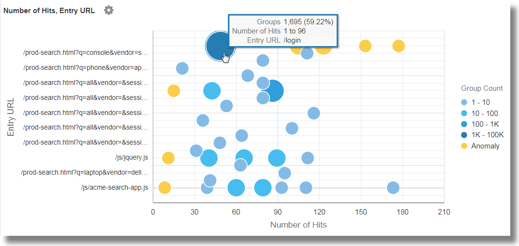
Click Analyze, select the fields Number of Hits and Entry URL, select the topcount as 20, and click OK.
'Log Source' = 'FMW WLS Server Access Logs' | link 'User Name' | stats earliest(URI) as 'Entry URL' | rename Count as 'Number of Hits', 'Start Time' as 'First Access', 'End Time' as 'Last Access', 'Group Duration' as 'Access Duration' | classify topcount = 20 'Number of Hits', 'Entry URL'
This displays the first URL used by the users in relation to the number of hits. For example, /login is the first URL majority of the users use.
-
-
To identify the Entry and Exit path for most users, group the log records by the value of the user name in the log record, rename the default fields in the groups table to suitable values, and analyze the groups for the values of the entry URLs and exit URLs. With this analysis, you can identify
-
The most common paths taken by the users to transit through the website
-
The most popular product pages from where the users are exiting the website
-
The most common exit URLs, like the product checkout pages or the payment gateway
-
The unusual exit URLs, and root cause the unexpected exits
-
Drag and drop the field URI to Display Fields.
-
To get the exit page, change the function of the field URI from Unique to Latest.
-
Edit the command-line and rename the field latest(URI) to Exit URL and submit the query.
-
Click Analyze, select the fields Entry URL and Exit URL, select the topcount as 20, and click OK.
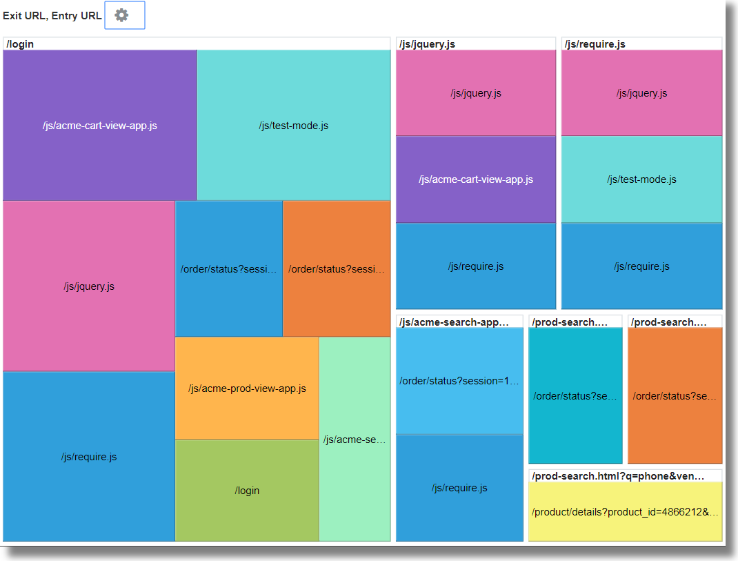
'Log Source' = 'FMW WLS Server Access Logs' | link 'User Name' | stats earliest(URI) as 'Entry URL', latest(URI) as 'Exit URL' | rename Count as 'Number of Hits', 'Start Time' as 'First Access', 'End Time' as 'Last Access', 'Group Duration' as 'Access Duration' | classify topcount = 20 'Entry URL', 'Exit URL' -
Increase the size of the chart by using the Analyze Chart Options.
This tree map shows the relationship between the entry and exit URLs in a site. This would be very useful for the retail sites where the service providers would want to identify the entry URLs that lead the customers to the checkout pages, and the product URLs that’re causing users to not proceed to checkout.
-
Generate Charts with Virtual Fields
To create a new virtual field, you can use the eval command in the link feature. The eval query on the command-line will generate a line chart for the virtual field and enable tracking it over time.
To create a new virtual field, you can use the eval command in the link feature. The eval query on the command-line will generate a line chart for the virtual field and enable tracking it over time.
Examples:
-
Consider the scenario where the log records from the log source
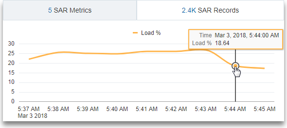
SAR CPU Logsare grouped by the host name and the CPU. To determine the load experienced by the CPU of the server over time, theevalcommand creates a virtual fieldLoad %and generates the line chart.'Log Source' = 'SAR CPU Logs' | rename Instance as CPU | link 'Host Name (Server)', CPU | stats avg('CPU Idle Time (%)') as 'CPU Idle Time (%)' | eval 'Load %' = 100 - 'CPU Idle Time (%)'To view the line chart:
-
Click the Histogram tab.
-
Click the down arrow next to the Chart options (
 ) icon. Click Hide / Show Charts. Select Load %.
-
Click the down arrow next to the Chart options (
 ) icon. Click Chart Options. From the Chart Type list, select Line Without Marker. Click Close.
-
-
Consider the scenario where the log records from the log source
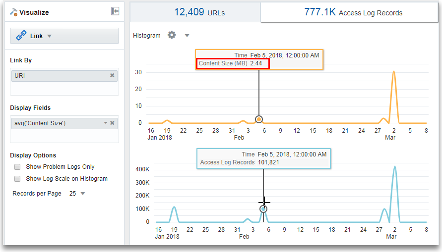
OMC WLS Server Access Logsare grouped by the URI. To determine the size of the data accessed over time in megabytes, theevalcommand creates a virtual fieldContent Size (MB), calculates the content size in megabytes based on the value of the fieldContent Size,and generates the line chart.'Log Source' = 'WLS Server Access Logs' | link URI | stats avg('Content Size') as 'Content Size Bytes' | eval 'Content Size (MB)' = 'Content Size Bytes' / 1024To view the line chart:
-
Click the Histogram tab.
-
Click the down arrow next to the Chart options (
 ) icon. Click Hide / Show Charts. Select Content Size (MB) and Access Log Records.
-
Click the down arrow next to the Chart options (
 ) icon. Click Chart Options. From the Chart Type list, select Line Without Marker. Click Close.
-
Link by Using SQL Statement as the Field of Analysis
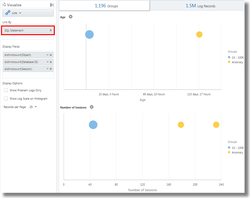
Link supports SQL Statement as a field for analysis. SQL Statement contains the SQL that’s executed, and is captured by log sources like Database Audit XML Logs and Oracle Unified DB Audit Log Source Stored in Database 12.1.
You can use link 'SQL Statement' to group SQLs and analyze their behavior and identify anomalies.
Example:
Consider the following query that links the log records based on the field SQL Statement:
'Log Source' in ('Database Audit Logs', 'Database Audit XML Logs')
	| rename 'Host Name (Server)' as 'DB Server', 'User Name (Originating)' as 'OS User', 'User Name' as 'DB User'
	| link 'SQL Statement'
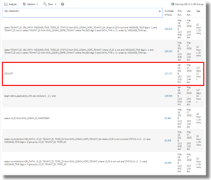
	| rename Count as 'Number of Runs', 'Start Time' as 'First Run', 'End Time' as 'Last Run', 'Group Duration' as Age
	| addfields [ Object = dual | stats count as 'dual Table Access' ],
		[ Object like 'all_%' | stats count as 'ALL_ Table Access' ],
		[ Object like 'dba_%' | stats count as 'DBA_ Table Access' ],
		[ Object like 'user_%' | stats count as 'USER_ Table Access' ],
		[ Object like 'v$%' | stats count as 'VDollar Table Access' ],
		[ Object = null | stats count as 'No Table Access' ],
		[ Action = '2' | stats count as 'Insert Count' ],
		[ Action = '3' | stats count as 'Select Count' ],
		[ Action = '6' | stats count as 'Update Count' ],
		[ Action = '7' | stats count as 'Delete Count' ],
		[ Type = '8' | stats count as 'Connect Count' ],
		[ 'Status Code' = 1 | stats count as Failures ]
	| eval 'Object Type' = if('dual Table Access' > 0, Dual,
		'ALL_ Table Access' > 0, System,
		'DBA_ Table Access' > 0, System,
		'USER_ Table Access' > 0, System,
		'VDollar Table Access' > 0, System,
		'No Table Access' > 0, 'No Table', Other)
	| eval 'SQL Type' = if('Insert Count' > 0, Insert,
		'Select Count' > 0, Select,
		'Update Count' > 0, Update,
		'Delete Count' > 0, Delete,
		'Connect Count' > 0, Connect, Other)
	| stats distinctcount(Object) as Objects, distinctcount('Database ID') as 'Number of DBs',
		distinctcount(Session) as 'Number of Sessions'
	| fields -'dual Table Access', -'No Table Access', -'ALL_ Table Access',
		-'USER_ Table Access', -'DBA_ Table Access', -'VDollar Table Access', -'Insert Count',
		-'Select Count', -'Update Count', -'Delete Count', -'Connect Count', -'SQL Type', -'Object Type'
	| classify Age
	| classify 'Number of Sessions'
	| classify 'Number of DBs'
	| classify 'Number of Runs', 'Object Type'
	| classify 'Object Type', 'SQL Type'
Note:
addfields is a function available with link visualization to add virtual fields to the query. It takes a query and pipes the output to a stats command. The resulting virtual field is available in the table as well as in the time series chart.
For the syntax and other details of the addfields command, see Addfields Command in Using Oracle Log Analytics Search.
By executing the above query, the following results can be observed:
-
Based on the classify command, the bubble charts for
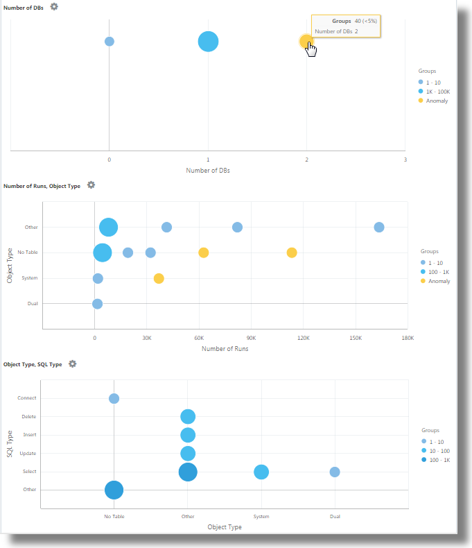
Age,Number of Sessions,Number of DBs,Number of Runs, Object Type, andObject Type, SQL Typeare generated.In the bubble charts, the log records are grouped based on the number of SQLs that fall under each set of parameters. The
Object TypeandSQL Typeparameters are determined using theevalcommand in the query. -
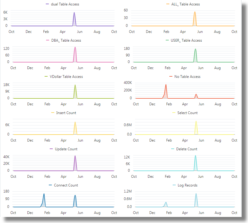
The Line with Area histogram charts illustrate the occurrence of fields like
dual Table Access,No Table Access,ALL_ Table Access,USER_ Table Access,DBA_ Table Access,VDollar Table Access,Insert Count,Select Count,Update Count,Delete Count,Connect Count, andLog Recordsplotted against time.-
In the histogram chart tab, click the down arrow next to the Chart options (
 ) icon.
-
Select to show the charts of all the fields.
-
Under Chart Type, select Line With Area.
-
Adjust the width to display two charts per line.
-
-
The Groups Table lists the groups identified by link based on the SQL Statement field. You can observe that for each SQL, the table lists the number of time that the SQL was run, the start time, the end time, and the group duration. Click on each group and view the log records for more details. You can also view the groups in the cluster visualization for further analysis.
Analyze the Time Taken Between Steps in a Transaction
The link feature gives you the ability to analyze user sessions, extract the various time parameters by grouping, and deduce data about the transaction time to help you in getting business insights.
Consider this unordered data set taken from an Access Log file. The following fields indicate the information about a user session and the actions performed by the user:
Time | Session ID | Action
 T2  | 1          | Login
 T1  | 5          | Login
 T6  | 1          | addtocart
 T3  | 1          | productlisting
 T4  | 1          | purchase
 T9  | 1          | purchase
 T7  | 5          | addtocart
 T5  | 1          | addtocart
 T8  | 5          | purchase
The actions like Login, addtocart, productlisting, and purchase are recorded in a random order T1 through T9, and have occurred in two sessions with session ID 1 and 5.
To, perform similar time analysis of your Access Logs, extract the Session ID from the logs into a field. Extract the intermediate steps of the session from the Access Logs by applying a regular expression to obtain the URL from the logs.
In a generic context, the sessions in this example represent any user transactions, and the actions represent the intermediate steps performed by the user to complete a transaction.
To analyze this unordered data and to extract the required information, the following example query can be run:
'Upload Name' = logadmin
| link 'Session ID'
| rename 'Group Duration' as 'Session Duration'
| addfields
  [ Action = addtocart | stats earliest(Time) as 'First Add To Cart Time' ],
  [ Action = purchase | stats latest(Time) as 'Last Purchase Time' ]
| eval 'Time Taken for Purchase (Secs)' = ('Last Purchase Time' - 'First Add To Cart Time') / 1000
| fields -'First Add To Cart Time',
         -'Last Purchase Time'
| classify 'Time Taken for Purchase (Secs)'-
link 'Session ID'groups the Access Logs records by the Session ID, creating two groups:Time | Session ID | Action T2 | 1 | Login T6 | 1 | addtocart T3 | 1 | productlisting T4 | 1 | purchase T5 | 1 | addtocart T9 | 1 | purchase T1 | 5 | Login T7 | 5 | addtocart T8 | 5 | purchase -
addfieldsis run against each of these groups. The firstaddfieldspicks up the records whereAction = addtocart. The result of this query is as below for both the groups:Time | Session ID | Action T6 | 1 | addtocart T5 | 1 | addtocart T7 | 5 | addtocart -
stats earliest(Time)sorts the above result by time, for each group:Time | Session ID | Action T5 | 1 | addtocart T6 | 1 | addtocart T7 | 5 | addtocart -
Then the specified field, which is
Time, is picked up from the first record:'First Add To Cart Time' = T5 for Group = 1 'First Add To Cart Time' = T7 for Group = 5 -
The second
addfieldsruns onAction = purchase, extracting the following records:Time | Session ID | Action T4 | 1 | purchase T9 | 1 | purchase T8 | 5 | purchase -
latest(Time)also sorts the above records byTime:Time | Session ID | Action T4 | 1 | purchase T9 | 1 | purchase T8 | 5 | purchase -
latest(Time)picks up the last record and extract the specified field, which isTime:'Last Purchase Time' = T9 for Group = 1 'Last Purchase Time' = T8 for Group = 5 -
At this point, both the groups have the values for
First Add to Cart TimeandLast Purchase Timeset. These are timestamps.evalsubtracts one from another to get the elapsed time. -
In effect, you can get the time taken from Adding to the Cart to the Purchase step for each session. This can now be used in
classifyto analyze the variance of this Elapsed Time across sessions.
For the syntax and other details of the addfields command, see Addfields Command in Using Oracle Log Analytics Search.
Generate Charts for Multiple Fields and their Values
You can use the addfields command in the query to specify
multiple fields to generate separate charts. Now, you can also use the histogram Add
Chart option in the UI to perform the same operation as the
addfields command.
Typically, you would want to compare the charts of a single field with various values, for example, values of the field Severity like Error, Critical, Alert, and Warning. The Add Chart option allows you to generate multiple charts to compare side-by-side by specifying the field and its values in the dialog box.
Alternatively, you can type and update the query with the command. The Add
Chart option enables you to perform the operation faster than composing the query with
addfields command.
-
From the link UI, go to Log Records tab > click the Add Chart
 option, to automatically update the query with the
addfieldscommand.The Add Charts dialog box opens.
-
Next to Subquery, select the field from the drop-down menu, for example,
Severity.Select the relevant operator.
Click the edit icon
 to select the value of the field from the available options, for
example,
 alert. -
Next to Stats, select the Function to perform on the field and the Function Field from the drop down menu, for example,
count. -
Click Add Chart to view the resulting query. Click the edit icon
 to edit the query.
-
Repeat steps 2 through 4 to add more charts, for example, to generate charts for the values
error,critical, andwarningof the fieldSeverity.Click OK.
-
Click the down arrow next to the Chart options (
 ) icon and ensure that new charts that you've generated are included and
selected in the Hide/Show option. You can further select the type of
chart and size from the chart options, for example,
 Line without marker. See Histogram Chart Options.
You can now see the customized charts of select fields and their select values in the Log Records tab, and compare them visually.
Second Level Aggregation Using Eventstats Command in Link
Link is used to group the log records using one or more unique keys. For example,
you can group all the log records belonging to a transaction using the unique
transaction ID. Statistics can be generated on each group using the
stats command. eventstats is a new command that
can further aggregate these statistics. The following examples illustrate the use cases
for eventstats.
Consider the following Access Logs Dataset thoughout the examples:
1-Jan-2020 10:00:00 PST, chicago_dc1    /index.html      100
1-Jan-2020 10:00:00 PST, chicago_dc1    /index.html      100
1-Jan-2020 10:00:00 PST, chicago_dc1    /index.html      50
1-Jan-2020 10:00:00 PST, chicago_dc1    /index.html      50
1-Jan-2020 10:00:00 PST, chicago_dc2    /index.html      200
1-Jan-2020 10:00:00 PST, chicago_dc2    /index.html      200
1-Jan-2020 10:00:00 PST, austin_dc7     /report/download 5000
1-Jan-2020 10:00:00 PST, austin_dc7     /users/auth      50
1-Jan-2020 10:00:00 PST, amsterdam_dc1  /index.html      350
1-Jan-2020 10:00:00 PST, amsterdam_dc1  /report/download 1024
The dataset has these fields:
- Time: For example, 1-Jan-2020 10:00:00 PST.
- Host Name (Server): The host that served this request, for example, chicago_dc1.
- URI: The URL of the request, for example, /index.html.
- Content Size Out: The number of bytes downloaded, for example, 100.
Simple Grouping:
   * | link 'Host Name (Server)', URI
     | stats sum('Content Size Out') as 'Bytes Downloaded'
The above query groups the log records using the distinct combination of Host Name (Server) and URI fields. The Content Size Out field of each record is then summed up per group into the new field Bytes Downloaded.
Global Sum Using Eventstats
The bytes downloaded in the previous example is for each server and URL combination.
A simple use case of eventstats is to compute the total data downloaded
across all the servers and URLs:
  * | link 'Host Name (Server)', URI
    | stats sum('Content Size Out') as 'Bytes Downloaded'
| eventstats sum('Bytes Downloaded') as 'Total Bytes Downloaded'In the above example, eventstats aggregates values for each
group to produce a single global roll up. This can now be passed to
classify or eval, as well as used in the
where clause.
Multiple eventstats Commands:
Multiple eventstats can be grouped together or chained as in
the following example:
.. | eventstats sum('Content Size In') as 'Bytes Uploaded', sum('Content Size Out') as 'Bytes Downloaded'
   | eventstats avg('Duraton') as 'Global Average Duration'
Grouping Using Eventstats
The command eventstats also has a group by mode. Consider
the following query:
* | link 'Host Name (Server)', URI
  | stats sum('Content Size Out') as 'Bytes Downloaded'
  | eventstats sum('Bytes Downloaded') as 'Total Bytes Downloaded' by URI
Instead of computing a single value, eventstats now computes
one value per unique URI:
The sum is produced by first getting the distinct URIs and then performing the aggregation:
index.html       -> 300 + 400 + 350 = 1050
/report/download -> 5000 + 1024     = 6024
/users/auth      -> 50              = 50
Eventstats with Eval
The command eventstats can also operate on a field produced by an
eval command. For example, instead of the URL, we can produce the totals
against the data center:
* | link 'Host Name (Server)',  URI
  | stats sum('Content Size Out') as 'Bytes Downloaded'
  | eval offset = indexof('Host Name (Server)', _)
  | eval Datacenter = substr('Host Name (Server)', 0, offset)
  | eventstats sum('Bytes Downloaded') as 'Total Bytes Downloaded' by Datacenter
| fields -offsetThe sum function is executed after the grouping by
substrings:
chicago_dc1 = 300
chicago_dc2 = 400
  -> chicago = 300+400 = 700

amsterdam_dc1 = 350
amsterdam_dc1 = 1024
  -> amsterdam = 350 + 1024 = 1374

austin_dc7 = 5000
austin_dc7 = 50
 -> austin = 5000 + 50 = 5050
Grouping can be performed by using one or more properties. The properties are
the group keys, or string values produced by stats or
eval.
Compute Percentages for Group Comparison
A very important application for eventstats command is to produce a
global value, and identify the high percentage or low percentage contribution from
various groups:
 * | link 'Host Name (Server)', URI
   | stats sum('Content Size Out') as 'Bytes Downloaded'
   | eval offset = indexof('Host Name (Server)', _)
   | eval Datacenter = substr('Host Name (Server)', 0, offset)
   | eventstats sum('Bytes Downloaded') as 'Total Bytes Downloaded' by Datacenter
   | eval 'Download Contribution %' = 100 / ('Total Bytes Downloaded' / 'Bytes Downloaded')
| fields -offsetDownload Contribution % is computed using the global value produced by
the eventstats..by and the value per group produced by
stats:
chicago_dc1, index.html         => 100/(700/300)   = 42.857
chicago_dc2, index.html         => 100/(700/400)   = 57.143
amsterdam_dc1, index.html       => 100/(1374/350)  = 25.473
amsterdam_dc1, /report/download => 100/(1374/1024) = 74.527
austin_dc7, /report/download    => 100/(5050/5000) = 99.01
austin_dc7, /users/auth         => 100/(5050/50)   = 0.99
This query allows you to see which URLs cause the highest download traffic compared to the other URLs in the same data center. Download Contribution % field can be used to filter the groups using:
- the
whereclause sortcommand for rankingclassifycommand for anomaly detection
Use Link Navigation Functions to Identify Events in a Database
Use Link to create structured data from log records and display the data as an ordered table. Statistical functions can be applied to columns of the table using the stats command, to create derived columns. These derived columns can be further aggregated using the eventstats command.
Navigation Functions
Navigation functions are useful to fetch values of a specific column from a specific row. They produce different results depending on the preceding sort command.
The following navigation functions can be used with the eventstats
command in link:
| Function | Description |
|---|---|
|
|
Create a row number column |
|
|
Get the first value for the specified field |
|
|
Get the last value for the specified field |
|
|
Get the column value for the specified row |
|
|
Get the column value for the previous row |
|
|
Get the column value for the next row |
For more information about the functions, see Eventstats Command in Using Oracle Log Analytics Search.
Get Context for an Event
Oracle Log Analytics provides out-of-the-box labels for the Database Alert Logs. The Label Abnormal Termination indicates a serious issue causing the database to shutdown. A typical triage involves analyzing the sequence of events that happened before such a shutdown. It is also useful to know the events after a shutdown.
The following sections explain the steps to triage by using some of the
eventstats functions for Database Alert Logs.
Link Events in Database Alert Logs
Run the following query to link the events for a selected database:
'Log Source' = 'Database Alert Logs' and Label != null and Entity = MyDB
| rename Entity as Database
| link span = 1minute Time, Database, Label
| sort Database, 'Start Time'
This creates a unique row for each Label in the Database. Since we have included the Time column, there would be multiple rows for the same Label, if they repeat at different times.
The sort command sorts the table by the order of Label, with
the oldest one at the first row.
Add Row Number
Run the following query to add a number to each row:
'Log Source' = 'Database Alert Logs' and Label != null and Entity = MyDB
| rename Entity as Database
| link span = 1minute Time, Database, Label
| sort Database, 'Start Time'
| eventstats rownum as 'Row Number' by Database
If the query had more than one database, then the Row Number would reset for
each Database, due to the by Database clause.
Identify the Row with Database Crash Event
The Label Abnormal Termination indicates that the database crashed. Identify such rows with the following query:
'Log Source' = 'Database Alert Logs' and Label != null and Entity = MyDB
| rename Entity as Database
| link span = 1minute Time, Database, Label
| sort Database, 'Start Time'
| eventstats rownum as 'Row Number' by Database
| addfields
   [ * | where Label = 'Abnormal Termination'
       | eventstats last('Row Number') as 'Crash Row'
   ]
addfields is used to identify a subset of the log records. In this
case, addfields searches through several rows of the table. The
matching rows are passed to eventstats, and last('Row
Number') picks up the last matching row's Row Number. This is
now populated as a new field Crash Row. Note that Crash Row will have a value
only for those rows that match the condition specified in
addfields.
Crash Row is populated only for specific rows. Use another
eventstats to populate all the rows with the value:
'Log Source' = 'Database Alert Logs' and Label != null and Entity = MyDB
| rename Entity as Database
| link span = 1minute Time, Database, Label
| sort Database, 'Start Time'
| eventstats rownum as 'Row Number' by Database
| addfields
   [ * | where Label = 'Abnormal Termination'
       | eventstats last('Row Number') as 'Crash Row'
   ]
| eventstats max('Crash Row') as 'Event Row' by Database
This creates the column Event Row in every row, and contains the row that had the last Database Crash.
Identify Events near Database Crash
The table still has several events, for example, hundreds. To identify few events before the Event Row, and few events after the Event Row, change the query to filter the rows:
'Log Source' = 'Database Alert Logs' and Label != null and Entity = MyDB
| rename Entity as Database
| link span = 1minute Time, Database, Label
| sort Database, 'Start Time'
| eventstats rownum as 'Row Number' by Database
| addfields
   [ * | where Label = 'Abnormal Termination'
       | eventstats last('Row Number') as 'Crash Row'
   ]
| eventstats max('Crash Row') as 'Event Row' by Database
| eval 'Start Row' = 'Event Row' - 3
| eval 'End Row' = 'Event Row' + 2
| where 'Row Number' >= 'Start Row' and 'Row Number' <= 'End Row'
The table now shows which events happened before Abnormal Termination. We can also see the events that happened after Abnormal Termination.
Previous and Next Events
lag() can be used to get the previous event. An optional
row number can be passed to get a specific previous row. lead() can
similarly be used to get the next row:
'Log Source' = 'Database Alert Logs' and Label != null and Entity = MyDB
| rename Entity as Database
| link span = 1minute Time, Database, Label
| sort Database, 'Start Time'
| addfields
   [ *
      | where Label != null
      | eventstats lag(Label) as 'Previous Event',
                   lead(Label) as 'Next Event'
   ]
Further, nthVal() can get the value from a specific
row.
Use the Currency Symbols in Your Log Analysis
You can use the unit function in eval
command to mark a field as containing currency. You can then use that field value in your
analysis and display corresponding currency symbol in the visualizations and groups
table.
You can first specify the currency unit using the format defined in Eval Command. After that, the link table and charts will display the right currency symbols.
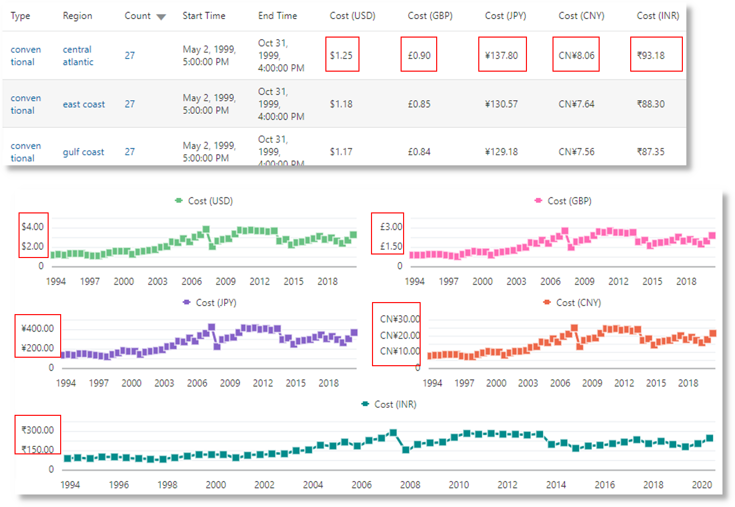
In the following example, the value of the field Price is used for calculating the values of the new fields Price (USD), Price (GBP), Price (JPY), Price (CNY), and Price (INR) and marking them as containing currency. The same new fields are used for analysis in obtaining the region-wise average price of gasoline over a period of several years.
'Log Source' = 'Gasoline Prices'
| eval 'Price (USD)' = unit(Price, currency_usd)
| eval 'Price (GBP)' = unit(Price * 0.72, currency_gbp)
| eval 'Price (JPY)' = unit(Price * 110.6, currency_jpy)
| eval 'Price (CNY)' = unit(Price * 6.47, currency_cny)
| eval 'Price (INR)' = unit(Price * 74.79, currency_inr)
| link Time, Type, Region
| stats avg('Price (USD)') as 'Cost (USD)',
        avg('Price (GBP)') as 'Cost (GBP)',
        avg('Price (JPY)') as 'Cost (JPY)',
        avg('Price (CNY)') as 'Cost (CNY)',
        avg('Price (INR)') as 'Cost (INR)'
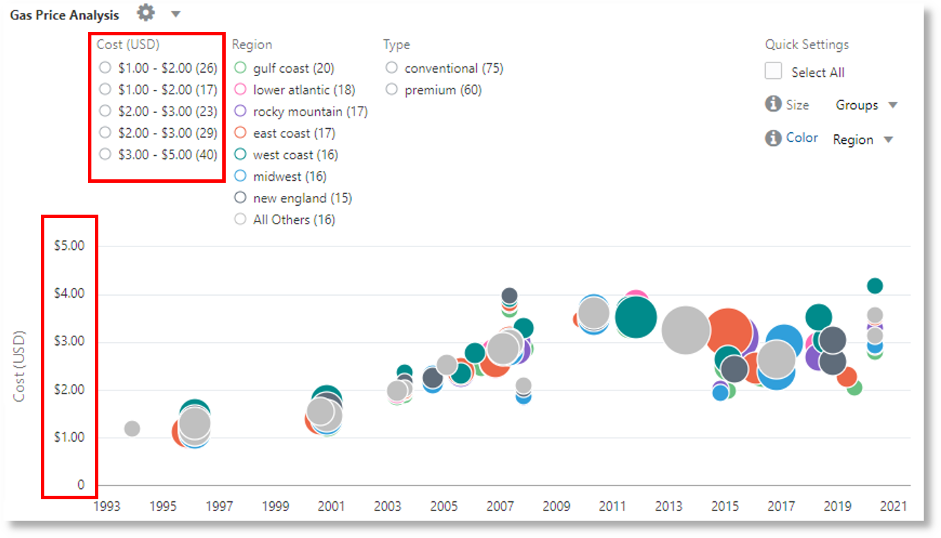
| classify 'Start Time', 'Cost (USD)', Region, Type as 'Gas Price Analysis'
In the following image, the groups are identified based on region, time and type of gasoline. The average price band of gasoline is used to plot the bubbles along y-axis.
In the following image, the groups table shows the average price of gasoline in various currencies. The charts show the variation of the cost across several years for each currency value.


